

Vector File for Printing: Why Factories Bounce It
The format is right, the logo is clean, and production still cannot start. Six checks separate a correct vector file from a press-ready one.
Need this made?Custom acrylic fabrication services →
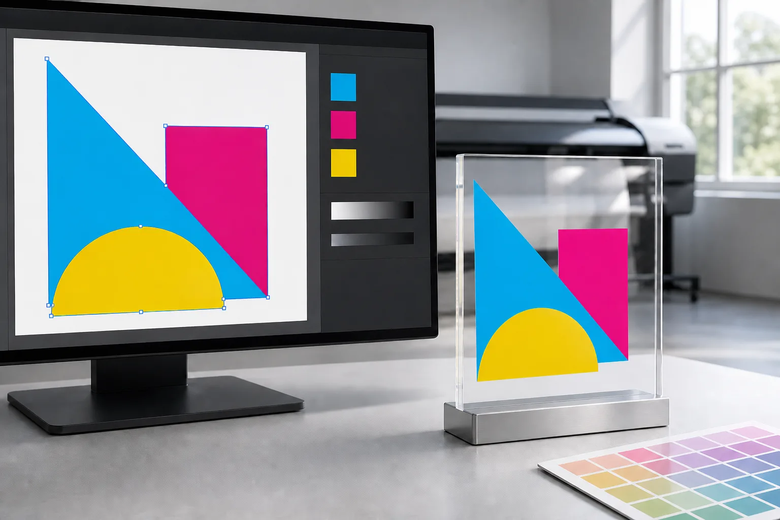
Key Takeaways
- A vector file for printing clears the format requirement, not the production requirement — the factory still checks editability, fonts, layers, dieline, color separation, and placement.
- Outlined fonts print identically on any machine but are a one-way conversion: send the outlined production file and keep an editable master with live type.
- One artwork file feeds two machines — print layers go to the printer, the dieline goes to the laser or CNC — so a logo outline that is really a cut line must live on its own named layer.
- Metallic gold is a separation, not a color: it needs its own named spot layer or foil die art, never a flattened yellow gradient inside the main artwork.
- Photo frame inserts are the raster exception — duplex files at 300 DPI final size, front and back aligned, with one printed insert approved before bulk.
On this page
- Why a vector file for printing still gets bounced
- Vector is a format — press-ready is a state
- Outlined fonts — the one-way conversion
- One file, two machines — print layers vs cut layers
- The acrylic dieline — drawing the object, not the artwork
- Metallic ink — gold is a separation, not a color
- Photo frame inserts — duplex print prep
- Logo placement is confirmed, never assumed
- What happens after your file clears
Why a vector file for printing still gets bounced
A vector file for printing clears the format requirement — not the production requirement. Before a custom acrylic order starts, we check six things the .ai extension cannot guarantee: editability, outlined fonts, print-versus-cut layer separation, a 1:1 dieline, metallic-ink separation, and confirmed logo placement. Any one of them can stop the job.
The file that costs buyers the most calendar time on my prep desk is not a bad file. It is a good file sent as the wrong artifact: a 2 MB logo.ai, genuinely vector, drawn in clean paths, attached to a note explaining that the logos are already vector — with a tone that says that should settle it. Then I open it. The type is live in a font we do not own, the gold is a flattened gradient, and the shape that reads as a border is actually the cut line. Nothing in the file is wrong. I bounce far more genuine vector files than corrupt ones. The file is simply not press-ready, and the distance between those two states is what this guide walks through.
The practical stakes: we answer every inquiry within 24 hours, samples ship in 3-5 days, production runs 15-20 days after sample approval, and our MOQ is 100 pieces. Every one of those clocks starts after the artwork clears. The file check is the only stage of a custom acrylic order whose speed you fully control.
| Check | What a miss looks like | What clears it |
|---|---|---|
| Editability | Every path outlined and flattened, no layered source | Layered AI/PDF/EPS source plus a final outlined copy |
| Fonts | Live type set in a font the factory does not license | Type converted to outlines; editable master kept on your side |
| Print vs cut layers | One layer doing two jobs; cut line printed as a border | Separate named layers: PRINT, CUT, GUIDE |
| Dieline | Artwork drawn to no physical object, or off-scale | 1:1 dieline with holes, slots, and 3 mm bleed past the cut line |
| Metallic ink | Gold rendered as a CMYK gradient inside the art | Dedicated named spot layer or foil die art |
| Placement | Orientation assumed from the file layout | Marked proof: face, edge, rotation, one named approver |
The sections below take the table one row at a time — what each check protects, why it fails quietly, and the fix that costs minutes now instead of days later.
Vector is a format — press-ready is a state
A file is vector when its shapes are stored as paths instead of pixels, so it scales from a business card to a lightbox without losing edge sharpness. A file is press-ready when a production team can print, cut, and engrave from it without asking a single question. The first is a property of the file; the second is a property of the whole handoff.
Editability is where the two diverge first. A fully outlined, flattened vector file is technically perfect and practically frozen: we cannot isolate the logo from its background, re-scale one element to fit a 40 mm engraving zone, or pull the artwork clear of a hole position. That is why the first thing I ask for on a new artwork hand-off is both artifacts — the layered AI, PDF, or EPS source, and a final outlined copy. The source lets the factory adapt; the outlined copy locks what you approved.
There is also a legitimate raster lane, and buyers are often surprised by it. Photographic artwork — a portrait going into a frame insert, full-bleed art on a tray base — does not need to be vector at all. It needs resolution: 300 DPI at the final printed size, not 300 DPI at whatever size the camera produced. What “photo-grade” means for a printed serving surface is its own subject, covered in our bottom-printed tray print-quality guide; the file rule here is simpler. Logos and line art: vector. Photographs: high-resolution raster. Most files I prep carry both, on separate layers.
Outlined fonts — the one-way conversion
Live type is a reference, not a shape: the file says “set these words in this font,” and the rendering machine looks the font up. If our prep station does not license the exact font, the software substitutes another — and spacing, weight, and line breaks shift quietly. The fix is outlined fonts: converting type to vector paths so the letterforms travel inside the file itself.
Outlining is a one-way conversion. Adobe’s own documentation is blunt about it — once converted, the text loses its text properties and can no longer be edited with text controls1. That one-way nature is why the workflow has two halves, and buyers usually hear only the first. Yes, outline the type before sending. But keep your live-text master, because the day your phone number, tagline, or product name changes, the outlined file cannot be retyped — it can only be redrawn.
Since 2014, I have handled this conversation hundreds of times, and my standing request is one of two packages: an outlined production file plus your live master kept safely on your side, or — when revisions are likely mid-project — the live file together with the font file itself, license permitting. Either package works. The one that does not work is a single outlined file and no master anywhere, which converts a two-line text change into a design job.
One file, two machines — print layers vs cut layers
A custom acrylic artwork file feeds at least two machines that read it in opposite ways. The printer prints everything in the print layers — every visible shape becomes ink. The laser or CNC follows the cut layer as a toolpath — its lines are movement instructions, never ink. When both jobs share one layer, each machine executes the other’s content, and the errors ship in both directions.
The failure we intercept most often is the border that was never a border. A buyer draws the product outline around the logo to show its shape — helpful for a human, ambiguous for a press. If that outline sits in the print layer, it prints: a thin keyline frame on 50 finished pieces that nobody ordered. Reversed, it is worse. Artwork that strays into the cut layer becomes a path our 8 laser cutters or 4 CNC machines will happily follow, straight through the middle of the piece.
The fix costs one minute in any design tool: three named layers — PRINT, CUT, GUIDE — with nothing shared between them. When a file arrives without that separation, I do not let the line guess. We rebuild the layers, I mark the interpretation on the digital proof, and you confirm which lines are ink and which are toolpath before anything runs.
The acrylic dieline — drawing the object, not the artwork
An acrylic dieline is the drawing of the physical object: the outer cut path, every hole and slot, bend or score positions, and any engraving zones — drawn at 1:1 scale on its own layer. The artwork decorates the object; the dieline defines it. Without one, we are reverse-engineering your product from a rectangle.
The term comes from packaging, where a dieline drives the cutting die for a folding carton, and the print industry has formalized the whole discipline of press-ready file delivery around conventions like these — the Ghent Workgroup exists precisely to standardize how print-ready files are specified and verified across countries and workflows2. Acrylic borrows the concept with a materials twist: our dieline drives a laser toolpath through a rigid 3-25 mm sheet rather than a die through folding board, so hole diameters, slot widths, and engraving boundaries carry machining meaning, not just visual meaning.
Two numbers do most of the work on this check. Scale: the dieline must be 1:1 — a “roughly proportional” drawing forces a dimension-confirmation round that costs more calendar time than drawing it correctly would have. Bleed: artwork that should reach the edge must extend 3 mm past the cut line, because a print aligned exactly to the edge will show a hairline of bare acrylic the moment cutting tolerance moves either way. Both numbers are exactly what the digital proof and the physical sample verify before bulk — dimensions get tested on one piece, not discovered on fifty.
Metallic ink — gold is a separation, not a color
Metallic gold cannot be mixed from ordinary process inks. It is produced by a dedicated metallic ink pass or by hot-stamping foil from a die — which route fits which artwork is the method decision we map in our printed acrylic box guide, and the printing process itself is covered in our UV printing on acrylic guide. The file requirement is the same for every route: metallic elements live on their own named spot layer.
Here is why the flattened version fails. When gold lettering is rendered as a yellow-to-brown gradient inside the main artwork, the file contains no signal that says “this is metallic.” The press prints exactly what the layer says — ordinary yellow ink in a gradient — and the shimmer the designer saw on screen never existed in the file at all. A named spot layer, by contrast, tells us to route those shapes to the metallic pass or to build the foil die from them.
Frames and multi-layer assemblies add one more line to the check: which face of which layer carries each print. A gold mark can sit on the front of the top layer, the back of a clear layer for a protected second-surface read, or a middle layer of a stacked frame — three different instructions from the same artwork. I ask for that placement in writing on the proof, and the approved sample then becomes the enforceable record of what “gold” means on your product: foil or ink, which face, which layer. Orders that skip this step are the ones where the reorder debate starts with a photo and a disagreement.
Photo frame inserts — duplex print prep
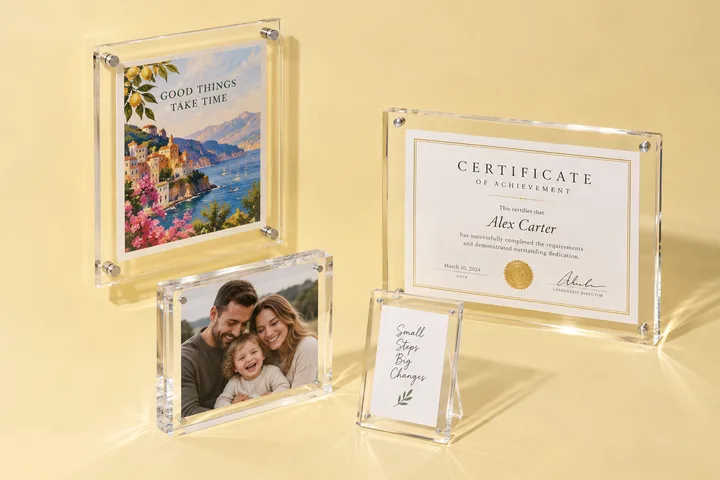
Photo frame inserts are the corner of acrylic work where raster files are not a compromise but the correct choice — and where file prep shifts from cut paths to alignment. An insert is the printed sheet that slides or seats between acrylic layers, and for double-sided frames it is usually duplex: printed on both faces, viewed from both sides.
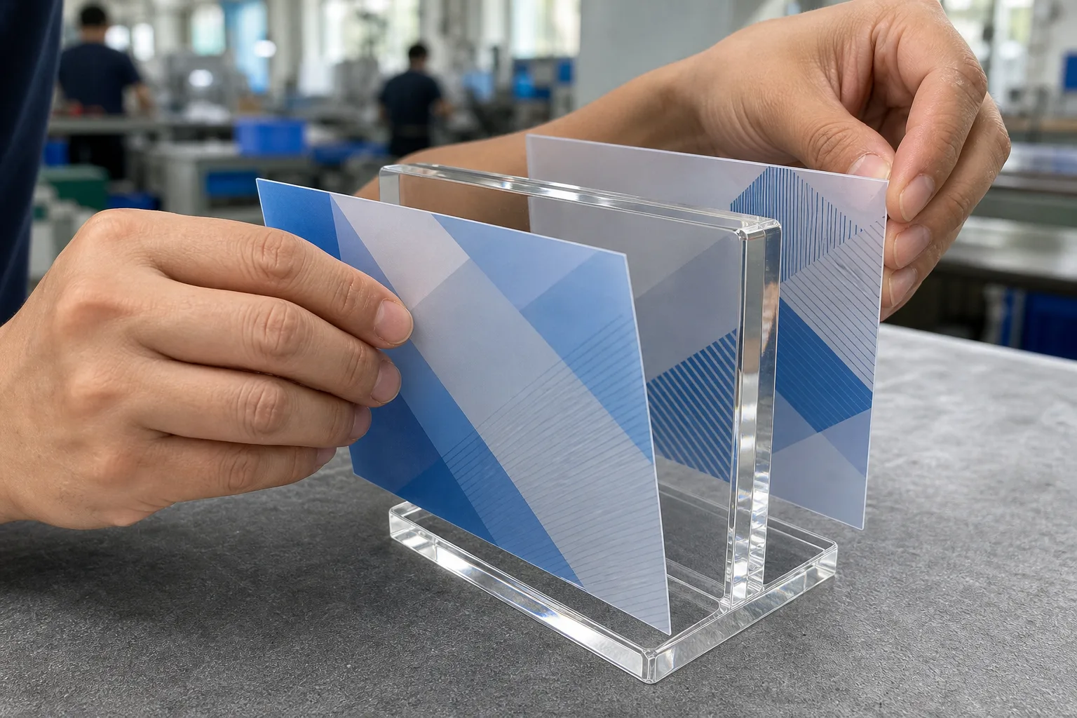
A press-ready duplex insert file has four properties. Front and back supplied as two pages of one PDF, not two loose files that can drift apart in an inbox. Registration: both sides share the same trim size and orientation so the faces align when the sheet is flipped — an orientation arrow on the guide layer settles which edge is up. Resolution: 300 DPI at final printed size, the raster lane from earlier in this guide. And sizing to the insert pocket, not the frame’s outer dimension — a magnetic frame’s insert is smaller than the acrylic that holds it, a distinction our magnetic picture frames buyer guide covers alongside the closure hardware itself.
The approval habit that protects insert orders is printing one before printing hundreds. We produce a single finished insert, photograph it seated in the frame front and back — or courier it as a 3-5 day physical sample — and hold bulk until you sign off. That one approved piece becomes the QC reference for the whole run across our magnetic acrylic frames production, checked piece by piece at final inspection.
Logo placement is confirmed, never assumed
Placement is the check with no technical failure mode at all — the file can be flawless and the product still wrong. A logo can sit on the lid or the base, the front face or the back, read from outside or through the acrylic, aligned to the top edge or centered. The file’s layout implies an answer; production needs a stated one.
Our convention is a marked proof: the dieline with the artwork placed on it, faces labeled, rotation shown, and each logo position dimensioned from a named edge. You confirm top, side, bottom, or back placement on the drawing — not in a sentence that says “like the photo.” Product-specific flows add their own placement vocabulary; engraved game tiles are the extreme case, and our mahjong artwork-to-production guide shows how tight that loop gets when 144 pieces each carry art.
Version discipline is the quiet half of this check. Artwork that goes through two rounds of revision exists in three versions, and the only one that matters is the one on the approved proof. We name the version on the proof itself, and one named person on your side approves it. Since 2014, I have seen far more reprints caused by “the other file” than by any press error — the file check ends, always, with everyone pointing at the same document.
What happens after your file clears
Clearing the file check starts every other clock in the order. The sequence runs: file check inside our 24-hour response window, digital proof for your approval, a physical sample in 3-5 days where the order calls for one, then 15-20 days of production with 100% piece-by-piece inspection under our ISO 9001 system before packing. Proof approval is the hinge — it locks the artwork version and makes the ship date real.
None of this requires your file to arrive perfect. Reference photos and rough dimensions are enough for us to quote and to tell you exactly what the production file will need — buyers regularly start with a phone snapshot of a competitor’s product and end with a press-ready layered file we helped assemble. The checks in this guide are not an entrance exam; they are the punch list we work through with you, usually in one round.
The payoff for getting the file right is compounding. The bespoke printed tray project shows how one placement ambiguity or flattened metallic layer can propagate unless the released artwork, physical color proof, drawing, sample, inspection, and packing record agree. That is what press-ready buys: fewer preventable questions between approval and release.
If artwork is sitting on your desk right now, send it for a file check and quote — imperfect files welcome, flagged fixes free. Not sure what to send at all? Our custom acrylic fabrication overview walks through what we build from a sketch, a sample, or a photo. Either way, the answer lands within 24 hours.
Footnotes
-
Adobe Help — Create outline text in Illustrator — Adobe’s documentation on converting type to outlines, noting that once converted the text “loses its text properties, making it uneditable with text controls”; supports the one-way-conversion claim in the outlined-fonts section. ↩
-
Ghent Workgroup — Specifications — the international print-industry body founded to standardize verification and delivery rules for print-ready PDF files (GWG2022, Sign & Display, Packaging specifications); supports the claim that press-ready file delivery is an industry-defined state rather than a per-shop opinion. ↩
Frequently Asked Questions
If my logo files are vector, why do you still need to check them?
Vector format answers one question out of six. Before production we also confirm the file is editable (not flattened), fonts are outlined, print artwork and cut lines sit on separate layers, the dieline is at 1:1 scale, metallic colors are separated as spot layers, and logo placement is confirmed on a marked proof. A genuine .ai file can fail any of these and still be a perfectly good vector.
What artwork files do you need for a custom printed acrylic order?
For a quote: a reference photo or sketch plus rough dimensions is enough — we reply within 24 hours. For production: layered AI, PDF, or EPS with fonts outlined and cut lines on their own layer. Photographic artwork, such as photo frame inserts, can be raster instead of vector as long as it is 300 DPI at final printed size.
How should metallic ink and cut lines be set up in acrylic artwork?
Each on its own named layer. Metallic gold or silver is printed as a separate pass or hot-stamped from a foil die, so it must be a dedicated spot layer — a flattened yellow gradient prints as ordinary yellow ink. A cut line must be labeled as a cut path, because anything left in the print layer gets printed: an outline that was meant for the laser becomes a visible border on the finished piece.
Can I approve one printed insert before bulk printing?
Yes, and for duplex photo frame inserts we recommend it. We print one insert, photograph it front and back inside the frame, or ship it as a physical sample in 3-5 days, and hold bulk printing until you sign off. The approved insert becomes the reference standard our QC team checks the production run against piece by piece.
What happens after I approve the print proof?
Approval locks the artwork version — file name, placement, and color separations — and starts the clock. Samples ship in 3-5 days where a sample is part of the order, and bulk production runs 15-20 days after sample approval, with 100% inspection before packing. A ship date only becomes real once the proof is approved, which is why the file check happens first, not last.
Ready to send your artwork for a file check?
Send whatever you have — a layered AI, a flat PDF, even a photo of an existing product with rough dimensions. We check files inside our 24-hour response window, flag exactly what needs fixing, and quote while the fixes happen.