Acrylic Display Branding Methods Guide
Choose the branding process after you define viewing distance, artwork life, color standard, surface, and replacement plan.
Need this made?Acrylic display manufacturer →
Key Takeaways
- UV printing suits detailed multicolor artwork; screen printing suits repeat solid-color programs.
- Engraving creates physical depth but does not reproduce full-color artwork.
- Replaceable inserts separate the long-life acrylic fixture from short-life campaign graphics.
- A PDF proof approves content and position; a paid sample approves the actual material, color, finish, and viewing condition.
- Keep the approved artwork, color target, method, placement drawing, and revision in one reorder file.
On this page
- Start with artwork life and viewing distance
- Compare the four common routes
- Use UV printing for detailed color
- Use screen printing for stable spot colors
- Use engraving for physical depth
- Separate permanent fixtures from changing graphics
- Approve color in layers
- Build a proof hierarchy
- Keep a reorder-ready branding file
Start with artwork life and viewing distance
Acrylic display branding methods should be selected from the job the graphic must perform. Define whether the mark is permanent or seasonal, viewed from arm’s length or across a store, one color or photographic, and protected behind acrylic or exposed to handling. Those inputs narrow the process before price enters the discussion.
UV printing, screen printing, engraving, foil, decals, and replaceable inserts are not interchangeable decorations. Each creates a different surface, proof path, setup, inspection method, and reorder file. I first separate permanent fixture identity from campaign content because the two often need different lifetimes.
Use the acrylic display stand manufacturer page to identify the physical stand family. The panel, shelf, base, enclosure, or insert location determines access, viewing side, and print orientation. Branding should follow the approved construction drawing, not a floating logo file.
Ask the supplier to quote one recommended route and one purposeful alternate. Comparing four methods without a defined objective produces noise. A useful alternate might compare permanent UV print with a replaceable printed card, or engraving with a one-color screen print.
Compare the four common routes
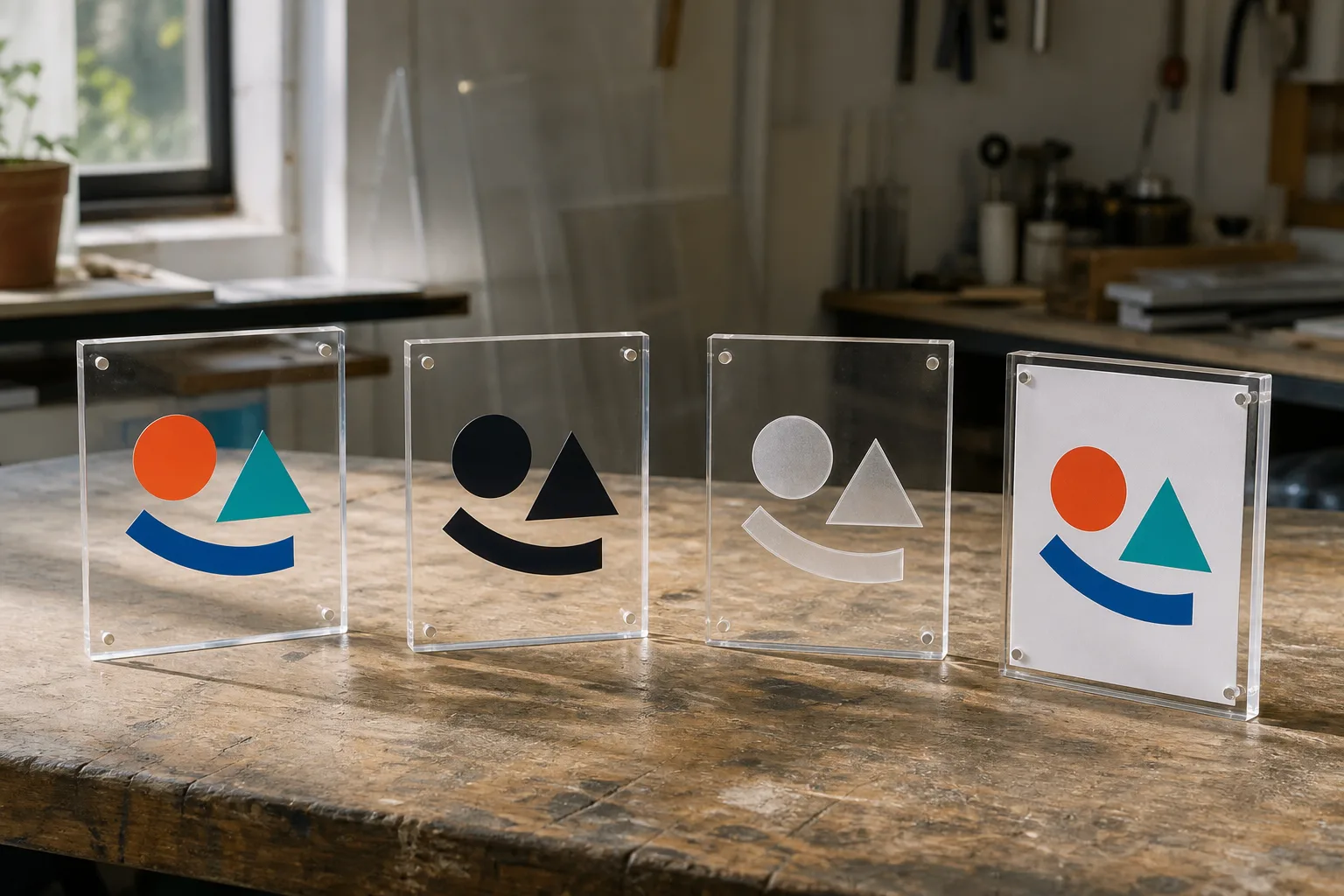
UV print carries detailed multicolor artwork and variable files. Screen print carries stable spot colors efficiently in repeat programs. Engraving produces a recessed or frosted physical mark. A replaceable insert keeps campaign art separate from the acrylic fixture. The right route is the one whose visible result and change cycle match the brief.
| Method | Strong fit | Buyer must approve | Change control |
|---|---|---|---|
| UV print | Detailed color, gradients, short version runs | White ink, color, registration, viewing side | Artwork and RIP-ready file |
| Screen print | Solid spot colors, repeated high-volume art | Ink color, opacity, mesh result, registration | Screen and approved color target |
| Engraving | Tactile depth, restrained marks, serial details | Depth, edge quality, legibility, location | Vector toolpath and sample |
| Replaceable insert | Seasonal graphics, retailer names, frequent campaigns | Fit, access, retention, print stock | Insert template and version label |
Do not reduce the comparison to durability. A permanent method can still be wrong when the message changes every quarter. A replaceable graphic can be the more durable commercial system because the acrylic body remains useful after campaign art expires.
Specify the viewing side. Second-surface printing places artwork behind clear acrylic and can protect the printed face, but it reverses the file and changes how white ink and transparency work. First-surface printing may suit a matte or opaque panel. The drawing should name the surface.
Use UV printing for detailed color
UV printing is the default candidate for logos with several colors, small text, gradients, variable names, or photographic content. The process can print directly to flat acrylic panels and can use white ink beneath color where the substrate would otherwise influence appearance.
Transparent acrylic makes color approval more complex than paper. Ambient light, background color, gloss, sheet tint, print side, and white-ink construction change what the eye sees. Pantone provides standardized color communication, but the physical production sample remains the approval object for the complete stack.1
Send vector artwork where possible, plus linked or embedded raster assets at production resolution. Convert fonts to outlines or provide the licensed font package. Name the required viewing side and whether clear areas must remain optically open.
Approve registration at edges, cutouts, and panel joints. Artwork that crosses a bend, bonded joint, or removable panel needs a placement tolerance and a visual priority. A proof can confirm coordinates; a sample confirms how the coordinates look on the assembled stand.
Use screen printing for stable spot colors
Screen printing suits repeat artwork built from one or a few solid colors. It can deliver strong spot-color coverage, but each color and registration relationship needs control. It is less suited to photographic gradients and frequent small version changes.
The quote should state color count, print area, substrate, viewing side, and whether the setup can be reused. A new retailer name or legal line may require a new screen even when the stand is unchanged. Keep setup charges separate from unit printing.
Approve the actual ink on the named acrylic finish. Clear, frosted, colored, mirrored, and coated surfaces do not present one universal background. Ask how the supplier treats white or light colors and whether the approved appearance assumes a particular backing surface.
When artwork is stable and quantities are repeated, screen printing can be commercially efficient. When versions multiply, UV printing or a replaceable insert may reduce the burden of separate physical screens and version storage.
Use engraving for physical depth
Engraving changes the acrylic surface or removes material, creating a tactile or frosted mark. It works well for restrained logos, labels, serial information, and graphics whose value comes from depth rather than full color. Laser and CNC routes produce different geometry and edge character.
Place engraving away from stressed holes, thin webs, polished show edges, and bonded zones unless the drawing and sample approve the relationship. Depth and line width affect legibility. Very fine features can lose clarity when the viewing distance increases.
An engraved recess can remain unfilled, receive a buyer-approved fill, or sit behind another color layer. Each route adds its own inspection point. Do not promise a universal fill adhesion or cleaning result; name the materials and approve the assembly as a system.
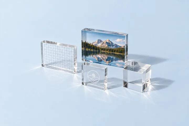
The logo-block engraving and UV printing guide applies the same choice to thick acrylic blocks. For display stands, add viewing distance, panel flex, and assembly access to the decision.
Separate permanent fixtures from changing graphics
Replaceable inserts are often the cleanest route for price cards, seasonal campaigns, market names, QR panels, and legal copy. The acrylic carries the structure and brand architecture while a printed card or panel carries the content likely to change.
Define the insertion direction, finger access, retention, visible margin, and maximum print-stock thickness. A slot that accepts the first proof may bind after lamination or coating. A magnetic face needs approved magnet locations, polarity, and removal access.
Create one controlled insert template with safe areas, bleed, cut size, orientation, and version field. The printer and acrylic supplier can then work from the same geometry. If Wetop supplies both parts, list them as separate controlled items on the quote.
Keep replacement frequency in the RFQ. A graphic changed weekly needs faster access than one changed once per season. Store teams should be able to replace it without scratching show surfaces or loosening structural hardware.
Approve color in layers
Color approval should move from target to digital proof to physical sample. The target names the intended color. The proof confirms content, version, scale, and placement. The physical sample confirms the combined result on the named acrylic under an agreed viewing condition.
Do not ask a monitor screenshot to approve a transparent, mirrored, pearlescent, or back-painted assembly. Screens, exported PDFs, and office printers do not reproduce the same optical stack. Record whether color is judged over white, black, product-filled, or ambient retail backgrounds.
For repeat orders, retain the approved file, material, finish, print construction, color target, sample photos, and acceptance note. If the sheet, ink, printer, coating, or viewing requirement changes, reopen the affected approval rather than claiming the old proof covers a new system.
The angled accessory-board project applies that proof hierarchy to a non-electrical display fixture with buyer-defined product mounts, color, labels, and QR placement.
Color measurement can support communication, but the buyer should define the instrument, geometry, background, and tolerance when a numeric limit matters. ISO/CIE colorimetry standards describe measurement frameworks; they do not create a product-specific acceptance limit by themselves.2
Build a proof hierarchy
A proof hierarchy prevents one approval from being asked to prove everything. Use artwork review for file integrity, a PDF proof for content and coordinates, a material swatch for sheet or finish, and a paid assembled sample for the final interaction.
Wetop paid samples take 3–5 days, are paid separately, and are never credited to production. Production MOQ is 100 pieces per design. Bulk production takes 15–20 days after drawing, artwork, sample, and commercial approvals.
Write each approval into the purchase file. Name the approver, date, revision, and accepted exceptions. A chat message saying “looks good” is difficult to reconcile when several PDFs and sample photos exist.
If the buyer waives a physical sample, record which risks remain open. The supplier can still inspect against the drawing and proof, but the buyer has not physically approved material appearance, color interaction, tactile finish, or assembled viewing condition.
Keep a reorder-ready branding file
The reorder file should include the final vector art, linked assets, outlined fonts, color targets, print construction, placement drawing, approved proof, sample reference, quantity by version, labels, and packout. Use one revision identifier across the PO, drawing, artwork, and carton marks.
The beauty counter display project shows how a fixture brief separates visible brand surfaces, removable components, and approval inputs. Use it as a reference, not as a promise that another artwork or retail environment will use the same construction.
When only artwork changes, preserve the approved physical drawing and open a new artwork revision. When the acrylic geometry changes, review artwork placement and packout again. A small hole or panel change can move a logo or alter the visible margin.
Ask the supplier to return the file list with the quote. That simple step exposes missing fonts, conflicting versions, unclear color targets, and old placement drawings before setup begins.
Send the complete package through the display quote form. We will identify the recommended method, proof sequence, sample assumptions, and production file set within 24 hours.
Review the method on the acrylic display manufacturer page and countertop stand options.
Footnotes
-
Pantone color systems — Pantone explains how standardized color systems support consistent color communication across materials and processes. ↩
-
CIE colorimetry publications — The CIE describes standardized colorimetric concepts and measurement methods. ↩
Frequently Asked Questions
What is the best way to put a logo on an acrylic display?
Use UV printing for detailed color, screen printing for stable solid-color volume, engraving for physical depth, or an insert when graphics must change. The viewing distance and artwork life decide the best route.
Can UV printing match a Pantone color?
It can be approved against a named target, but transparent acrylic, white ink, gloss, lighting, and viewing direction affect appearance. Approve the color on the actual material and finish.
Is engraving more durable than printing?
Engraving removes or textures material, so there is no printed ink film. That does not make it automatically better: fine color artwork, cleaning, edge position, and legibility still require a sample review.
Can campaign graphics be replaced without replacing the stand?
Yes. Design a pocket, magnetic panel, slide-in card, removable face, or printed insert with a defined access path and retention method.
What files should a branding RFQ include?
Send vector artwork, color target, finished size, placement drawing, viewing side, material and finish, quantity by version, proof requirement, packing labels, and destination.
Approve the Branding Route Before Bulk
Send the stand drawing, artwork, color target, quantity by version, and intended viewing condition. We will reply with a method and sample plan within 24 hours.