
Delivered project · Beauty Retail · Multi-Door Program
Multi-SKU Beauty Counter Display Manufacturing Program
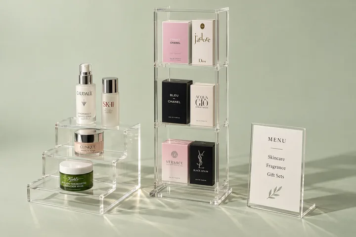
This 650-unit, 3-SKU beauty counter-display program delivered one controlled visual family across 120 retail doors: lipstick tester stands, skincare counter units, and shelf risers with replaceable tester inserts.
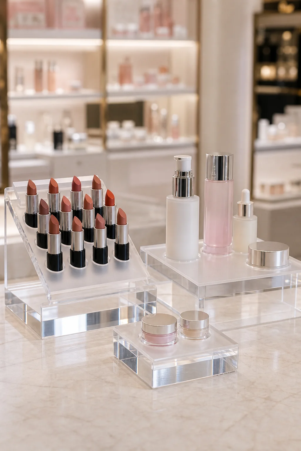
We validated product fit, print, finish, tester-product compatibility, and packing on physical samples before releasing bulk production. Project profile: A 650-unit, three-SKU program built around product fit, material, print, assembly, inspection, and door-allocation controls.
- units delivered
- 650
- SKUs
- 3
- retail doors
- 120
- base thickness
- 8 mm
Ordering a similar project
MOQ is 100 pieces per design. Paid samples normally take 3–5 days, are paid separately, and are never credited to production. Standard production takes 15–20 days after the planogram, product samples, drawings, material, artwork, packing, and display samples are approved; Wetop responds to a complete brief within 24 hours.
Different-specification price reference: the acrylic display manufacturer page publishes a two-tier countertop stand 250 × 180 × 220 mm, 5 mm clear, one-color UV logo: $28 each at 100 pcs, $16 at 500, $12 at 1,000 (FOB Shenzhen, published reference). That stand is a different specification and is not a quote for this three-SKU beauty program. Footprint, product wells, material, thickness, print, inserts, packing, SKU split, quantity, and destination determine the written quotation.
Key Takeaways
- Tester chemistry drove the spec: the buyer named the products and cleaners, then approved the selected sheet and finish on a production-intent sample.
- Replaceable tester insert trays separated the seasonal part (the shade lineup) from the durable part (the branded unit): the brand refreshes frosted trays, not 650 displays.
- Second-surface printing put the brand color under the acrylic, where daily counter wipe-downs cannot reach it.
- One geometry family across 3 SKUs read as a program, not three products: shared corner radii, shared 8 mm base thickness, shared logo zone.
- A 120-door program needed a buyer-approved SKU allocation and carton-label file before production packing began.
The Challenge
We delivered 650 counter-display units across three SKUs and 120 retail doors. The buyer needed one visual family; we built the quotation from the planogram, actual product samples, quantity split, counter footprints, artwork, cleaning routine, door allocation, packing, and destination.
Tester chemistry and cleaning were specification inputs, not assumptions. The buyer identified every product and cleaner likely to contact the display, and we approved the named material, finish, print, and insert system on a production-intent sample. We do not promise indefinite resistance to an unspecified chemical.
The program separated the seasonal part from the durable structure. Replaceable tester inserts allow a future assortment change to be quoted as inserts rather than complete displays, provided the retained base, fit, artwork version, and cleaning requirement remain compatible.
Four controls shaped the manufacturing brief:
- Chemical exposure. Fragrance and skincare testers carry alcohol, and alcohol attacks acrylic. We needed the drips, overspray, and cleaning products named so compatibility could be reviewed and sampled.
- Program consistency across 120 doors. One approved geometry family, artwork record, color reference, and packing allocation kept the three SKUs under one controlled plan.
- Refresh path. The buyer decided which parts could be replaced independently before the first production drawing was released.
- Contested counter space. Retail partners cap the footprint a brand fixture may occupy, and counters are handled and cleaned frequently. The sample checked product removal, stability, access, sightlines, and the approved cleaning method inside that footprint.
These controls belong in the RFQ and sample checklist. A rendering can confirm visual direction, but it cannot approve product fit, chemical compatibility, stability, color, print, or packing.
Our Approach
The program used three SKUs as one visual family: a lipstick tester stand, a skincare counter unit, and a small shelf riser. DFM review began with the buyer's planogram, product samples, concept files, artwork, counter limits, and quantity split.
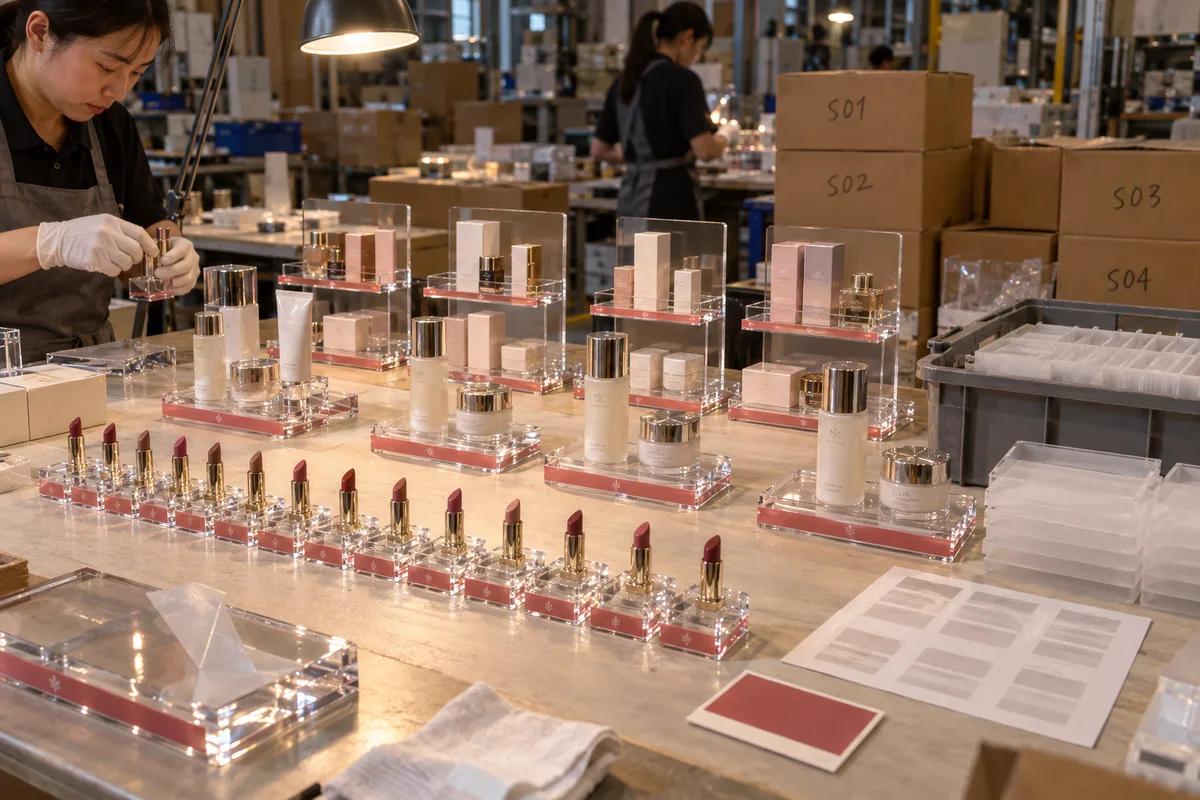
A paid sample of each design established the comparison set for bulk. The buyer checked product fit, one-handed access, stability, material, print, finish, insert replacement, cleaner compatibility, and packing. The signed samples and drawings then defined the production inspection plan.
Cast acrylic against tester chemistry
The single most consequential material decision in a beauty counter program is one most buyers never see on a quote sheet: cast versus extruded acrylic sheet. The two look identical on day one. They do not behave identically with every chemical or fabricated geometry. Residual stress, bending, bonding, edge finish, product chemistry, cleaner, exposure time, and temperature all affect crazing risk, so the named sheet and finished sample must be reviewed under the buyer's intended routine.
| Property | Extruded acrylic | Cast acrylic |
|---|---|---|
| Resistance to alcohol crazing | Review residual stress and finished geometry by sample | Often preferred; still requires chemical and sample review |
| Clarity retention under daily cleaning | Depends on sheet, fabrication, cleaner, and exposure | Depends on sheet, fabrication, cleaner, and exposure |
| Sheet cost | Lower | Moderately higher |
| Verdict for tester counters | Use only after buyer-approved compatibility review | Candidate for customer-touch parts; approve by sample |
This program began with cast sheet as a candidate for customer-touch parts, and the approved material followed the product and cleaner review. Ask the supplier to name the sheet and fabrication route, then test the finished sample rather than relying on a blanket material claim.
Replaceable insert trays — refreshes ship as trays, not displays
The seasonal part of a beauty counter unit is the shade lineup; the durable part is the branded structure. A drop-in frosted tester tray separated the two. Its keyed seat, lift clearance, product openings, retention, and replacement method were confirmed on the sample.
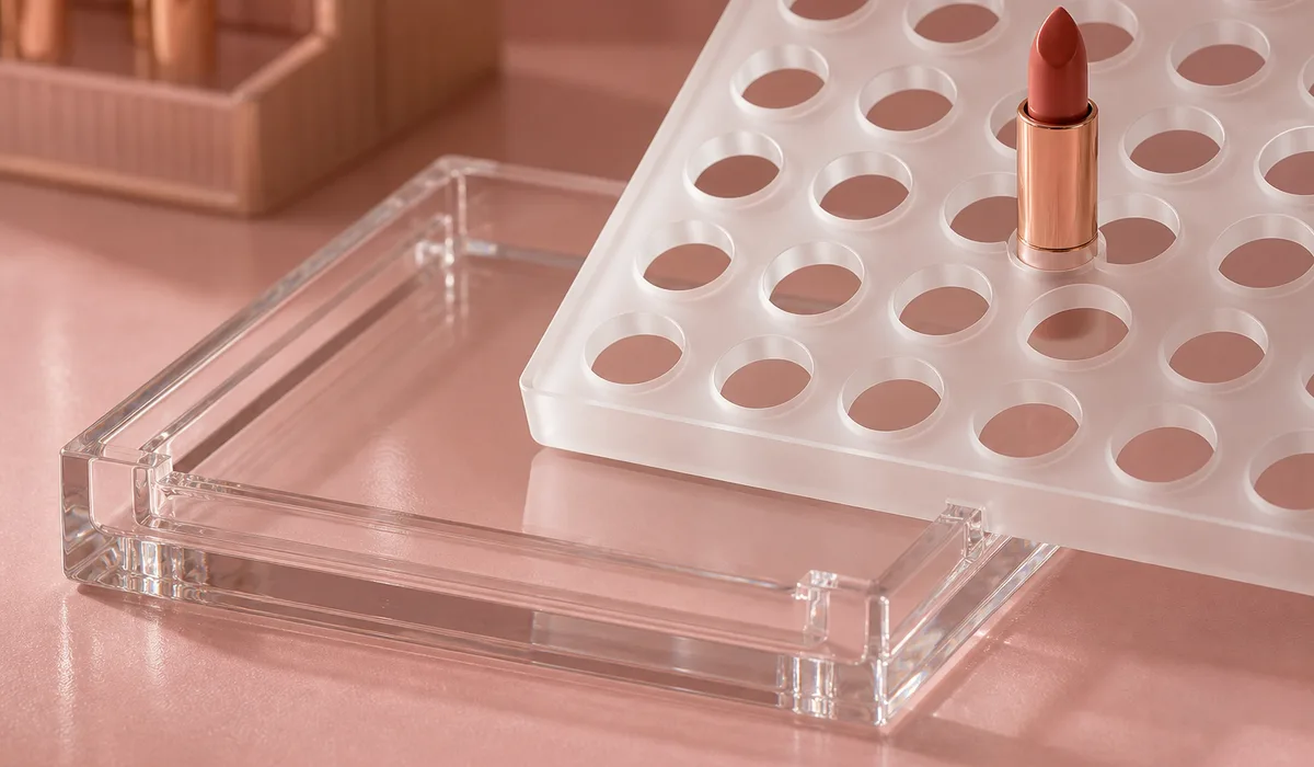
When the assortment changes, the buyer can request a tray-only quote if the retained structure and new product fit remain compatible. The revised tray still needs a drawing and sample; no fixed savings, refresh frequency, or service life is assumed.
Second-surface brand print and a weighted base
Second-surface printing places the graphic away from direct handling. In this program, the brand color was UV-printed on the underside of the top layer (second-surface printing), so the graphic reads through the acrylic with a depth and gloss a surface print cannot match, while wipe-downs touch the acrylic face rather than the ink. Compatibility with the named cleaner still required sample approval; the construction does not create indefinite chemical resistance.
The base solved the last constraint in the brief. Retail partners capped the footprint (the skincare counter unit, the largest of the three SKUs, had to live within a 200 × 150 mm counter footprint), so we could not simply make the units larger for stability. The sample therefore checked base thickness, mass, footprint, product-removal force, and tip behavior. Shared base logic, corner radii, and logo-zone height helped the three SKUs read as one system, so a door that received all three read them as one designed system rather than three products that happen to share a color. Shared geometry also reduced duplicated tooling and inspection setup, subject to the quotation.
The packing plan followed the buyer-approved door-allocation file: each carton received a location label and the specified SKU mix. The buyer approved the file version and carton sample before bulk packing.
The Results
The result was a buyer-approved release package: three drawings, physical samples, material and artwork records, insert fit, inspection criteria, SKU quantities, carton labels, and packing. Bulk began only after those inputs were approved.
The replaceable insert was the planned refresh path. A later assortment can be quoted as trays when the retained structure, product fit, artwork, cleaner, and store allocation remain compatible. The revised tray receives its own drawing and sample before production.
The door-allocation file was an approval gate. The packing record connected each carton label to the approved SKU mix and quantity so receiving teams could verify allocations.
One material record, geometry family, artwork version, approved sample, and inspection plan gave the buyer a defined standard for all three SKUs. The buyer's receiving and field records determine actual performance.
Buyer decision point: Replaceable tester inserts let the shade assortment change without replacing the branded display body at every retail door.
What This Means for Your Project
If you manage a beauty or cosmetics retail program, the questions that decide whether your counter hardware lasts are settled before production starts. Ask cast-versus-extruded first, and ask it specifically: "Which products and cleaners will touch this unit?" Use the answer to select and test the named material and finished sample. Ourcountertop display buyer guide walks through the full spec checklist, but the material question outranks everything else on it.
Second, design the refresh path before the first purchase order. A display program that fuses the seasonal part to the durable part commits you to rebuying hardware on marketing's calendar. Replaceable inserts, keyed seats, and second-surface graphics are decisions to test at the drawing and sample stage. If your program spans more than one SKU, compare a shared geometry family with separate designs in the quotation instead of assuming a fixed saving.
We build programs like this from a planogram and a tester lineup. Send yours through ourcustom acrylic fabrication process and we'll return a DFM review, a material spec matched to your product chemistry, and a program quote — custom acrylic displays are part of Wetop's custom fabrication work. Program quotes run FOB Shenzhen by default with DDP available, on 30% deposit / 70% balance-before-shipment terms. Freight timing is quoted for the named destination and mode rather than fixed on this page.
Planning a counter display program across retail doors?
Send us your planogram, tester lineup, and door count — we'll come back with a DFM review, a material spec matched to your tester chemistry, and a program quote with per-SKU pricing.
Paid sample in 3–5 days, separately paid and never credited · Production in 15–20 days · MOQ 100 pieces per design