Pantone Matching Acrylic: An OEM Color Guide
Buyers send HEX codes; factories match Pantone chips. How OEM acrylic color matching works: what a custom color costs, what delta-E to specify and what you sign.
Need this made?Custom acrylic fabrication services →
Key Takeaways
- Acrylic color approval needs a physical target, named finish, production thickness, viewing condition, and agreed measurement method; HEX or RGB alone is not a physical standard.
- Three routes can be quoted: closest stock sheet, custom-tinted material, or second-surface UV printing. Each has its own material minimum, setup, and acceptance criteria.
- $200 is the published low-end one-time reference per custom-tinted color; the quote names the final fee, material-batch minimum, lead time, and included swatch work.
- Transparent, translucent, and solid acrylic are three different matching problems: transparent tint deepens with every millimeter of thickness, translucent color shifts with backlighting, and solid opaque is the only one where the chip comparison is straightforward.
- Approval happens on a physical production-thickness sample under the viewing and measurement conditions written into the order.
On this page
- Why acrylic color matching starts with Pantone, not HEX
- Stock colors vs custom tint vs printed color
- Delta-E: setting an acceptance number before production
- Transparent, translucent, and solid: three matching problems
- Printed color: the small-quantity route done right
- The swatch sign-off workflow
- Specifying color on an OEM order
Why acrylic color matching starts with Pantone, not HEX
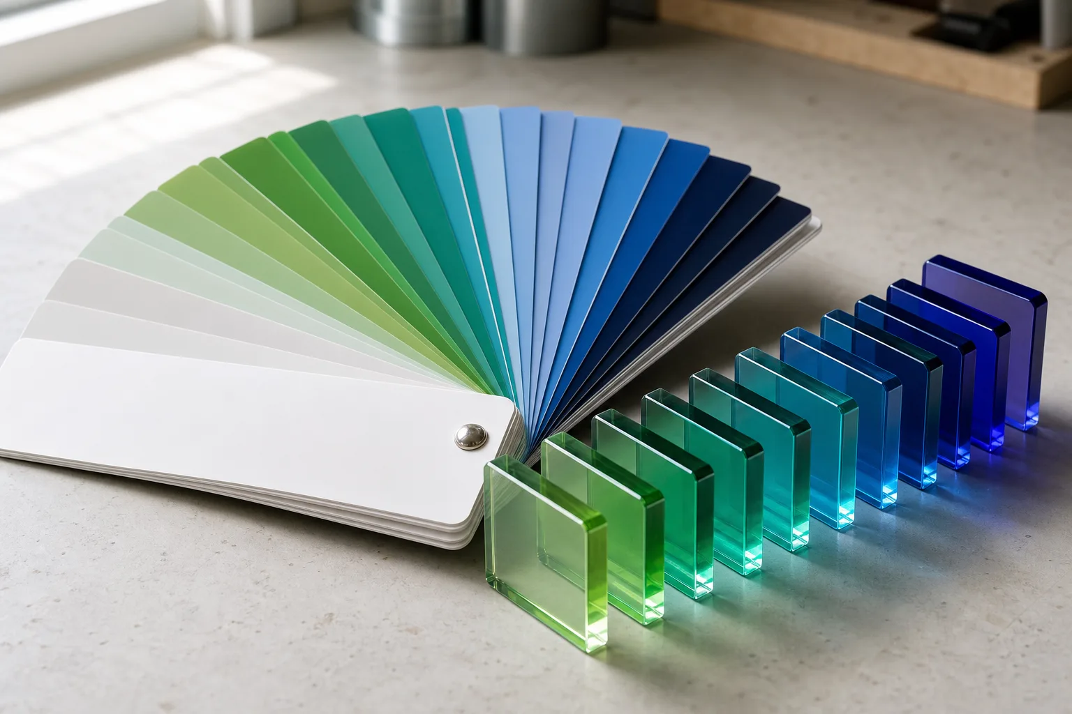
Pantone matching acrylic means choosing stock sheet, tinting sheet, or printing so the finished part matches a Pantone reference within an agreed tolerance. No supplier can honestly promise an exact match on every thickness and finish; the match is approved on a physical production-thickness sample, compared with the Pantone chip under agreed light.
A HEX value describes screen color, so it cannot be the acceptance target. A Pantone chip or a supplied physical item can. The order should name that target together with the material, thickness, finish, viewing condition and measurement method. The color route is one line of a wider custom acrylic fabrication quote, next to cutting, finishing and assembly.
The Pantone suffix is part of the target. The Pantone Matching System publishes coated (C) and uncoated (U) guides for different print conditions.1 A coated chip can be a useful reference for a polished surface, but it does not automatically predict color on transparent, translucent, frosted, printed, or thick acrylic. Write the chosen target and finish into the order.
The working sequence is to identify the physical target, choose a route the quantity supports, agree the viewing and measurement method, and approve a production-thickness sample. Retain the approved version record, as described in our sample approval standard; if delivered blocks differ, the acrylic-block claim checklist shows how to document the comparison.
Stock colors vs custom tint vs printed color
There are three routes to a brand color on acrylic: closest stock sheet, custom-tinted material, or second-surface UV printing. The quote should identify the route, target, material, thickness, setup, minimum, and acceptance method rather than treating them as interchangeable.
Quantity matters because each route has different economics. Custom tinting requires a dedicated material batch; $200 per color is the published low-end one-time reference, while the final fee, mill-batch minimum, swatch scope, and lead time are quote-specific. At quantities below the quoted material minimum, a disclosed stock-sheet comparison or a printed route may be more practical. Neither route should be called an exact match before physical approval against the agreed criteria.
| Route | One-time cost | Typical minimum | Color accuracy | Best for |
|---|---|---|---|---|
| Closest stock color | Quote-specific | Product MOQ | Compared to the agreed target | Small orders, accent parts |
| Custom-tinted material | $200 published low-end reference per color | Mill-batch minimum quoted per color | Agreed on production-thickness material | Volume programs, long-run brand colors |
| Second-surface UV print | Quote-specific setup | Product MOQ | Agreed on printed sample | Surface color at lower quantity |
Keep the color-development line separate from any project-specific setup, tooling, printing, or fabrication charges. The routes can also combine: a stock clear or black body can carry a printed brand-color area, as shown in the options for custom acrylic logo blocks and branded acrylic displays.
For sequential event pieces that also need controlled color, use the wedding and event table-number production guide to add numbering, artwork, and pack order to the approval brief.
Delta-E: setting an acceptance number before production
Delta-E expresses a calculated distance between two colors in a stated color space and formula.2 It is useful only when the order also defines the instrument setup, illuminant, viewing condition, finish, thickness, sample state, and measurement locations.
The allowable number belongs in the purchase order and must be agreed for the application. There is no universal Wetop threshold that should be copied into every program. Where ASTM D2244 and CIEDE2000 are chosen, name them together with the complete measurement setup and physical approved sample.3
Writing the acceptance method into the PO gives both parties the same comparison rule.
Transparent, translucent, and solid: three matching problems
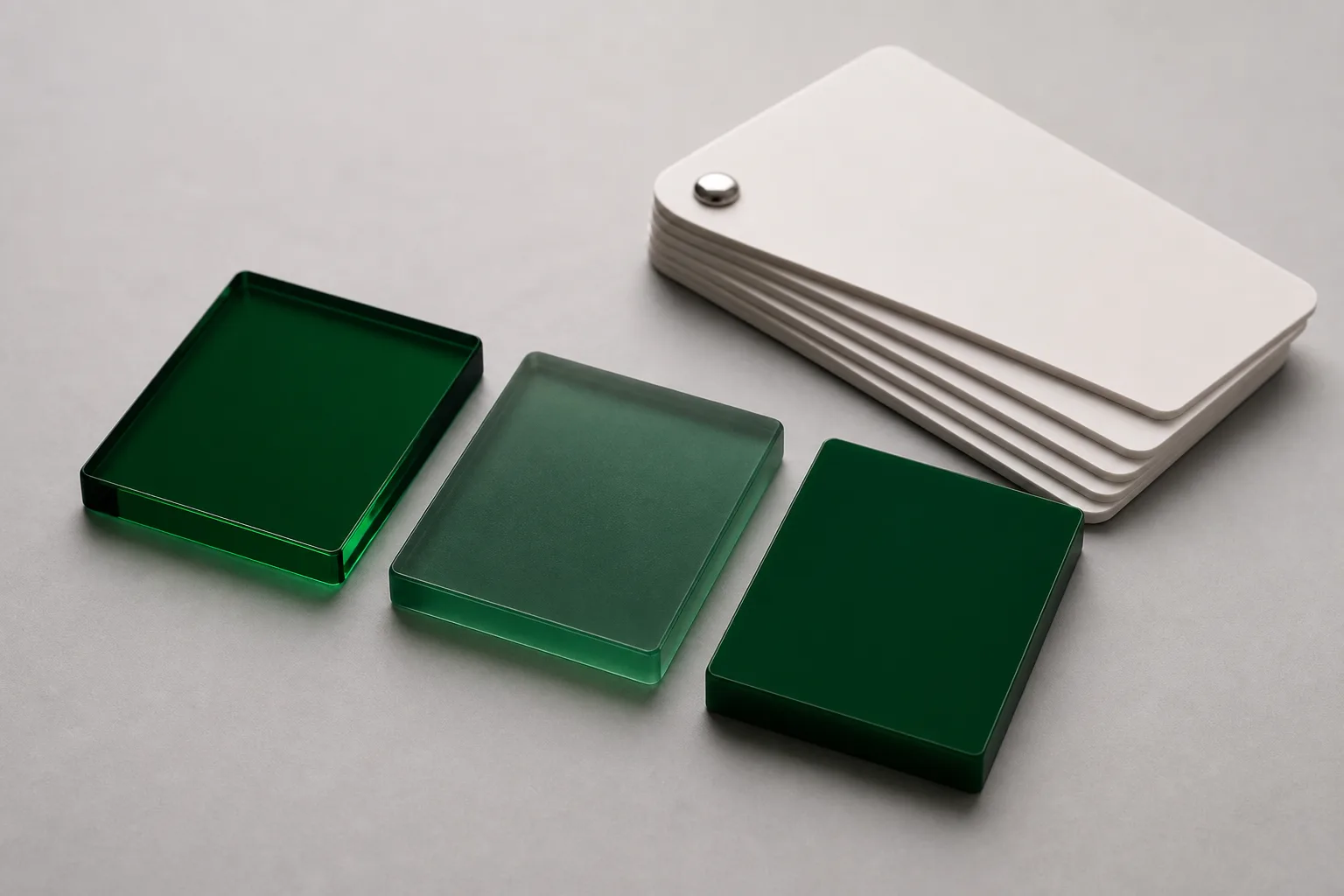
Opacity changes what “matching a chip” even means. Solid opaque acrylic is the straightforward case — reflected color, compared chip-to-swatch. Transparent tint deepens with every millimeter of light path, so thickness becomes part of the color spec. Translucent acrylic shifts with whatever light passes through it, so the lighting condition must be agreed before the color is.
Transparent is the one that surprises buyers most. Tinted transparent acrylic colors light by absorption along the light path: a 3 mm panel and a 10 mm block cut from the same material read as visibly different depths of the same hue, and edges — where light travels the part’s full width — glow deepest of all. That’s a physics property, not a production defect, and the spec answer is simple: approve transparent color on a swatch cut at your production thickness, and if a product family spans thicknesses, approve one swatch per thickness. When my operators prepare transparent swatch sets, they cut them from the exact gauge the order will run, because a 3 mm approval plaque tells you nothing enforceable about a 10 mm part.
Translucent — frosted tints, opal whites, the diffuser look — adds the light source to the equation. A translucent panel viewed by reflection in a bright room and the same panel backlit by an LED strip are two different colors to the eye, and both are “correct.” The fix is to define the viewing condition in the spec: reflected-light match for an unlit fixture, transmitted-light match against the actual LED temperature for an edge-lit or backlit build. Solid opaque, by contrast, behaves like the Pantone chip itself — which is why it’s the default recommendation when a brand color is non-negotiable and the part doesn’t need to pass light. For the broader finish decision between these families, see clear vs frosted vs colored acrylic.
Printed color: the small-quantity route done right
When quantity rules out custom tint, second-surface UV printing can place a brand-color area beneath clear acrylic. The approved printed sample, ink system, white-underbase construction, material, and viewing condition control the result; the route is not an automatic exact match.
The white-underbase construction affects opacity and appearance on clear acrylic. The quote and approved print sample should name the ink system, layer order, white-underbase coverage, material, viewing condition, and any requested instrument comparison. Do not assume a Pantone reference alone fixes the cured printed result; the UV printing on acrylic guide covers the print construction.
Two expectations keep printed-color projects smooth. First, geometry: print covers faces, not edges — a printed panel shows a clear rim at its polished edges where tinted material would carry color through. Design briefs that want color wrapping every surface are tint briefs, whatever the quantity says. Second, artwork: supply the brand color as a named Pantone C value in a vector file rather than as flattened RGB artwork, so the color separation stays clean at print. Both points cost nothing when they’re in the brief and a re-run when they’re not — the print-quality checks we apply to trays in bottom-printed acrylic print quality apply unchanged to any printed color panel.
The swatch sign-off workflow
Color approval happens on a physical production-thickness sample under the viewing and measurement conditions written into the order, not from a photograph, PDF, or screen. Record the approved version and the method that will govern production acceptance.
The workflow has four buyer-visible steps. First, target capture: supply the Pantone reference or physical item. Second, development: the quote names the formulation and sample scope at production thickness. Third, review: compare the sample under the agreed viewing and measurement conditions and record the approved version or correction request. Fourth, retention: the order identifies which approved sample or record controls production. Do not assume correction rounds are included unless the quote says so.
Version control belongs in that workflow. Label the target, supplier sample, buyer-approved sample, and production inspection record with dates or revision identifiers. Photographing a sample can help communication, but the image does not replace the physical reference or instrument record. If the buyer changes material grade, thickness, opacity, finish, print construction, or viewing condition after approval, reopen the color approval rather than carrying the old result into a different specification.
Physical approval is a general rule beyond color; the pre-production sample approval checklist explains why a screen is not a production acceptance sample. A documented acrylic photo-block repeat order shows how an approved sample and retained specification can control a different acrylic product across reorders; it is process evidence, not proof of a Pantone-matched material program. Color-development timing is quote-specific and should be added before the production window.
The same sequence ran on a small program in August 2026: a US branded-merchandise company approved the color references for a compact acrylic logo block of about 55 mm before the paid color-matched sample went into production. The block constructions are on the custom acrylic logo blocks page.
Specifying color on an OEM order
A complete color specification names the physical target, matching route, agreed color-difference formula and allowable value if used, instrument and viewing setup, opacity, material grade, production thickness, finish, measurement locations, and sign-off method.
The RFQ should also separate commercial and technical lines. Commercial lines cover the one-time color-development fee, mill-batch minimum, swatch rounds included, paid sample, production quantity, lead time, and Incoterm. Technical lines cover the target version, route, material, opacity, thickness, surface, lighting condition, background, measurement method, allowed value, measurement locations, and retention record. Keeping these fields separate makes later changes visible: a new thickness, for example, can trigger a new sample without implying that the previously approved color work disappeared.
An RFQ can use this structure: “Color target: Pantone 3425 C plus supplied physical chip. Route: custom-tinted cast acrylic. Opacity: solid opaque. Production thickness: 5 mm. Viewing condition and measurement method: supplier to propose for buyer approval. Acceptance value and measurement locations: to be agreed before sample sign-off. Approval: physical production-thickness sample before production.”
The commercial frame depends on the product and color route. The standard product MOQ starts at 100 pieces per design, while custom-tinted material adds a quoted mill-batch minimum and lead time. Paid samples are quoted separately and never credited to production. Standard payment is 30% deposit with the balance before shipment, FOB Shenzhen. Send the physical target or Pantone reference and complete production part specification for a route, sample scope, acceptance method, and schedule tied to the actual quantity.
Footnotes
-
Pantone Color Systems, Explained — Pantone — Pantone’s own explanation of the Pantone Matching System, including the coated (C) and uncoated (U) guide formats that represent how the same color renders on different substrate finishes. ↩
-
Identifying Color Differences Using Lab* or LCH* Coordinates — Konica Minolta Sensing — explains the CIELAB coordinate system and how total color difference (delta-E) quantifies the gap between a target and a sample, the measurement basis for acrylic color acceptance. ↩
-
Colorimetry — Part 6: CIEDE2000 Colour-Difference Formula — International Commission on Illumination (CIE) — the CIE’s reference publication for the CIEDE2000 formula, the perception-weighted delta-E calculation specified for modern color-tolerance work. ↩
Published price point
Quote the color route
Published low-end reference for custom-tinted material formulation. The final fee, material-batch minimum, swatch scope, and lead time are quoted per color; stock sheet and UV printing are different routes.
Paid samples are quoted separately and are never credited to production.
Thank you!
We've received your inquiry. Our team will reply within 24 hours — usually faster.
Frequently Asked Questions
Can you match my brand's exact HEX color on acrylic?
A HEX value can start the conversation, but it is not a physical acceptance target. Supply a Pantone reference or approved physical item, then name the material, opacity, thickness, finish, viewing condition, and measurement method before choosing stock sheet, custom tint, or UV print.
What does custom Pantone-matched acrylic cost?
$200 is the published low-end one-time reference per color for custom-tinted material formulation. The quote names the final fee, material-batch minimum, lead time, included swatch work, and any project-specific setup or tooling. Stock sheet and UV printing are separate routes with separate pricing.
What delta-E tolerance should I specify for acrylic color matching?
Do not copy a universal delta-E threshold from another project. Buyer and supplier should agree the allowable value, color-difference formula, instrument setup, illuminant, viewing condition, finish, thickness, sample state, and measurement locations; ASTM D2244 can be named when it is the agreed method.
Why does my transparent acrylic look darker than the approved chip?
Because transparent tint deepens with light-path length: every extra millimeter of thickness absorbs more light, so the same tinted material reads noticeably deeper at 10 mm than at 3 mm, and edges — where light travels the part's full length — read deepest of all. Approve transparent colors on a swatch cut at your production thickness, not on a generic chip.
How do I approve a custom acrylic color before production?
Approve a physical production-thickness sample against the target under the viewing and measurement conditions written into the order. Record the approved version and the production acceptance method. The sample is paid separately and never credited to production; its scope and timing are quote-specific.
Can acrylic be an exact Pantone match?
Not as a blanket promise. Pantone chips are printed ink on paper, while acrylic color changes with thickness, opacity, surface finish and light, so a 100% match on every part is not something a supplier should guarantee. What can be agreed is a target, a route, a measurement method and an allowable difference, then a physical production-thickness sample that both sides approve before production.
Lock the color route before production
Send the Pantone reference or physical target, acrylic type, opacity, thickness, viewing condition, part drawing, quantity, and acceptance method.