




Countertop Display Placement: Zone and 45cm Rules
The checkout counter sells more per square centimeter than anywhere else in the store, but only with the right zone, height and product. Here's the placement math.
Need this made?Custom countertop display stands →
Key Takeaways
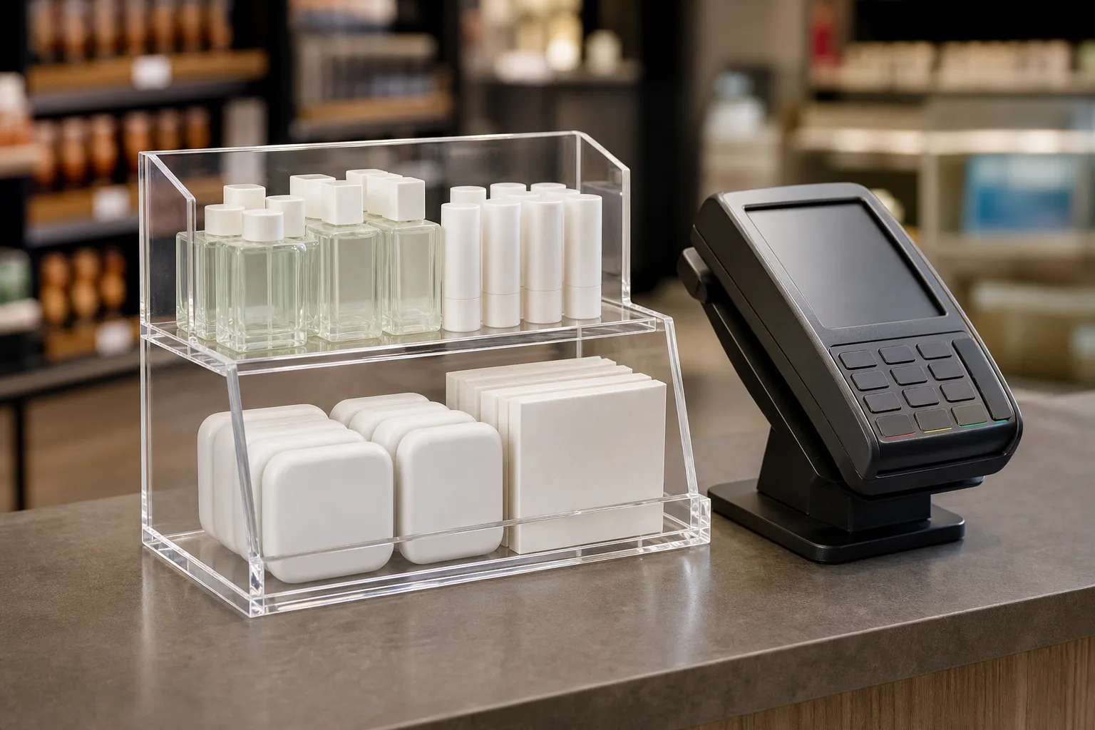
- The register has a golden triangle — payment terminal, hand-off zone, bagging area — and a countertop display earns sales inside it and gets ignored outside it. The hand-off zone, where the customer's hands wait, is the prime slot.
- Keep countertop displays under about 45 cm tall: US accessibility standards cap the accessible sales-counter section at 36 in (915 mm), so counters start low and a tall display walls off the cashier's sightline.
- Clear acrylic transmits about 92% of visible light, which is why a loaded acrylic countertop display keeps the counter feeling open where a cardboard unit the same size reads as a barrier.
- Placement rules change by retail type: pharmacy counters reward flat, wide trial-size trays; jewelry counters need lockable or tethered units; food counters need lids or covers on anything unwrapped.
- Rotate what's in the display every 4-8 weeks but never surrender the footprint — a fixed acrylic fixture with swappable product and graphics holds the spot that a removed display loses to the next brand's rep.
On this page
What countertop display placement decides
Stand at a drugstore checkout for ten minutes and watch hands, not faces. While the card reader thinks, customers straighten their wallet, glance at the counter, and — if something small and useful sits within reach — pick it up, turn it over, and about as often as not add it to the purchase. A countertop display is a small merchandising fixture that sits on a checkout or service counter to sell add-on products at the point of payment, and its entire economics run on those idle seconds.
Countertop display placement is the variable most brands never spec. The same display, same product, same store can perform completely differently depending on which 30 centimeters of counter it occupies, how tall it stands, and whether the cashier finds it in their way. I’ve visited hundreds of stores since founding Wetop in 2008 — first as a fabricator checking how our fixtures were holding up, later as a supplier trying to understand why one reorder came back triple and another never came back — and the pattern is consistent: displays fail at the counter far more often than they fail in the workshop.
This playbook covers the placement half of the countertop display question — where on the counter, how tall, what layout per retail type, and how to rotate product without losing the spot. For the fixture-spec half (footprint math, loaded weight, anti-theft hardware, cardboard-to-acrylic conversion), see the companion countertop display size and weight guide.
The golden triangle at the register
We map every checkout counter into three working zones — the payment terminal, the hand-off zone where money and goods change hands, and the bagging area. A countertop display performs inside this triangle and gets ignored outside it. The prime slot is the hand-off zone: directly in the customer’s downward eye line, within easy reach, and out of the transaction’s mechanical path.
The reasoning is simple dwell time. The customer spends the whole transaction — card processing, receipt, bagging — facing the hand-off zone with idle hands. Product placed there gets touched; product placed past the bagging area, or behind the terminal where the cashier’s equipment lives, sits outside both reach and attention. The point-of-purchase industry — organized enough to have its own trade association, Shop!1 — treats checkout-zone merchandising as its own discipline, and the practical conclusion is consistent: proximity to the payment moment is the asset, and inches matter.
| Counter zone | What happens there | Display role | What to avoid |
|---|---|---|---|
| Payment terminal | Card, PIN, phone tap | None — keep clear | Anything crowding the reader or receipt printer |
| Hand-off zone | Customer waits, hands idle | Prime display slot | Blocking the pass-through of goods and change |
| Bagging area | Staff packs the purchase | Secondary slot, staff-facing add-ons | Tall units that slow bagging |
| Queue approach | Customer waits in line | Pre-sell: signage, low displays | Displays that narrow the queue path |
Two placement rules ride on top of the zones. First, respect the staff veto: a display that interferes with scanning, bagging, or the till gets shoved to the counter’s dead corner within a week, and no planogram will bring it back — so the fixture’s footprint has to fit the zone with working room to spare. Second, favor the customer’s dominant-hand side of the hand-off zone where the counter layout allows it; a unit the customer can reach without crossing their own body gets handled more. Neither rule costs anything. Both are decided before the display is ever built, which is why we ask for a photo of the actual counter with almost every acrylic countertop display case inquiry.
Height, sightline, and why clear wins
Keep a countertop display under about 45 cm tall. US accessibility standards cap the accessible portion of a sales counter at 36 in (915 mm) above the floor,2 so checkout counters sit low — and a display much taller than 45 cm puts a wall between the cashier and the customer, the queue, and the door. Staff will move it, and the prime slot is lost.
Sightline is a security issue as much as a service one. Cashiers are trained to keep eyes on the sales floor and the entrance; a display that creates a blind spot gets relocated no matter how well it sells. This is where material choice quietly becomes a placement advantage: clear acrylic transmits about 92% of visible light,3 so even a fully loaded acrylic countertop display reads as open air with product floating in it, where a cardboard or wood unit with the same footprint reads as a barrier. In practice that means an acrylic unit can hold a slot — and a height — that an opaque unit would be evicted from.
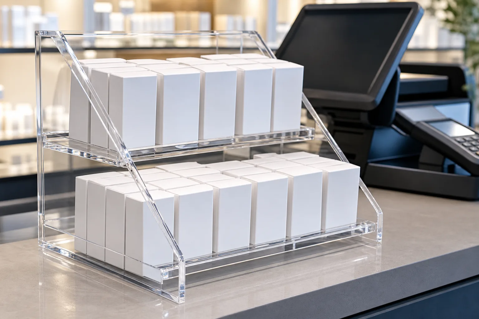
Within the height budget, angle beats altitude. A customer standing at the counter looks down at roughly 30-45° to see the counter surface, so product presented flat faces the ceiling, not the customer. Tiered risers or a back panel that tips product faces 15-30° toward vertical put the packaging’s front face into that natural downward gaze. Two or three shallow tiers inside a 45 cm envelope show more product face than a single tall tower — and the tower breaks the sightline rule anyway. The full range of riser and stand formats is on the acrylic display stands hub; the placement logic here is the same one our acrylic shelf talker guide applies at the shelf edge.
Placement playbooks by retail type
The golden triangle and the height rule hold everywhere, but countertop display placement — what sits on the counter, and what the display must defend against — changes by retail type. Pharmacy and beauty counters reward wide, flat trial-size merchandising; jewelry counters need security built into the fixture; food counters need hygiene covers on anything unwrapped.
Pharmacy and drugstore counters often carry lip balm, trial sizes, seasonal remedies, and other compact SKUs. A low segmented tray or tiered organizer can keep product visible, but pocket depth and replenishment rules should come from the buyer’s planogram. When a buyer requires controlled access, the pharmacy OTC locking display project shows how the buyer and its local authority approved the product category, lock, labeling, access procedure, drawing, and sample; the project does not claim regulatory compliance or a loss-prevention result.
Jewelry and accessories counters invert the logic: fewer pieces, more presentation, and theft as the design constraint. Counter units here are enclosed cases or single-piece pedestals — sightline-friendly by nature, since jewelry retail runs on clear cases — with lockable lids or tether points specified at the quote stage, not improvised after the first loss. Height matters differently too: a jewelry counter is a service counter where the customer stands and talks, so a compact case at the counter’s edge invites a look without interrupting the conversation.
Food, bakery, and café counters add hygiene to the placement math. Anything unwrapped at the register — pastries, samples, single-serve treats — needs a lid, a cover, or an enclosed case both for actual cleanliness and for the customer’s perception of it. Wrapped goods can ride in open trays. Because the counter also hosts a till, a pastry case’s door swing or lid lift must clear the transaction zone; a hinged front that opens toward the customer often fits where a staff-side lid fights the register.
| Retail type | Best counter format | Height | Security | Hygiene |
|---|---|---|---|---|
| Pharmacy / beauty | Wide segmented tray, 2-tier riser | ≤ 30 cm | Optional locking bin for regulated SKUs | Wipeable, open stock |
| Jewelry / accessories | Enclosed case or pedestal | ≤ 35 cm | Lockable lid or tether, spec’d at quote | Low |
| Food / bakery / café | Lidded tray or enclosed case | ≤ 45 cm | Low | Lid or cover on unwrapped goods |
| Convenience / general | 2-3 tier riser, gravity-feed bin | ≤ 45 cm | Weighted base against sweep theft | Wipeable |
Secondary placements beyond the register
The register is the prime counter, but most stores have two or three secondary counters worth a display: the service or consultation desk, the pickup counter, and the queue line itself. Each has a different dwell time and a different customer mindset, and the same fixture rarely works in all of them.
The service desk — pharmacy consultation window, jewelry service counter, phone-repair drop-off — has the longest dwell time in the store, often minutes rather than seconds. Customers there are waiting, not paying, which suits products that need a moment’s reading: a care kit with a benefit claim, an accessory that pairs with the service being performed. A slightly taller display with a printed back panel works here precisely because the sightline pressure is lower than at the till; the staff member is stationary and facing the customer anyway.
The pickup counter — click-and-collect, prescription pickup, catering orders — is the growing one. The customer arrives with the purchase decision already made and payment often already taken, so classic impulse mechanics are weaker, but add-on attachment is stronger: batteries beside electronics pickup, a card and ribbon display beside bakery collection. Keep it to one focused offer; a pickup customer gives the counter one glance, not a browse.
The queue line rewards floor-standing and shelf formats more than countertop display units, but where the queue rails past a counter edge, a narrow tray of single-SKU product along that edge pre-sells the impulse decision before the customer even reaches the register. The discipline is width: anything that narrows the queue path gets removed by staff for traffic reasons, the same veto that governs the till. If the aisle is tight, put signage there instead and let the counter do the selling.
Multi-SKU rotation without losing the spot
Rotate the product every 4-8 weeks; never remove the fixture. Regular customers stop seeing a static countertop display after a handful of visits — rotation resets attention — but counter space is negotiated territory, and a fixture that leaves the counter for even a week loses the slot to the next brand’s rep or the store’s own clutter.
The engineering answer is to split the display into a permanent shell and a swappable core. A fixed acrylic base holds the footprint, and interchangeable inserts, trays, or graphic panels carry each campaign: this month’s seasonal SKU, next month’s new flavor, the trial size after that. Swapping an insert takes staff seconds and requires no re-negotiation of the counter position, because the footprint never changes. A multi-SKU brief stands or falls on whether the products share a footprint envelope — if the largest SKU defines the pocket and the smallest still stands upright in it, one shell serves the whole rotation calendar; if not, we spec pocket inserts per SKU family against one shell.
Rotation cadence should follow the store’s rhythm, not the brand’s. Convenience and pharmacy locations with high repeat traffic reward the fast end (4 weeks); destination retail where customers visit monthly holds attention at 8. Whatever the cadence, tie it to a measurement: units sold per week from the counter position, before and after each swap. Counter placements survive quarterly resets when the brand can show the retailer sales per linear inch — keep the numbers, keep the spot.
One production note takes most of the cost out of the rotation model: because acrylic fixtures are CNC- and laser-cut rather than molded, there is usually no tooling fee — a new insert design is a new cutting file, not a new mold. Your cutting programs stay on file with us, so a brand can order shells once and commission insert variants for years against the same base, the way our repeat-order programs run across every category we build.
From placement plan to fixture spec
A placement plan turns into a fixture with five inputs: product dimensions (or a physical sample), units held, the counter space available, quantity per design, and the deadline. From there the path is fixed: quote within 24 hours, sample in 3-5 days, production in 15-20 days, 100% inspection in our ISO 9001-certified factory before shipment.
For a multi-location program, the buyer calculates required placement points, location quantities and spares. MOQ is 100 pieces per design, and the paid sample checks fit on the actual counter before production; sample fees are paid separately and never credited. The beauty-brand counter display project shows how SKU allocation, drawing, sample and packing inputs were controlled across the multi-door rollout.
If you’re still deciding what the fixture itself should be — footprint, loaded weight, anti-theft hardware, acrylic versus cardboard — start with the guide to countertop display size and weight and the acrylic countertop display case page. If you know your placement plan and your product, send us the five inputs and we’ll turn the plan into a counter unit you can put in the golden triangle.
Footnotes
-
Shop! Association — retail environments industry association. ↩
-
US Access Board — ADA Accessibility Standards — §904.4.1 requires an accessible sales-counter portion no higher than 36 inches (915 mm) above the finish floor, the regulatory anchor for how low US checkout counters sit and therefore how tall a counter display can stand before it blocks sightlines. ↩
-
Plaskolite OPTIX acrylic sheet PDS — 92% light transmission (ASTM D1003). ↩
Frequently Asked Questions
Where should a countertop display be placed on the counter?
In the hand-off zone — the stretch of counter between the payment terminal and the bagging area, where the customer's hands and eyes wait during payment. Keep it out of the transaction path itself: a display that blocks the card reader or the bag gets pushed aside by staff within a week.
How tall should a countertop display be?
Under about 45 cm on a standard checkout counter. US accessibility standards cap the accessible sales-counter portion at 36 in (915 mm) high, so counters sit low — a display much over 45 cm blocks the cashier's view of the customer and the door, and staff will move it. Two or three low tiers beat one tall tower.
What sells best in a countertop display?
Small, low-price, decide-in-seconds items: trial sizes and lip care at pharmacy counters, care kits and cleaning cloths at jewelry counters, single-serve treats at food counters. The common thread is a price low enough to add to the purchase without deliberation, in a package small enough to pick up with one hand.
How often should counter displays be rotated?
Swap the product or graphics every 4-8 weeks, keeping the fixture in place. Regulars stop seeing a static display after a few visits; rotation resets attention. A fixture with a swappable insert or graphic panel lets you rotate SKUs without giving up the counter position you negotiated.
What information does a manufacturer need to quote a countertop display?
Five things: product dimensions (or a sample unit), how many products the display holds, the counter space available, target quantity per design, and your deadline. A PDF or CAD drawing works, but a photo and measurements are enough to start. Our MOQ is 100 pieces, samples ship in 3-5 days, and production runs 15-20 days.
Explore Custom Acrylic Products
Browse product categories to compare formats, materials, and customization options before choosing the closest fit for your project.