Case Study · Promotional Products · United States
300 Designer Mahjong Sets, Two Collections, One Color Standard
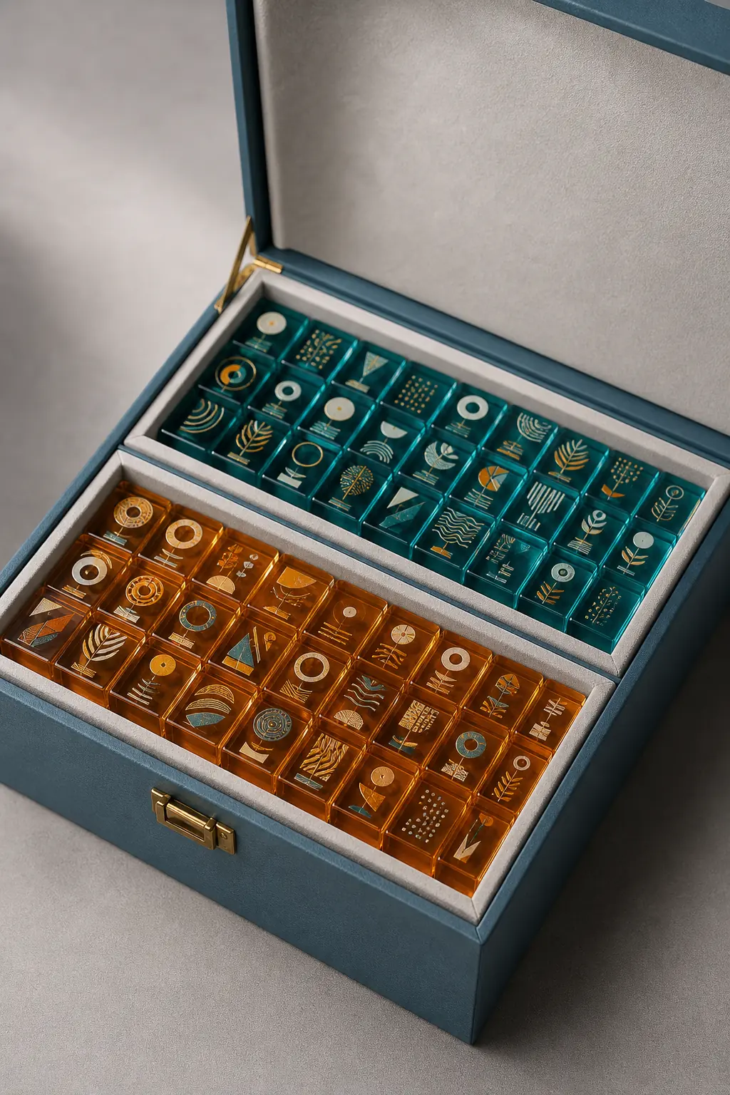
A promotional-products company on the US East Coast licensed two designer artwork collections and needed them as physical mahjong sets — 300 sets total, 150 per collection, each with 144 acrylic tiles plus accessories. The artwork arrived as vector files only, so before any tile was cut we ran two rounds of physical color-swatch chips against the designer's Pantone references, signed off both palettes at our ΔE ≤ 2.0 color-matching threshold, and produced all 43,200 tiles in a single 24-day run.

- sets, 2 collections
- 300
- tiles produced
- 43,200
- color sign-off standard
- ΔE ≤ 2.0
- production
- 24 days
Key Takeaways
- Vector artwork is a starting point, not a production spec: screen color and pigmented acrylic never match by default, so we run physical swatch chips before cutting a single tile.
- Two swatch rounds over 8 days locked both collection palettes to ΔE ≤ 2.0, our standard pigment-body sign-off threshold, far cheaper than one rejected production run.
- Cast-in pigment tile bodies plus UV-printed face art split the color problem in two: body color comes from the sheet itself, artwork detail from print registration.
- Cast PMMA tile blanks cut to the collection's spec, with machine-beveled shoulders, deliver the hand-feel buyers expect from a premium set.
- The two-collection rigid gift box was designed in the same run as the tiles: promotional buyers sell the unboxing, not just what is inside it.
The Challenge
The buyer develops branded merchandise programs for corporate and consumer clients, and this project started the way most of their products do: with licensed artwork and a catalog deadline. Their design team had secured two collections from an independent designer, two distinct palettes in one visual language, and the plan was to sell them as premium mahjong sets through their promotional catalog. What they did not have was any experience manufacturing mahjong, or any physical color standard for artwork that existed only as vector files.
That second gap is the one that sinks projects like this. A Pantone reference in a vector file describes ink on paper. Pigmented acrylic is a different material with different light behavior: the same reference number produces a visibly different color when the pigment is mixed into a translucent sheet, and a tile that looks right on a designer's monitor can land flat, dark, or garish in physical form. The buyer's product development lead had seen this movie before with printed drinkware and was direct about it: they wanted to see and approve real material before committing to 43,200 tiles.
The remaining constraints stacked on top. The two collections had to feel like siblings — identical tile geometry, identical box construction, so they read as one product line in the catalog — while each palette stayed unmistakably its own. The catalog print deadline fixed the delivery window and left no room for a rejected production run. And because the buyer had never specced a mahjong set, they needed design-for-manufacturability guidance on basics that mahjong producers take for granted: what survives on the collection's tile face, how fine a line UV printing can hold at that scale, and where artwork has to yield to the engraved suit characters players actually read.
The deadline math is what made the sequencing unforgiving. A promotional catalog prints once; a product that misses the issue waits for the next one, and the license on the artwork does not pause while it waits. Working backward from the catalog date left room for sampling, one full production run, and ocean freight — with no slack for a color dispute discovered after tiles were already cut. Every day spent proving the palette up front had to buy more than a day of risk at the production end, or the schedule would not close. That arithmetic, more than any preference of ours, is why the project put physical color approval first.
Our Approach
We structured the project around three decisions: prove the color physically before production, split body color and artwork detail into two different processes, and treat tile geometry and packaging as one system rather than two line items.
Physical color-swatch matching before production
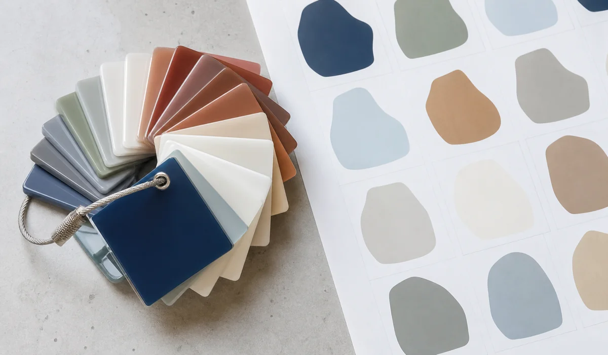
This is our standard color process for any pigmented-acrylic project, and on this run it was the hero decision. Before any artwork file moved, we put an NDA in place, standard practice for licensed designs and the reason a designer will release working files to a factory at all. Then, instead of trusting a screen-to-material conversion, we mixed pigment batches against the designer's Pantone references and cut physical swatch chips (small acrylic tiles in each candidate color) and couriered the full chip set to the buyer. Their designer reviewed the chips in daylight and under retail lighting, marked corrections, and we re-mixed. The loop ran like this:
Artwork intake: vector files and Pantone references logged, one pigment recipe drafted per collection color. Swatch round 1: first chips couriered; the designer approved most of collection one and rejected two colors in collection two. Swatch round 2: corrected chips approved in full, 8 days after intake. Golden tile: one finished tile per collection produced from approved recipes and signed off as the production reference. Production: pigment lots mixed to the approved recipes, with line QC checking tiles against the golden tile and swatch chips.
The chips themselves are made like production tiles, not like paint samples. Pigment goes into a small casting batch of the same base material as the production sheet, and the chips are cut and polished on the same lines the tiles will run on, so the gloss level and the translucency the designer judges are the ones the finished product will actually have. A sprayed or printed color card would be faster to produce and useless as a reference — half of what makes a color read differently in acrylic is the light passing through the material, and only the material can show that.
We hold ΔE ≤ 2.0, the point where two colors read as the same color to a trained eye at arm's length, as our standard pigment-body sign-off threshold, both at swatch approval and at final inspection; print-register work runs tighter. The round-2 correction mattered more than any spec sheet: a teal in collection two that looked perfect on screen came back from the first chips reading muddy in translucent acrylic, and the fix cost one re-mix and four days instead of a rejected 150-set batch.
Cast-in pigment bodies vs UV-printed faces
Color on a mahjong tile does two different jobs, and forcing one process to do both is how sets end up either fragile or dull. Body color needs to be durable and dimensionally deep — a tile gets handled, clacked, and stacked for years. Artwork detail needs resolution and registration: fine linework sitting precisely on a tile face. So we split them:
| Method | Durability | Color fidelity | Cost | Best for |
|---|---|---|---|---|
| Cast-in pigment | Color through full thickness — cannot chip or wear off | Excellent for solid body color, set at sheet stage | Mid (per-color pigment lots) | Tile bodies, backs, any handled surface |
| UV print | Good with clear-coat; sits on the surface | Full-color detail, fine linework, tight registration | Low-mid at volume | Face artwork, gradients, licensed graphics |
| Engrave + UV-fill | Excellent — recessed below the wear surface | Limited to solid fill colors | Mid (added print pass) | Suit characters, indices, traditional markings |
Each collection's tile body color comes from pigment mixed at sheet stage, so the color runs through the full thickness of the material, with no coating to chip and no wear pattern after a hundred games. The designer's artwork lives on the face as a UV print with registration tolerance held tight enough that pattern elements align across adjacent tiles on a rack; the print operator pulls tiles at intervals through the run and checks registration against the golden tile, because a drift that is invisible on one tile becomes an obvious stagger when fourteen of them line up in front of a player. Suit characters and indices are engraved, then UV-printed into the recesses, keeping them legible and protected below the wear surface. We do not offer hand paint-fill; the UV pass into the engraving holds tighter color control anyway. Three processes, one tile, each doing the job it is actually good at. For buyers weighing these trade-offs on their own project, our mahjong tile size guide covers how face dimensions constrain artwork, and the custom mahjong tile sets page shows the construction options side by side.
Tile geometry and packaging as one system
Both collections run on identical cast PMMA tile blanks cut to the collection's spec, with machine-beveled shoulders — the chamfer that lets a tile slide off a rack cleanly and gives the edge its light-catching line. Hand-feel was a deliberate spec, not an accident of material: the blanks are cut to deliver the hand-feel buyers expect from a premium set, because a featherweight tile reads as a toy regardless of how good the artwork is. Shared geometry across both collections also meant shared tooling, one QC standard, and no changeover cost between the two halves of the run.
The rigid gift box was engineered in the same run rather than sourced afterward. Each collection ships in a fitted two-tray box (tiles seated in a thermoformed tray, accessories below) with the collection's palette carried onto the box exterior. Promotional buyers live and die by the unboxing moment; a designer set arriving loose in a drawstring bag would undo everything the swatch process bought. Designing box and tiles together meant the sets shipped review-ready, and the buyer's catalog photography used production units straight from the carton.
The fitted tray also solves a transit problem that shows up whenever heavy acrylic tiles ship in bulk: 144 tiles rattling in a loose box will chip each other's shoulders long before the carton shows any external damage. Seating every tile in its own tray pocket immobilizes the load, so the beveled edges that took a machining pass to produce still look machined when the end customer lifts the lid.
The Results
All 300 sets, 43,200 tiles across two collections, shipped from a single 24-day production run, inside the buyer's catalog window.
The number that carried the project is the one that looks smallest: two swatch rounds. Eight days of chips and courier time is what stood between vector artwork and a production run the designer would actually endorse. Had the collection-two teal gone straight to production at the screen value, the buyer would have been choosing between accepting 150 off-palette sets or eating a re-run against a fixed catalog deadline. The swatch loop converted that risk into a four-day correction on a few grams of pigment.
Final inspection checked production tiles against the golden tiles and approved swatch chips, with color held within the same ΔE ≤ 2.0 threshold the buyer signed off at approval — the point of a physical standard being that the same reference object governs the first chip and the last carton. Because both collections shared geometry and tooling, the full 300 sets ran as one continuous job, and the two palettes stayed cleanly separated by pigment-lot control at the sheet stage rather than by anything the production line had to remember.
The 24-day production clock started at golden-tile approval, not at order placement, a distinction worth making because it is where OEM timelines are usually misread. Everything before the golden tile is decision time that the buyer controls: how fast artwork questions get answered, how quickly a courier chip set gets reviewed. Everything after it is manufacturing time that we control. Keeping those two clocks separate on the project plan is what let a first-time mahjong buyer hit a fixed catalog date with a product category they had never manufactured.
"The swatch chips saved us. Collection two's teal looked perfect on screen and completely wrong in acrylic, and Wetop caught it before a single tile was cut. All 300 sets landed in one run and the boxes photographed exactly like the designer's mockups."
What This Means for Your Project
Any brand turning 2D artwork into a physical acrylic product (mahjong sets, trays, blocks, displays) inherits the same three gaps this buyer faced, and the same three moves close them.
Budget a swatch loop. If your artwork exists as vector files and your product will exist as pigmented material, plan for at least one round of physical chips and the courier days that go with it. It is the cheapest insurance in custom manufacturing: a color correction costs days at the chip stage and a full batch at the production stage. Ask your manufacturer what their color sign-off threshold is and what physical reference governs final QC — if the answer is a screen value, keep looking.
Decide pigment versus print per surface, not per product. Handled surfaces want color in the material; detailed artwork wants print on the surface; markings that must survive decades of contact want engraving below it. A quote that proposes one process for everything is usually optimizing the factory's changeover time, not your product.
Treat packaging as part of the product spec. If the unboxing sells the product — and for licensed and designer goods it does — the box belongs in the same DFM conversation as the tiles, designed against the same palette and deadline. Sourcing it separately after the product is finished adds a second supplier, a second color-matching problem, and a second schedule to a project that already has one of each.
We run this kind of artwork-to-product program regularly for promotional and merchandise companies, with a 50-set MOQ that fits a licensed-collection test before a catalog-scale commitment. A test run goes through the same swatch loop and the same golden-tile sign-off as a full program — the process does not thin out at low volume, because the whole point of it is that the first fifty sets establish the standard every later order gets held to. Buyers who want a finished set in hand before committing can order one first: a full sample set typically runs about $350 including air courier, roughly a week door-to-door. Send us your vector files and reference palette through our customization process and we will come back with a swatch plan and a per-set quote.
Turning artwork into a physical mahjong collection?
Send us your vector files and reference palette — we'll come back with a swatch plan, a DFM read on what survives at tile scale, and a per-set quote.
Swatch chips in the first sample round · Production typically 15–20 days (this two-collection run: 24) · MOQ 50 sets