Delivered project · Multi-Property Wayfinding
Boutique Hotel Acrylic Wayfinding
A boutique hotel group came to us for wayfinding signs across several of its properties.
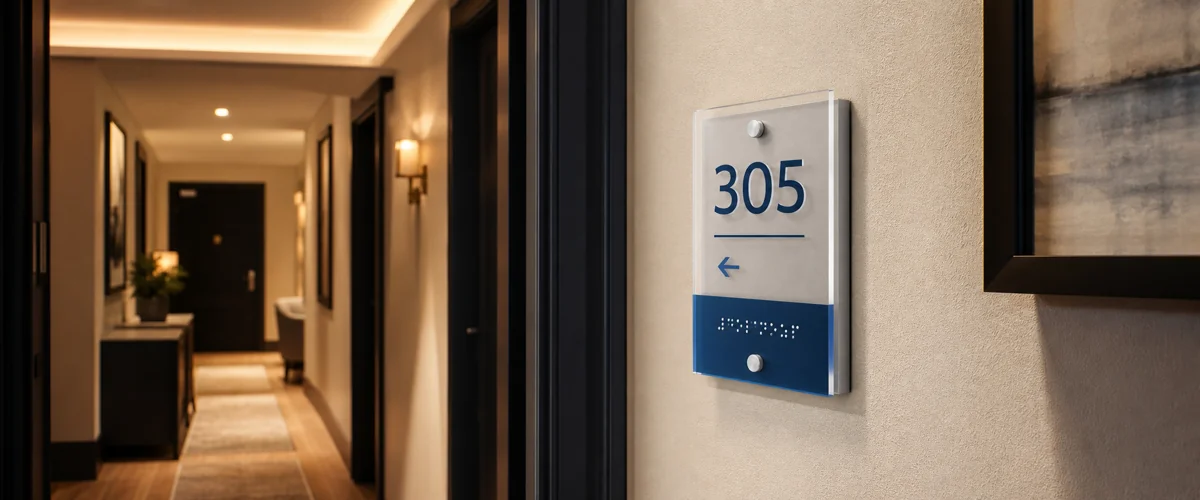
We made them as one system from its approved sign schedule: etched and paint-filled acrylic faces, tactile characters and Braille, one physical color reference, and cartons packed by property and floor. Delivered: room, amenity, restroom and directional signs checked against the sign schedule, packed by property. The buyer and its accessibility consultant signed off the tactile content.
Ordering a similar project
MOQ is 100 pieces per design. Paid samples normally take 3–5 days; sample fees are paid separately and never credited. Standard production takes 15–20 days after the sign schedule, released artwork, material, mounting interface, inspection plan, packing and sample are approved. Wetop responds to a complete brief within 24 hours.
Key Takeaways
- A boutique hotel group needed room, restroom, elevator, amenity and back-of-house signs for several properties, all reading as one brand. We built them from its approved artwork and one complete sign schedule.
- We made the faces in etched, paint-filled acrylic with tactile characters and Braille to the dimensions released by the buyer and its accessibility consultant.
- We locked thickness, finish, color reference, character geometry, mounting and edge quality on one signed golden sample before production.
- Property, floor, room and sign IDs travelled from artwork through QC labels and cartons, which kept a well-made sign from arriving at the wrong installation point.
- We packed foam-cradled, property-grouped cartons that protected exposed corners and let installers stage the rollout without opening every carton.
The Brief
The boutique hotel group came to us for room numbers, restroom signs, elevator and stair identifiers, amenity directionals and back-of-house signs for several properties. The commercial requirement was simple: every location had to read as one brand. The production requirement was harder. Every sign ID had to match the schedule; finish and color had to stay coordinated; and each carton had to reach the correct property and floor.
For the tactile characters and Braille, we did not write the translation or declare a sign compliant from a drawing. The buyer, architect and accessibility consultant supplied and approved the final text, character geometry, contrast, mounting position and installation height. We manufactured and inspected against that released file.
Our quotation started from the sign schedule rather than a single reference image. The inputs were the sign type, finished size, quantity, room or location ID, face finish, artwork revision, mounting method and destination. Once those columns were stable, we quoted the sample, production lead time and property-split packing line by line.
Our Approach
We built one golden sample from the hardest sign on the schedule. A room-number sign with tactile content, a brand-color fill and the back mount carried more production risk than a plain directional. Approval covered face material, edge finish, color reference, surface gloss, character position, tactile components, adhesive or hardware, wall offset and cleaning method.
Etched + paint-fill, not back-printed vinyl
Etched and paint-filled artwork gave the hotel signs a dimensional face without relying on a replaceable surface film for the brand treatment. We set etch depth, paint system and sheen on the sample. For tactile content, we routed, bonded and inserted components to the released specification. We measured each construction against the approved drawing instead of judging by eye.
We started the interior signs from a 6 mm cast acrylic face on a slim back plate and set final thickness by sign size, wall condition, impact exposure and visual weight. We laser cut, CNC routed, engraved, printed, paint-filled and assembled every sign in one production run, and kept the approved files for replacements.
We compared three face methods with the buyer. The hotel group chose the middle row, etched acrylic with approved tactile components, for its permanent room and facility signs.
| Method | Setup cost | Best use | Approval focus |
|---|---|---|---|
| Back-printed graphic insert | Low | Changeable non-tactile information | Color, adhesion, replacement access |
| Etched acrylic + approved tactile components | Medium | Permanent room and facility identification | Released artwork, dimensions, contrast, mounting |
| CNC-routed lettering with applied Braille | High | Deep dimensional brand treatment | Tool path, edge quality, fill consistency |
One approved standard, then controlled variations
Once the consultant approved the construction, the signs varied only in controlled fields: room number, arrow, destination, icon, size or property code. We converted the schedule into production files and used the sign ID as a traceable key on artwork, inspection records, protective film and carton labels.
Acceptance covered dimensional checks on tactile elements, color comparison to a physical master, print or fill adhesion, back-mount alignment and a packaging drop trial. The limits sat in the signed drawing and QC checklist, so procurement, the consultant and our production team all worked to the same criteria.
How Each Sign Was Built
We built each sign as a three-layer construction: face, fill, and back-mount. The same construction carried across sign types while outline dimensions and approved content varied. That created a coherent visual family and reduced setup changes during production.
Three details we settled in spec review:
- Etch depth. We set it during sampling so the paint fill read cleanly at oblique viewing angles without weakening small character strokes or telegraphing through a transparent face.
- Approved tactile component. A routed pocket added registration and mechanical engagement, and the final component, adhesive and geometry matched the released accessibility specification.
- Concealed back mount. We matched the mount to the wall substrate, sign weight, corridor impact exposure and installation method. We prototyped the offset and hole pattern before the rollout.
Production and Acceptance QC
Production began after the golden sample and complete sign schedule were approved. We confirmed capacity against the released quantity, property split, tactile content and mounting systems before committing the date.
Three QC checks ran through production:
- Color per batch. We compared production pieces with the buyer-approved physical reference under the agreed lighting condition. The order set a numerical color tolerance, so the inspection record listed the instrument, illuminant and sampling frequency.
- Tactile dimensions per batch. We measured the released geometry at the agreed sample frequency and preserved the results with the production lot. Third-party review stayed the buyer's and consultant's gate.
- Identity and visual inspection. We checked every sign ID, artwork revision, fill, edge, mount and protective surface before it entered the property-grouped packing cell.
The buyer received a traceable manufacturing packet: what we made, how we checked it and which approved revision controlled production. Local review and installation stayed with the buyer.
Multi-Property Packing and Installation Handoff
We handled multi-property freight as an information problem as much as a protection problem. Each sign carried a removable ID linked to the schedule. We grouped foam-cradled pieces by floor, packed them by property and labeled each carton with a manifest. Installers received a usable sequence instead of a mixed pallet of finished signs.
Exposed corners, finished faces and mounted hardware received separate protection. We accepted no face-to-face contact, no free movement inside the carton and a verified carton count against each destination manifest. The approved files stay on record, so replacement signs come from the same revision.
Before production, procurement confirmed who owned the field dimensions, accessibility review and final installation. The quotation named those boundaries and attached the approved drawing, sample record, QC checklist and packing map.
The Results
What held the rollout together: we approved one demanding golden sample, released one controlled sign schedule and kept every sign ID intact from artwork to installation.
If You're Planning Something Similar
Get tactile text, geometry, contrast and mounting height approved by your accessibility consultant before fabrication, and send one revision-controlled sign schedule with a sign ID per location. Agree color on a signed physical sample, since a Pantone callout alone leaves room for argument. Ask for per-sign protection and cartons grouped by property and floor. See acrylic displays,wall sign holders andfrosted acrylic vs sandblasted glass for hospitality.
Sourcing wayfinding signs for your hotels?
Send us your approved sign schedule, brand guide, mounting details and property split. We'll return DFM questions, a sampling route and a quotation with destination-based packing built in.
MOQ 100 pieces per design · Paid sample in 3–5 days, separately paid and never credited · Standard production in 15–20 days after approvals