Acrylic Tray Bottom Insert — Vector Logo + Dimension Spec
Hospitality and corporate-gift programs are the heaviest tray-bottom-insert buyers, and the vector-art prep step is what decides whether your logo reproduces at the depth you spec'd or comes back blurry.
Key Takeaways
- 4 vector-art rejection patterns account for 80%+ of brand-tray rework: hairline strokes below 0.3 mm, gradient fills, RGB color profile submissions, and complex logos with sub-pixel detail. Fix at the brief stage, not the production stage.
- Insert-on-tray (laminated brand insert sandwich between two PMMA layers) holds 5+ years; etched-on-tray (laser engraved into the substrate) is permanent but loses brand color information. Choice depends on brand color requirement.
- Color-on-clear math — the brand's logo color saturation visible through the substrate — needs ink stack opacity above 85% on color-printed inserts. Below 85%, the logo reads washed-out under hospitality lighting.
- Tooling library workflow saves 7 days on repeat orders against the same vector file: register calibration, ink-stack profile, and substrate cut path are preserved in the library for active brand programs.
On this page
- Tray inserts pass or fail at the file review: artwork, ink stack, register
- Vector-art prep — the 4 rejection patterns
- Insert vs etched-on-tray — when each method wins
- Color-on-clear math — opacity and ink stack
- Dimension tolerances + register at multi-color print
- Tooling library — why repeat orders skip 7 days
- What to include in your brief — checklist for a clean first pass
Tray inserts pass or fail at the file review: artwork, ink stack, register
Acrylic tray bottom inserts succeed when 4 vector-art rejection patterns are caught at the brief stage (hairline strokes, gradients, RGB profile, sub-pixel detail), insert-on-tray vs etched-on-tray is matched to whether brand color is required, color-on-clear ink stack hits 85%+ opacity for hospitality lighting, and dimension tolerances at multi-color register stay below ±0.3 mm. Tooling library workflow on active brand programs cuts repeat-order timeline from 21 to 14 days because register, ink-stack, and cut path are preserved.
I get tray-insert briefs from hospitality and corporate-gift buyers about 2-3 times a month, and the vector-art rejection patterns are predictable enough that we now run the DFM review on every incoming file before quote stage. The five sections below cover what each spec axis decides and where the tooling-library workflow fits.
Vector-art prep — the 4 rejection patterns
The brief stage is where 80% of tray-insert rework gets prevented. Four vector-art patterns reliably fail at production scale and need to be flagged before quote.
Hairline strokes below 0.3 mm. Modern brand wordmarks often use light-weight typography with stroke widths that read fine at screen resolution but disappear at production scale. On a 200 mm tray insert with a logo printed at 60 mm width, a stroke that’s 0.5 px in the source file lands at roughly 0.25 mm physical width — too thin to print or etch crisply. The fix: thicken strokes to a minimum 0.3 mm production weight in a separate “production master” file kept apart from the brand’s standard logo file.
Gradient fills. UV print can simulate gradients via halftone or fine-resolution stepping, but at typical tray-insert print resolution (300-600 dpi) the gradient steps become visible. The result reads as banded rather than smooth. The fix: rebuild gradients as flat-fill regions or commit to a higher-resolution print run that absorbs the cost premium.
RGB color profile. RGB doesn’t translate cleanly to UV-print CMYK + spot-color workflow. Brand colors specified in RGB will shift in unpredictable ways at print. The fix: convert vector files to CMYK with Pantone spot-color references for any color critical to brand identity. We accept RGB submissions but always send a CMYK conversion proof for sign-off before production.
Complex logos with sub-pixel detail. Logos with intricate detail (decorative serifs, fine internal patterning, multi-element compositions) lose readability at tray-insert scale. At 60 mm logo width, detail below 0.5 mm physical disappears in print or etch. The fix: use a simplified logo variant for production at small scale, or commit to a larger insert geometry where the detail can be preserved.
The DFM review we run on every incoming brief specifically flags these four patterns. Brand teams who arrive with production-prepped vector files (rather than the brand’s master files) save themselves the rework cycle.
Insert vs etched-on-tray — when each method wins
Two methods for getting the brand identity onto the tray bottom: laminated insert (a printed graphic sandwiched between two PMMA layers) or laser-etched-on-tray (the design engraved directly into the substrate).
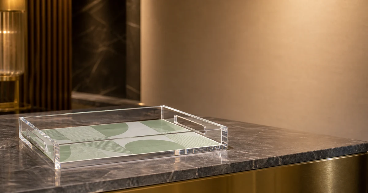
Insert-on-tray. A printed graphic (typically on rigid card stock or thin plastic film) is laminated between a 6-8 mm cast PMMA top layer and a 3-4 mm bottom layer. The insert is sealed against handling wear, abrasion, and liquid contact. Brand colors hold 5+ years under hospitality lighting. The visible result: brand identity reads through the optical depth of the top PMMA layer with a slight depth-glow that adds perceived premium.
Etched-on-tray. The brand identity is laser-engraved directly into the bottom face of a single PMMA layer. The engraving holds 5+ years (it’s in the substrate, not on it) but produces clear-on-clear contrast only — no color information. The visible result: brand identity reads as a recessed channel, beautiful for monochrome marks or wordmarks but limited in carrying brand color identity.
Decision rule. Insert if brand color is required. Etched if monochrome is acceptable or if the engraved-clear aesthetic is itself the design intent. Most hospitality programs (hotels, restaurants) require color identity, so insert wins on those. Some corporate-gift programs (executive welcome trays, event giveaways) work well with etched because the recessed-clear engraving reads as deliberate craft.
Color-on-clear math — opacity and ink stack
Hospitality lighting is dim relative to retail. A printed brand identity that holds saturation under retail spot lighting (5,000-7,000 K, 800+ lux) can wash out under hospitality ambient (3,000-3,500 K, 200-400 lux). The ink-stack opacity is what decides whether the brand identity reads at ambient.
Single-layer CMYK print. Opacity typically 60-75%. The substrate optical depth reads through and washes out the printed colors at hospitality light levels. Acceptable for retail or office light environments; not acceptable for hospitality-grade brand identity.
CMYK + white-ink underprint. Opacity typically 85-92%. The white underprint blocks substrate read-through and lets the CMYK colors hold their target Pantone reference. Production-grade for hospitality and any environment where ambient lighting is below 500 lux.
CMYK + Pantone spot + white underprint. Opacity typically 92-97%. The Pantone spot adds saturation on the brand’s specific reference color. Used for brand programs where color accuracy is critical (luxury hospitality, premium retail, brand-specific corporate-gift programs).
The cost delta between single-layer and full-stack printing is meaningful: roughly $0.40-$0.80 per tray at typical sizes, depending on volume. For brand programs across 500+ trays, the white-underprint at minimum is non-negotiable. For the broader UV-print context, our UV printing on acrylic guide walks through the ink-stack workflow in detail.
Dimension tolerances + register at multi-color print
Dimensional tolerance and print register on a tray-insert program affect both visual quality and tooling-library reusability.
Tray body dimensional tolerance. Production-grade target: ±0.5 mm on the long edge, ±0.3 mm on the short edge, ±0.2 mm on insert window dimensions. Above these tolerances, the visible inset gap between the insert and the tray edge varies enough that buyers report it as a quality variance.
Print register tolerance. Within-piece register (where multi-color overlap meets) target: ±0.2 mm. Across-batch register tolerance (where sequential prints in the same batch land relative to tray edge) target: ±0.3 mm. Above ±0.5 mm, the variance becomes visible at hospitality viewing distance and degrades the brand read. The colour-control discipline that holds these tolerances across a multi-thousand-piece run follows the international process-control standard for halftone colour separations and proofs1, which is the same framework commercial printers use for packaging and POS at retail scale.
Multi-color print at scale. A 4-color print on a 1,000-tray run holds ±0.2 mm register at any point in the run when the line is calibrated against a fiducial reference at the start and spot-checked every 100 prints. Without spot-checking, register drift across the run can reach ±0.6 mm by the end of the batch — visible and on the wrong side of the brand’s QA standard.
Surface preparation before print. Before any UV-print stack lands on the substrate, the PMMA face is cleaned and surface-energy-tested to verify ink adhesion. Cast PMMA out of the protective film typically reads at 38-42 mN/m surface energy, which is sufficient for solvent-free UV inks; older sheet stock that has absorbed plasticizer or surface contamination reads lower and pulls poorly under thermal cycling. The standard test method for surface energy on polymer films2 specifies the wetting-tension contact-angle workflow that production-grade print lines run as a periodic QC check on the substrate stock.
Tooling library — why repeat orders skip 7 days
For active hospitality or corporate-gift brand programs, the tooling-library workflow is what makes seasonal repeat orders viable on tight timelines. Three artifacts get archived after each program completes.
Register calibration profile. The exact print position and orientation relative to tray dimensions, with fiducial-reference offsets recorded. On a repeat order, the register is restored from the library rather than recalibrated from scratch (which takes 1-2 days the first time).
Ink-stack profile. The specific layer order, Pantone references, and ink density curves for the brand’s color palette. On a repeat order, the print line loads the saved profile and runs against the same Pantone references — color match against the original program holds at ΔE ≤ 1.5 across batches separated by 6+ months.
Substrate cut path. CNC and laser settings tuned to the tray geometry, including cut speed, depth-of-cut profile, and chamfer-edge specifications. On a repeat, the cut path runs from the saved program rather than re-engineered from drawing.
The combined effect: repeat-order engineering window drops from 7 days (first-order) to 1 day (library hit). Production runs at the same speed but starts earlier in the buyer’s calendar. For brand programs running quarterly seasonal refreshes, this is the difference between a 21-day and 14-day repeat cycle. For programs where the branding goes into the tray surface instead of under it, see our laser etched acrylic logo spec guide.
What to include in your brief — checklist for a clean first pass
A tray-insert brief that includes the following items typically clears DFM review on the first pass and avoids the 7-day rework cycle: vector file in production-master form (Adobe Illustrator with strokes ≥0.3 mm, flat-fill regions, CMYK + Pantone spot references); target tray dimensions with ±0.5 mm tolerance budget noted; venue lighting profile (warm-white at 3000 K vs cool-white at 4000 K vs daylight at 5000 K) — this affects ink-stack recommendation; unit volume target across the program’s calendar (initial run + repeat-order cadence) so the tooling-library decision can be made at quote stage; and finally a sign-off contact for the printed proof — most rework comes from proof sign-off being routed through brand managers who weren’t part of the spec call.
For brand creative directors or hospitality fit-out leads scoping a tray-insert program, send the brief over to our team — we’ll come back with a vector-art DFM review (flagging any of the 4 rejection patterns), an insert vs etched recommendation, and a production-grade sample with your logo at the register tolerance we’ll hold in production. For the standard tray geometries we run before brand-insert customisation is added, see our acrylic trays product page, and for an end-to-end example of a tray run that integrated artwork into the bottom insert, see the bespoke acrylic tray with artwork integration case study.
Footnotes
-
International Organization for Standardization. ISO 12647 — Process Control for the Manufacture of Half-tone Colour Separations, Proofs, and Production Prints. https://www.iso.org/standard/57833.html ↩
-
ASTM D5946 — Standard Test Method for Corona-Treated Polymer Films Using Water Contact Angle Measurements — the wetting-tension / contact-angle test protocol production print lines run as a periodic surface-energy QC check on the PMMA substrate before printing. ↩
Frequently Asked Questions
What are the 4 vector-art rejection patterns on tray bottom inserts?
(1) Hairline strokes below 0.3 mm — these don't print or etch crisply at typical tray-insert scale and read as broken lines. (2) Gradient fills — UV print can simulate gradients but with stepping artifacts at low resolution; clean recommendation is to stick to flat fills. (3) RGB color profile submissions — RGB doesn't translate cleanly to UV-print CMYK + spot-color workflow; submit Pantone-referenced CMYK files. (4) Complex logos with sub-pixel detail — at standard tray insert size (typically 200-400 mm long edge), logo detail below 0.5 mm gets lost in either print or etch. We send a DFM warning back when we see any of these in an incoming brief.
When does insert-on-tray beat etched-on-tray?
When brand color matters. Etched-on-tray (laser-engraved into substrate) is permanent and holds 5+ years cleanly, but it produces clear-on-clear contrast only — no color information. For brand programs where the logo color is part of the brand identity (most are), insert-on-tray (a printed graphic laminated between two PMMA layers) is the right call. The insert is sealed against handling wear and holds 5+ years under hospitality lighting. Etched-on-tray is the right call for monochrome brand identities or for trays where the engraved-clear aesthetic is the design intent.
What's color-on-clear math for hospitality lighting?
Hospitality lighting (3000-3500K warm white at typical reception or restaurant level) is dim by retail standards. To produce the saturation that brand identity needs at hospitality light levels, the printed insert needs ink stack opacity above 85% — meaning the printed colors block 85% of light passing through to the substrate behind. Below 85%, the substrate's optical depth reads through and washes out the printed color. Production-grade insert printing uses 2-3 ink layers (CMYK base + Pantone spot + white-ink underprint) to hit 90%+ opacity reliably.
How does the tooling library save time on repeat orders?
Three things get archived in the library after each tray-insert program: the calibrated register profile (where exactly the print or etch lands relative to tray dimensions), the ink-stack profile (the specific layer order + Pantone references for the brand's colors), and the substrate cut path (CNC and laser settings for the tray geometry). On a repeat order against the same vector file, all three are pulled from the library and the engineering window drops from 7 days (first-order) to 1 day (library hit). For active hospitality brand programs with quarterly seasonal refreshes, this is the difference between 21-day and 14-day repeat-order timelines.
Spec'ing a branded acrylic tray run?
Send us your vector file (Adobe Illustrator preferred), Pantone references, target tray dimensions, and unit volume. We'll come back with a vector-art DFM review (flagging any of the 4 rejection patterns), an insert vs etched recommendation tuned to your brand colors, and a sample tray with your logo at production-grade register.