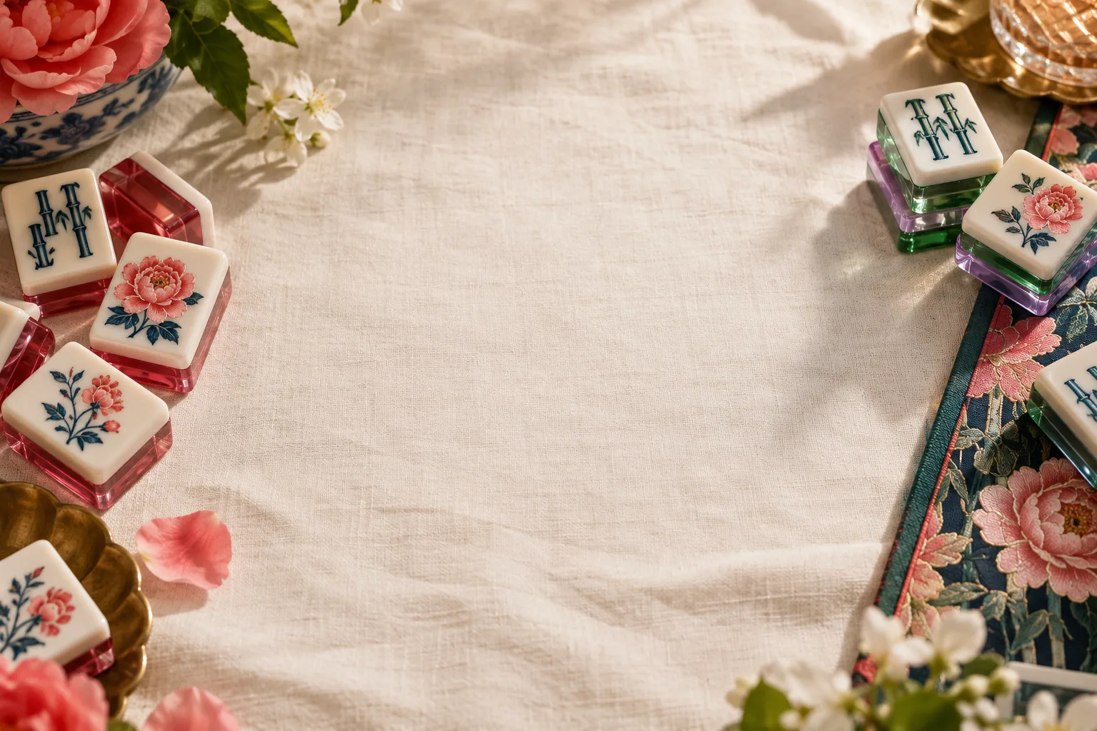


Opaque face colors
A solid face helps the artwork stand out. Choose a compatible white or ivory grade and approve the finished face.
Browse photographed references →Colors
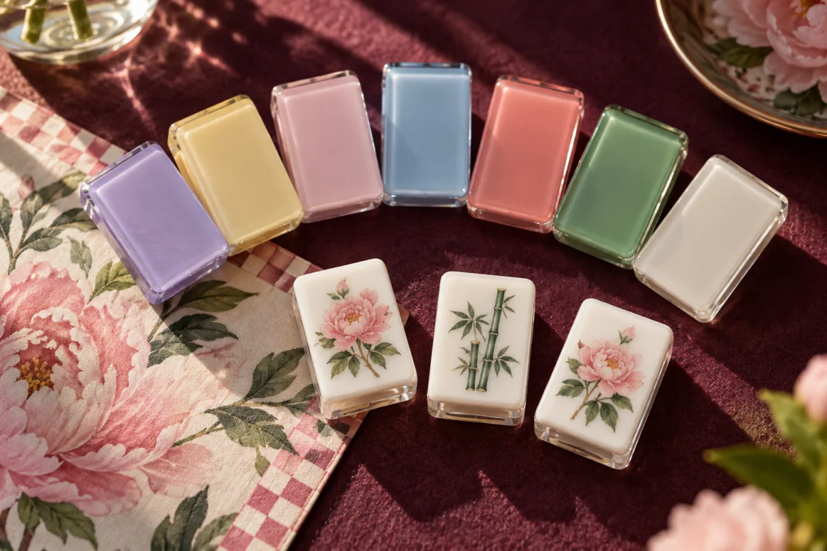
Choose from 199 photographed stock codes, explore pastel, pearl and effect specialty sheets, or send a Pantone target. Coordinate the face, core, back and accessories around your American mahjong collection.
Choose → confirm → approve → produce
One sheet code or reference for each layer and matching accessory.
We check the sheet, thickness and availability before sampling.
Check the actual color, light transmission and finished edge in hand.
Your approved physical sample becomes the production color standard.
Material character
A solid face helps the artwork stand out. Choose a compatible white or ivory grade and approve the finished face.
Browse photographed references →

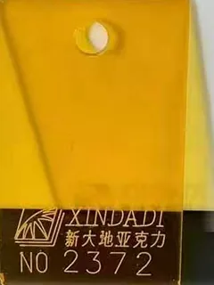
Light and thickness change the apparent color. Compare the core or back together with the opaque face.
Browse photographed references →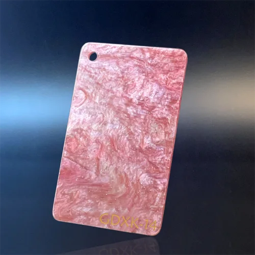
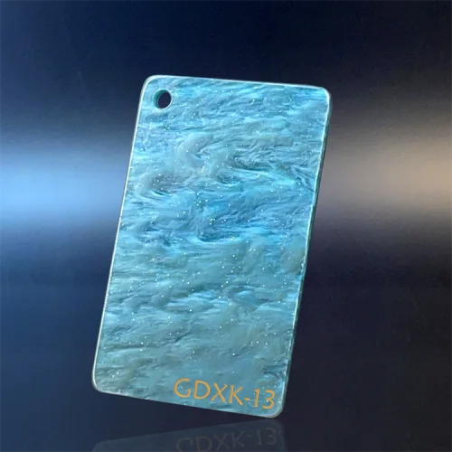
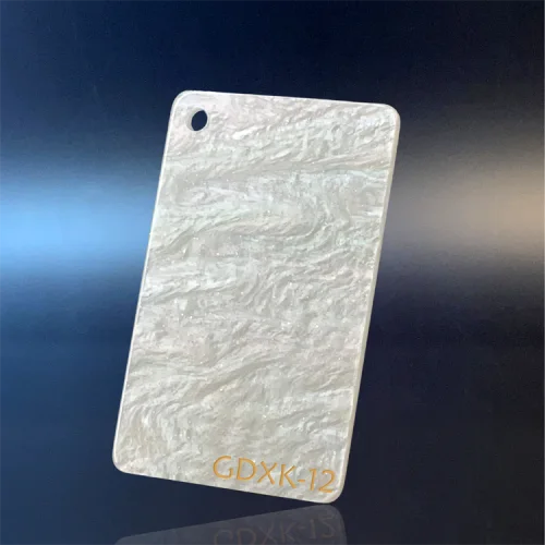
These specialty references need a separate material and thickness review. They are not confirmed stock for every tile construction.
Explore specialty references →Compare opaque, translucent and effect materials by the appearance you want for your collection.
Color per layer
A laminated tile is a stack of sheets, so every layer takes its own color: an opaque ivory face, a colored core, an effect back is the request we see most. Put one target on the brief for each layer, and one for the racks, pushers and case — or tell us which tile layer the accessories should match so we can check a compatible sheet lot. Layer count and sheet thickness are decided on the sizes and layers page; this page only decides what each sheet looks like.
In-stock sheet board · 199 codes · effective 2026-09-17
Browse 199 stock codes and 180 specialty references. Select a color here, then carry it into your quote.
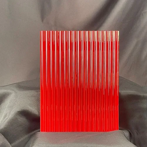
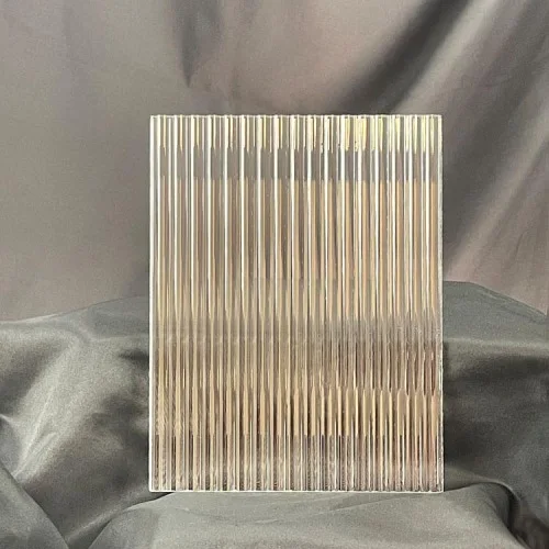
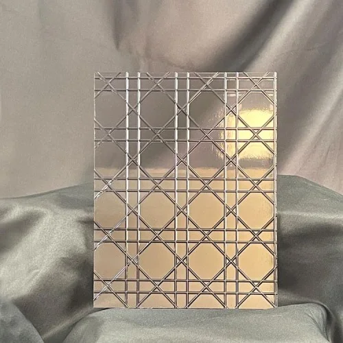
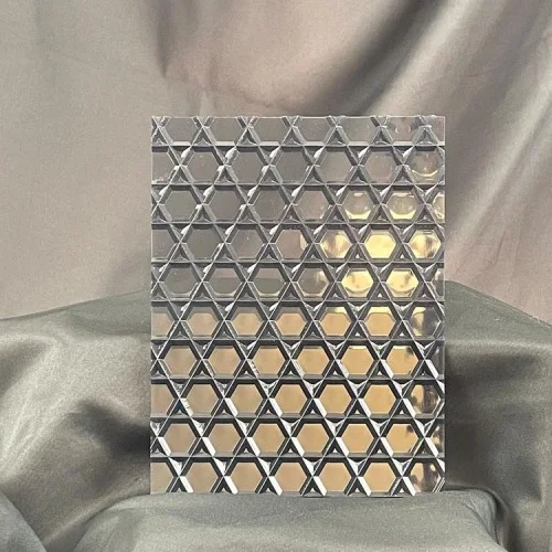
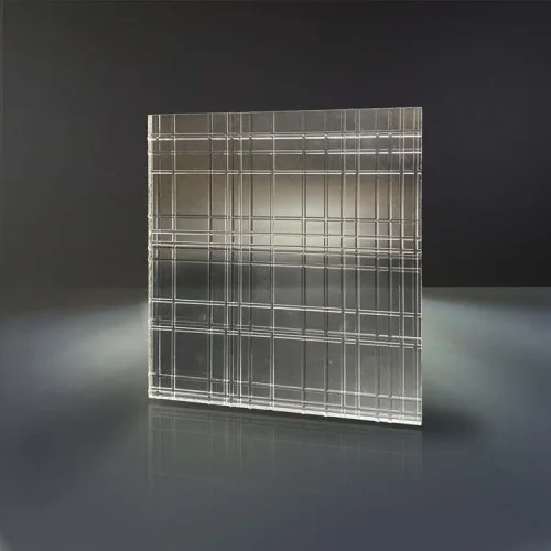
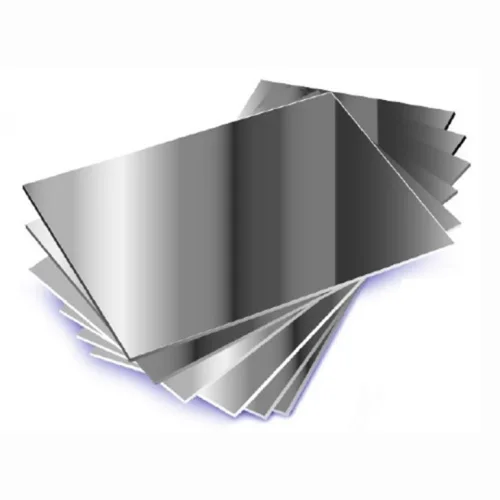
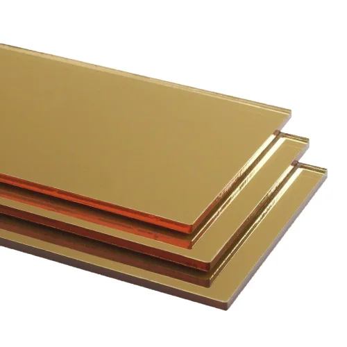
Stock codes and specialty references are labeled separately. Specialty references need a check of material, thickness, availability and price; textured and mirror sheets are accessory material requests, not standard tile-face options.
Showing all 199 codes
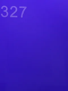
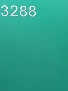
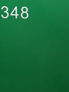
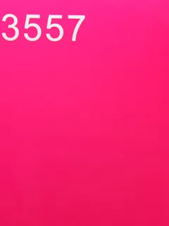
Codes as printed on the chip (e.g. 402).
White grades — 402 / 422 / 425 / 433 differ in opacity and light transmission, not hue; pick on sample

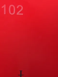
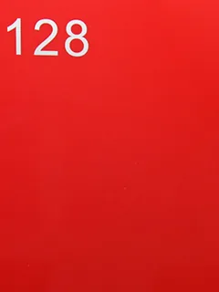
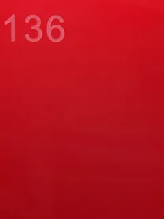
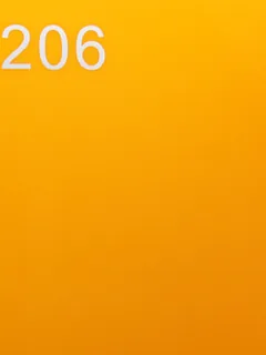
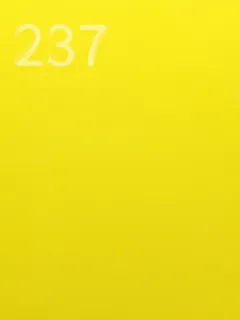
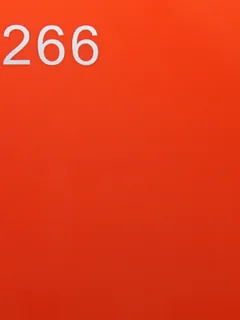
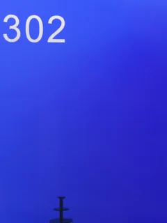
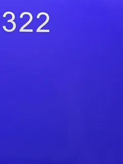
Solid opaque colors

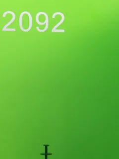
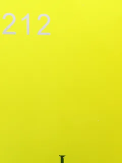
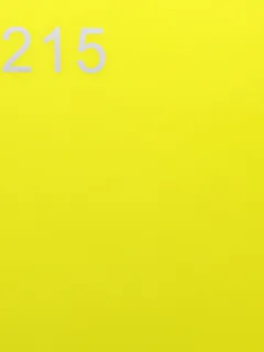
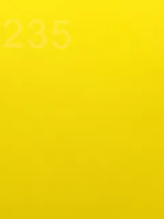












Frosted (matte) surface series — P = one side, PP = both sides







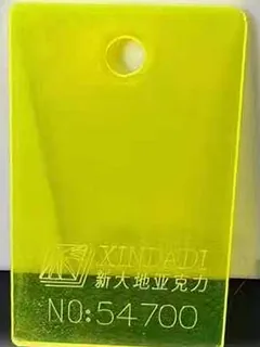
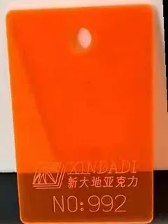
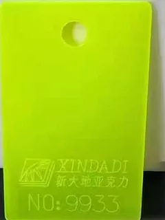
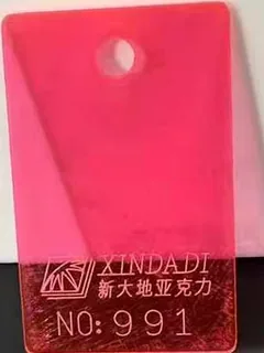
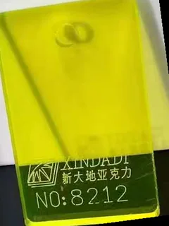
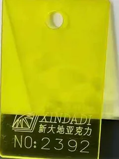
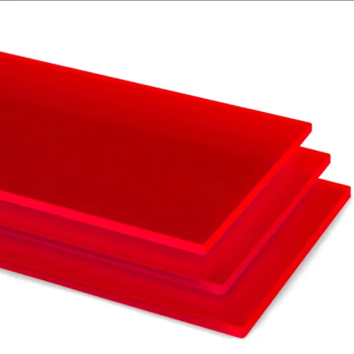
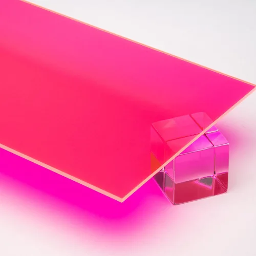
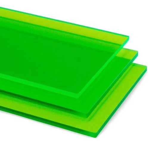
Fluorescent translucent — cores and backs, not engraved faces

Water-clear
Codes prefixed XDD- (e.g. XDD-5053); M1/M2 = one-/two-side matte.
Solid opaque colors



















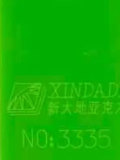






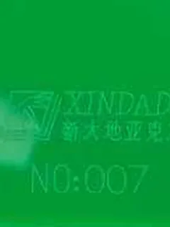

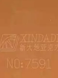

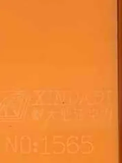
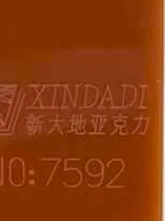


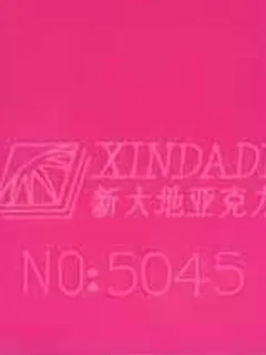


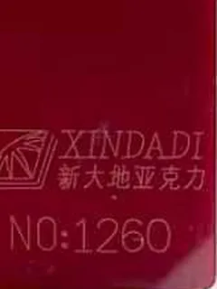





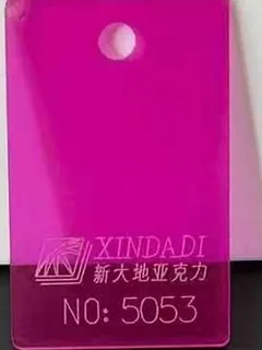
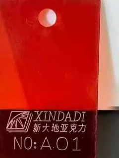
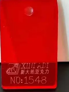
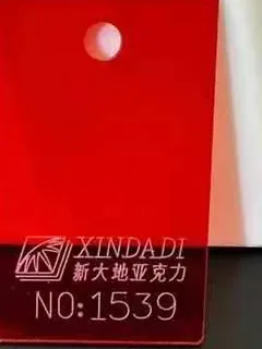
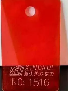

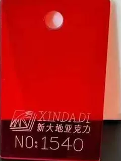
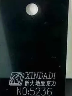

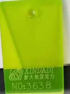
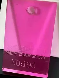
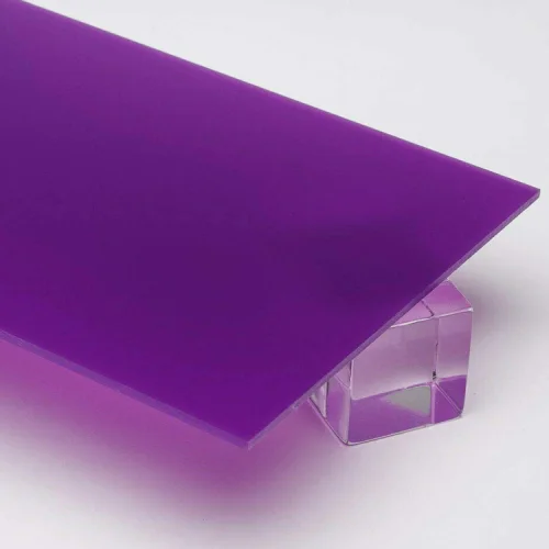
Translucent tinted sheets — light passes through; cores and backs, or faces when a see-through tile is the design
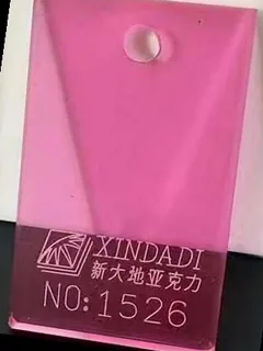
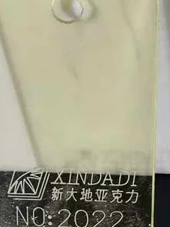
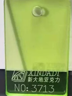

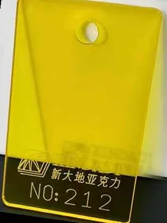
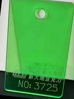
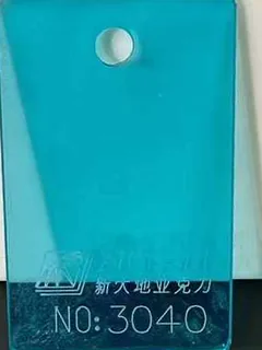
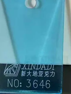
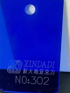
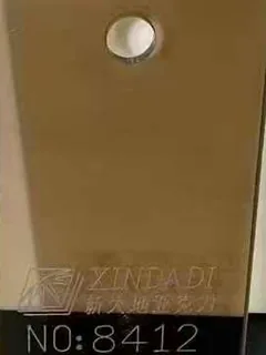

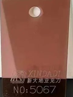
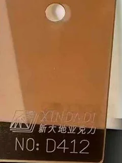
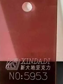
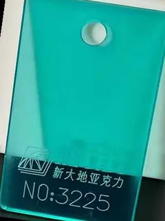
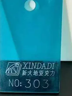
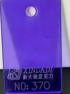
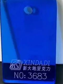
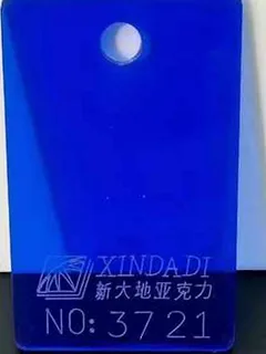
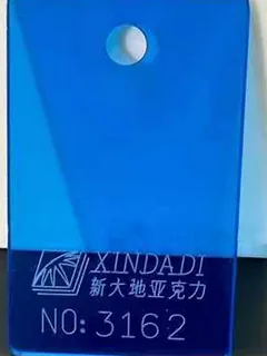
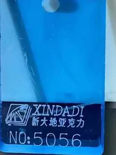
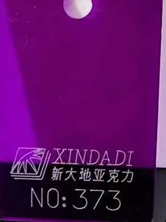
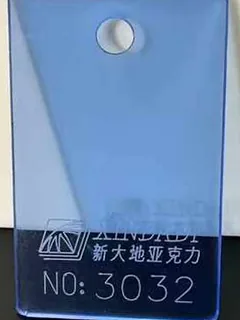
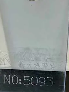
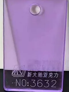
Frosted (matte) surface series — P = one side, PP = both sides
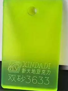
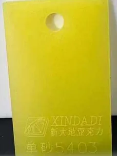
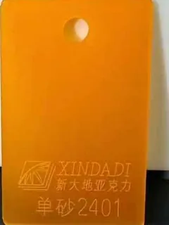
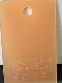
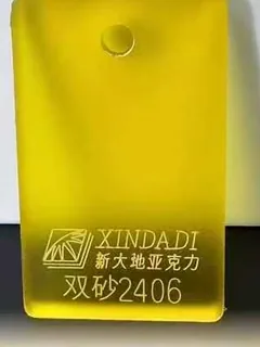
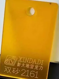
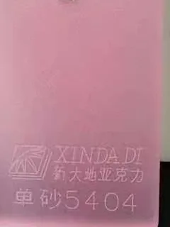
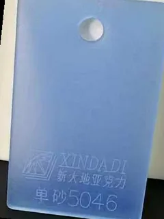
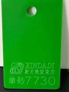
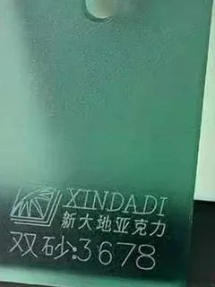
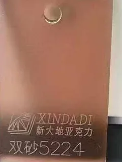
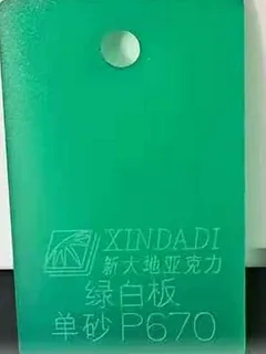
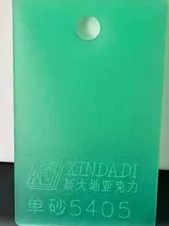
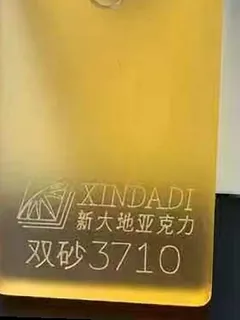
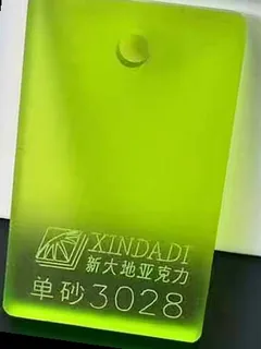
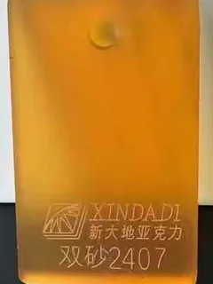
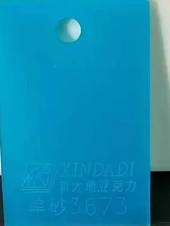
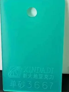
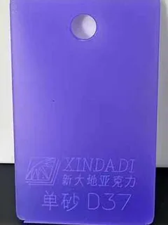
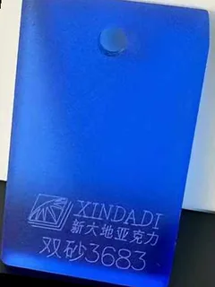
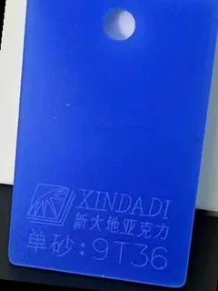
Fluorescent translucent — cores and backs, not engraved faces

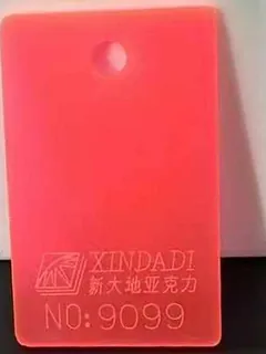
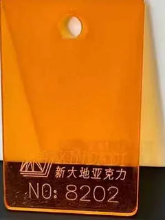
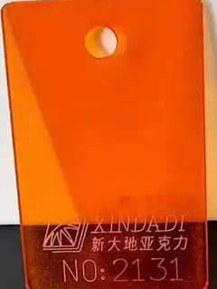
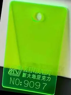
Water-clear
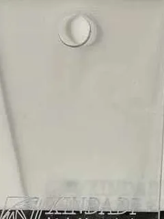
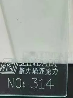
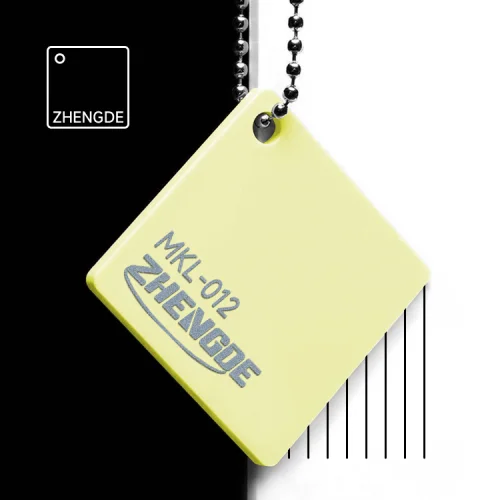
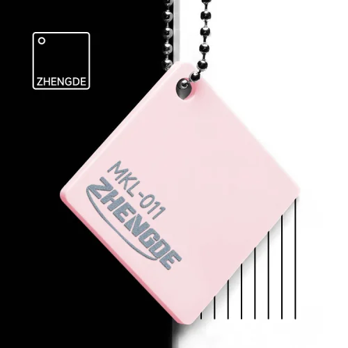
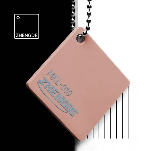
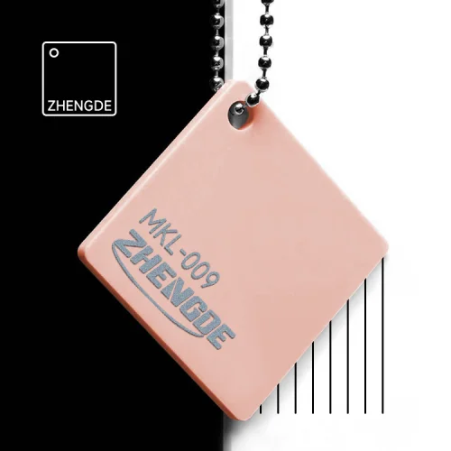
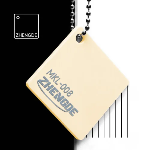
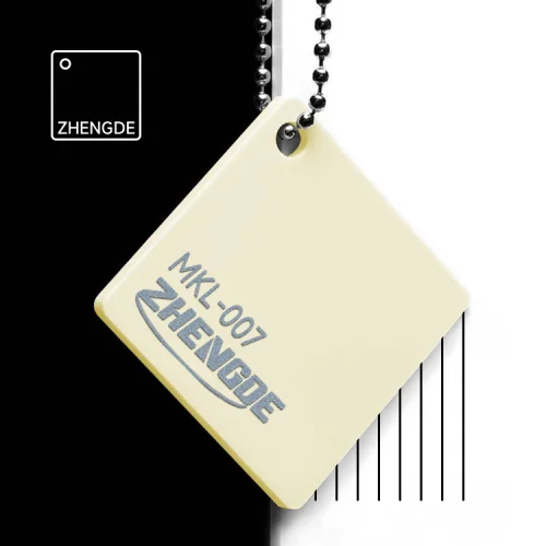
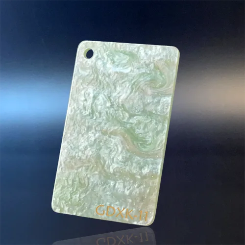
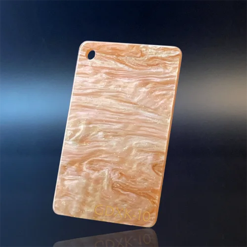
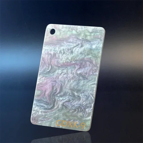
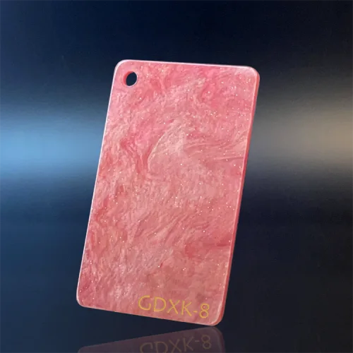
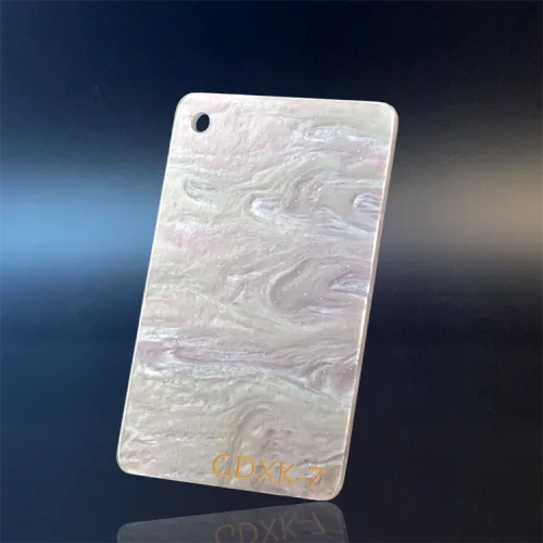
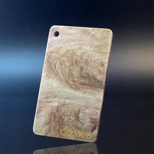
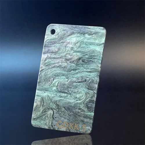
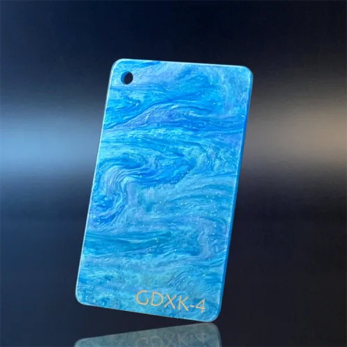
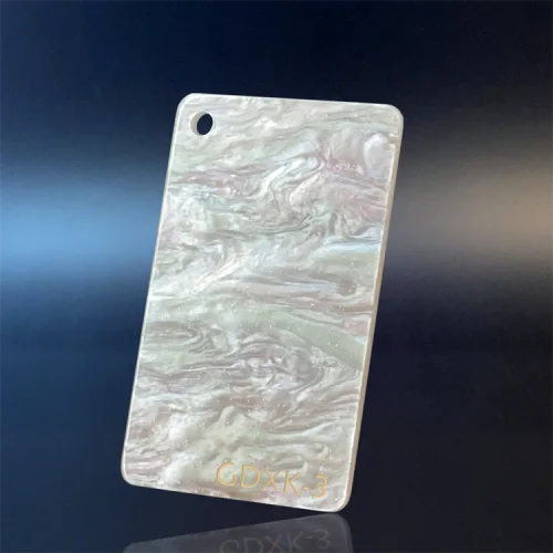
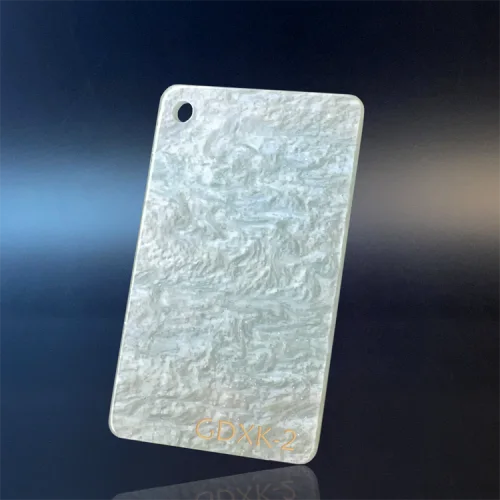
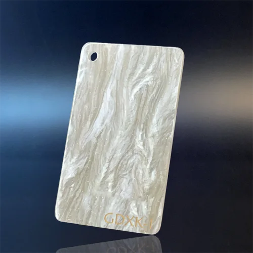
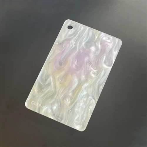
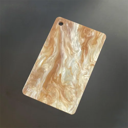
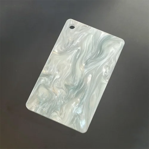
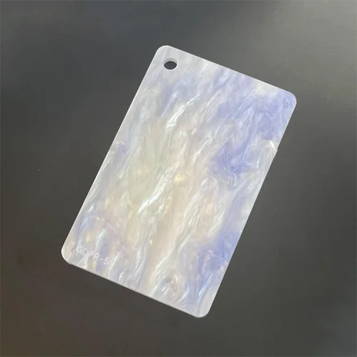
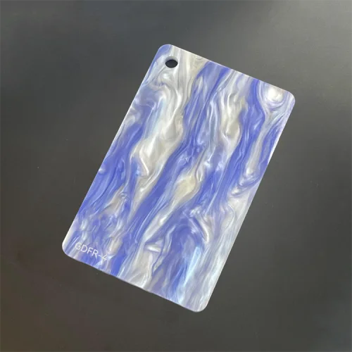
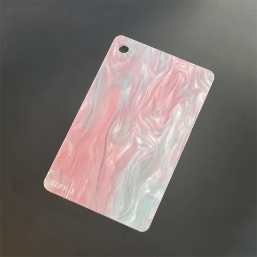
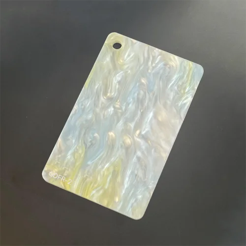
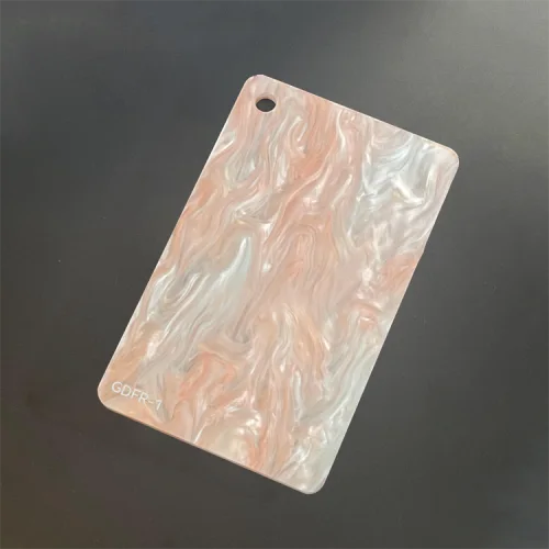
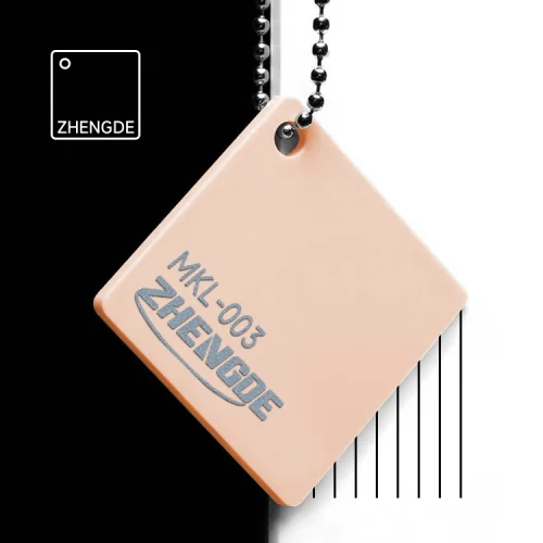
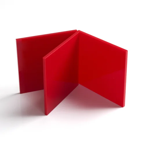
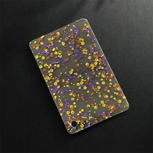
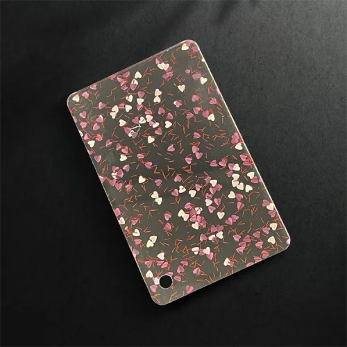
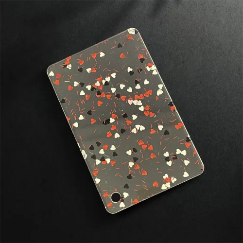
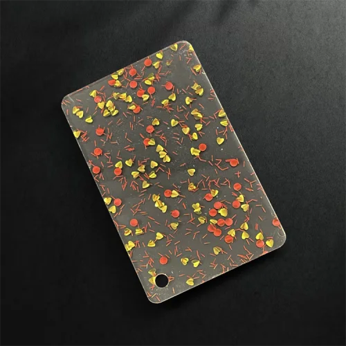
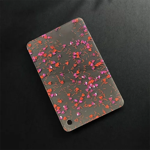
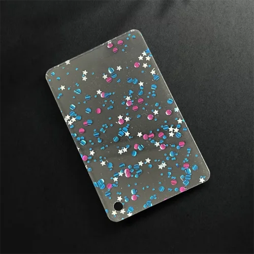
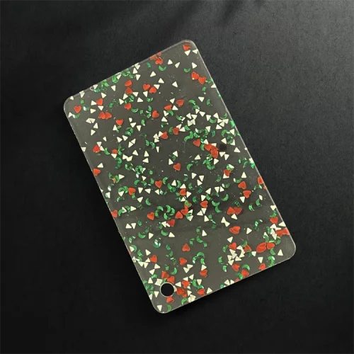
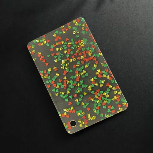
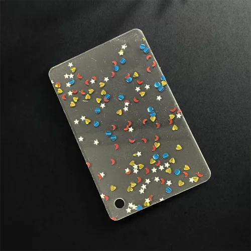
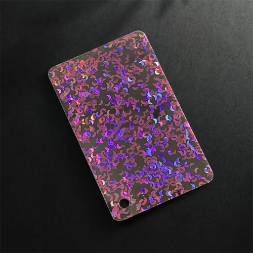
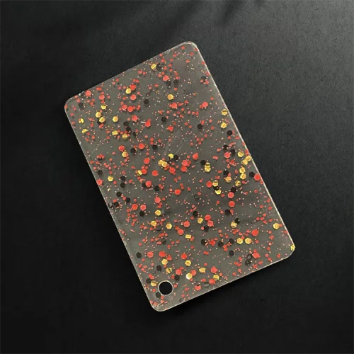
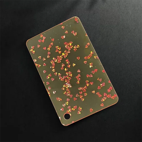
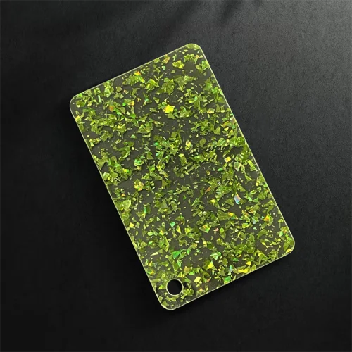
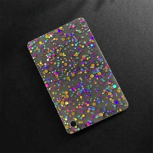
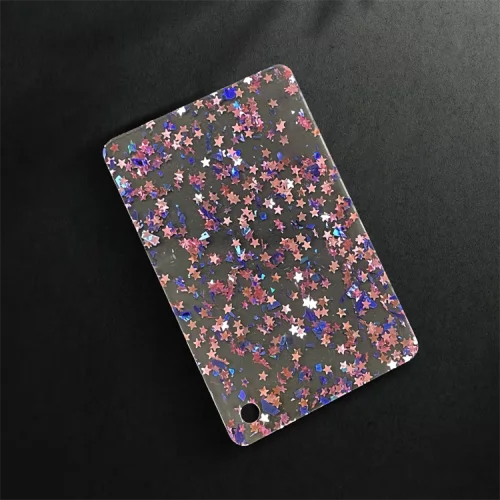
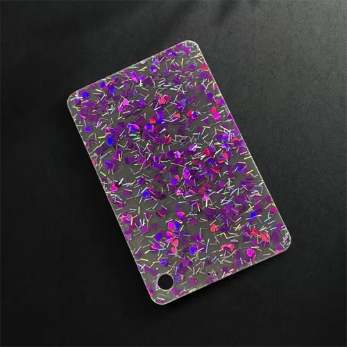
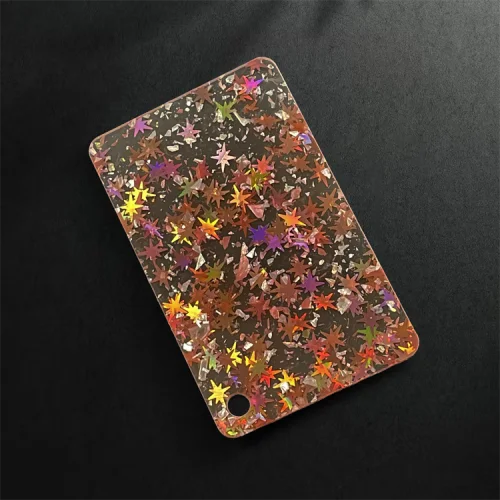
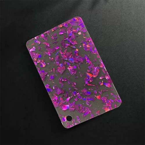
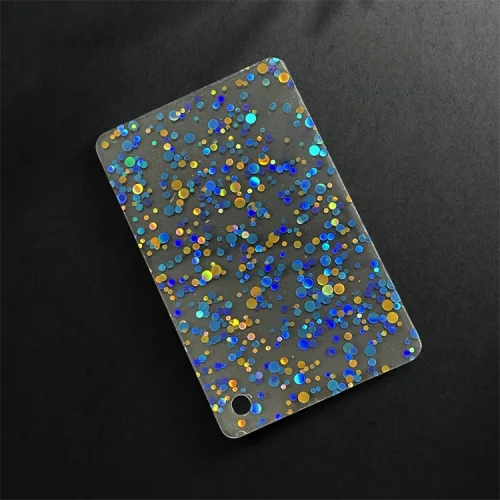
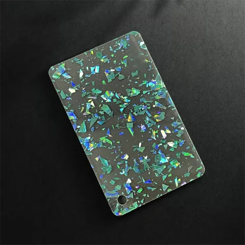
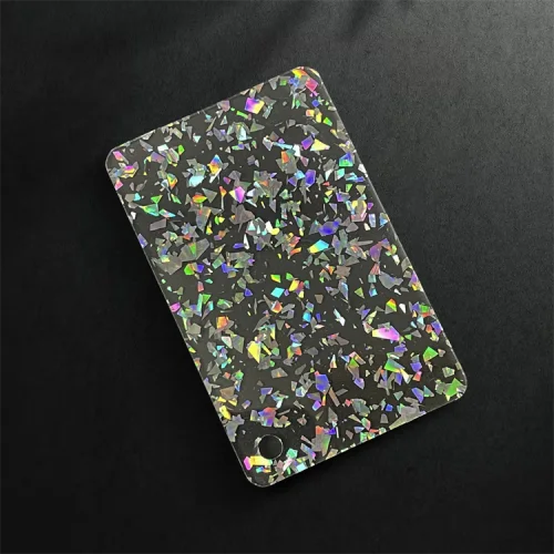
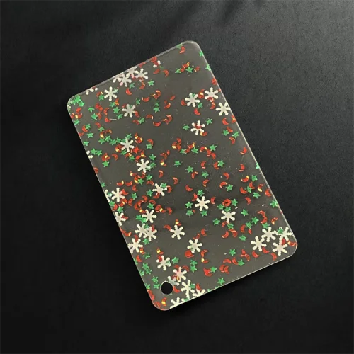
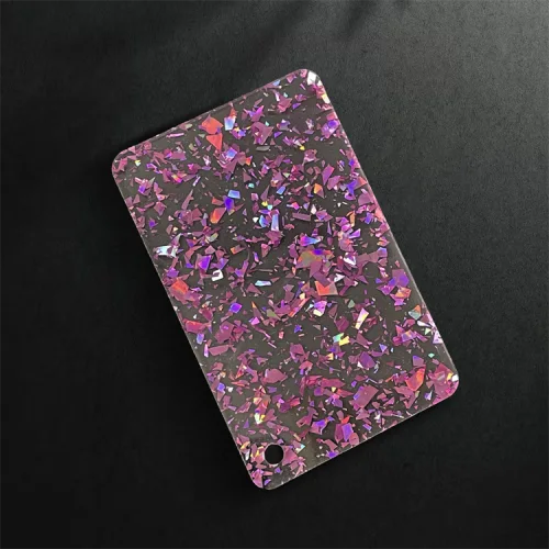
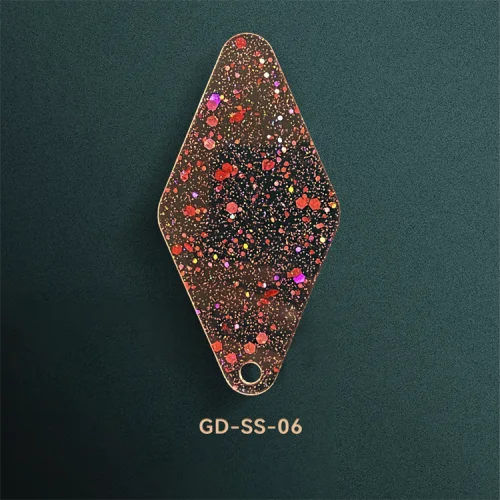
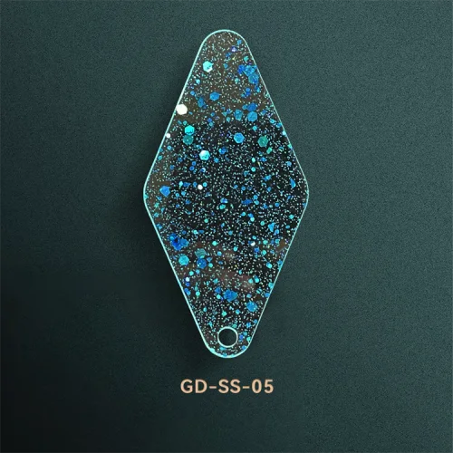
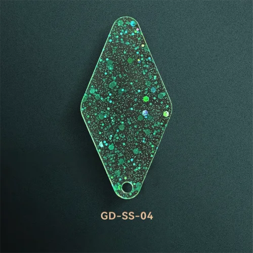
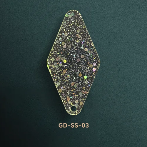
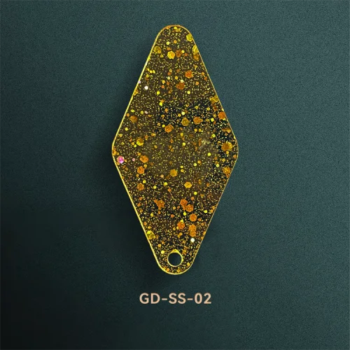
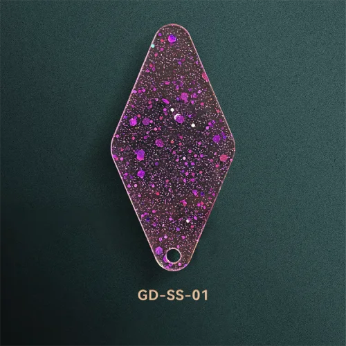
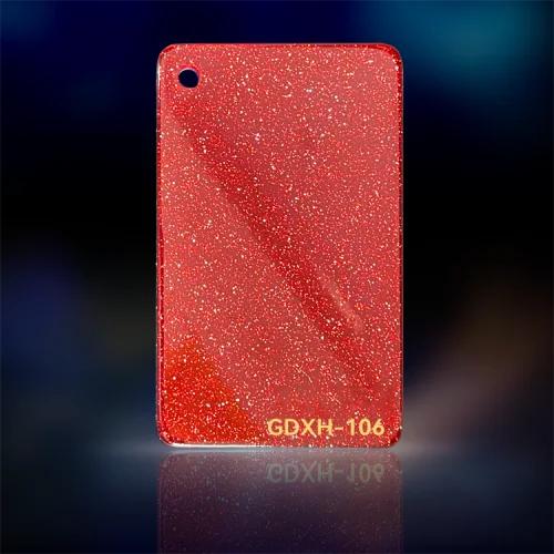
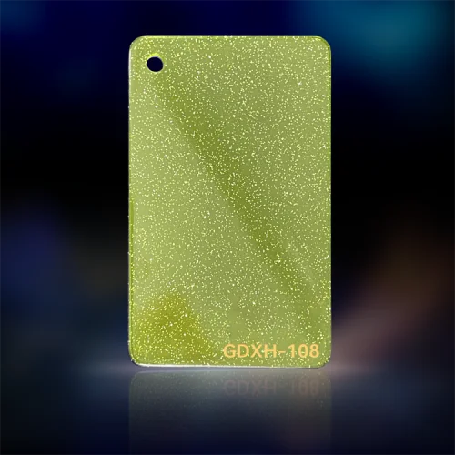
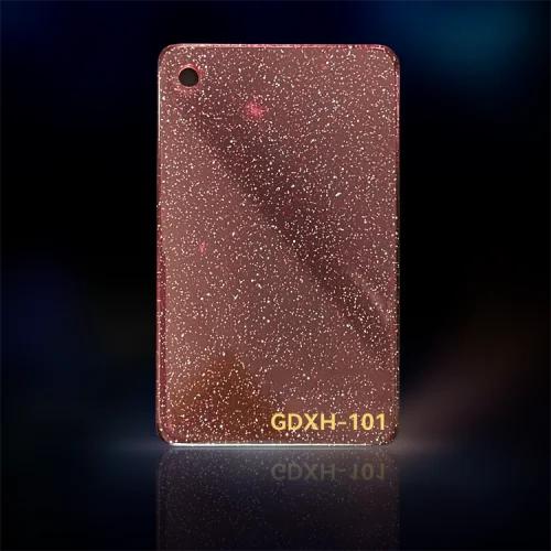
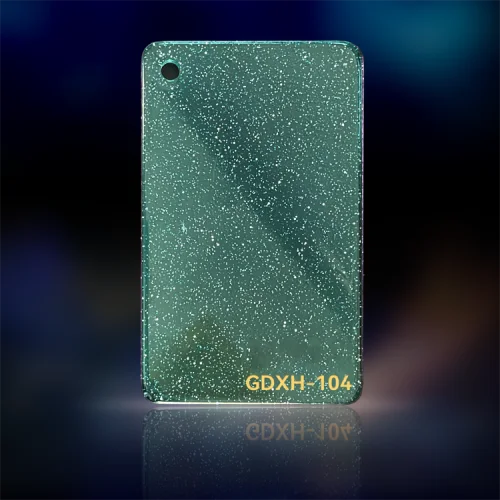
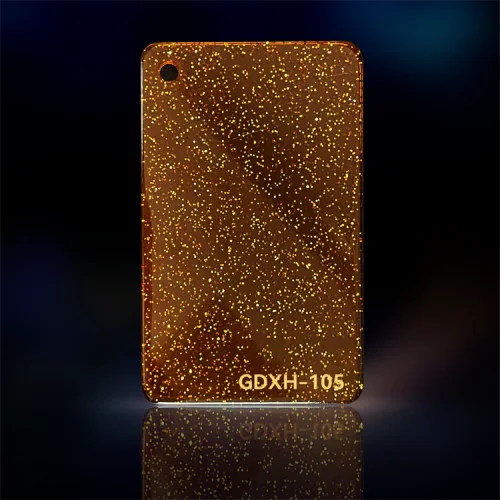
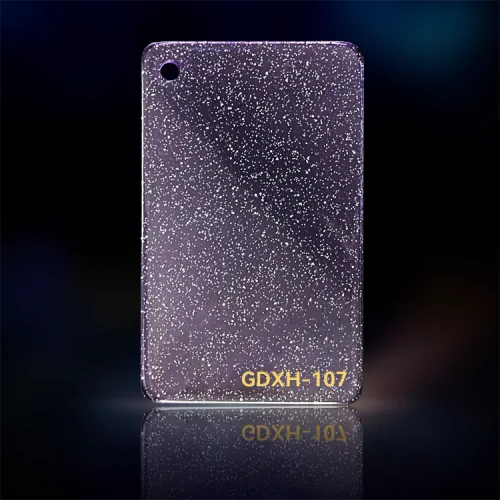
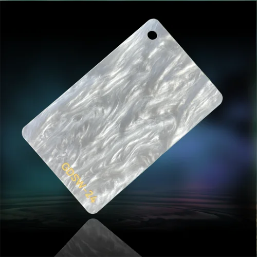
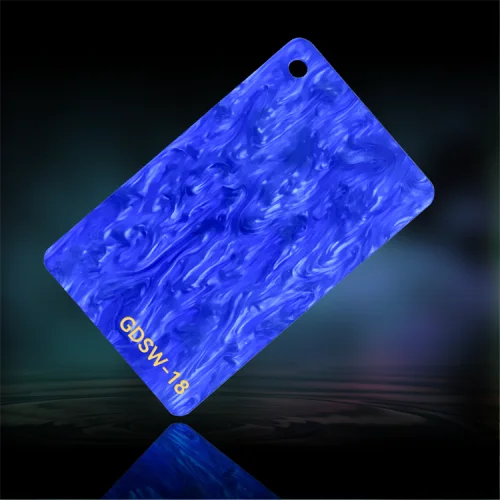
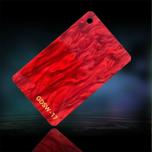
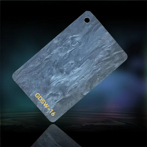
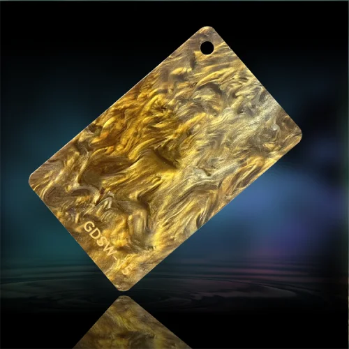
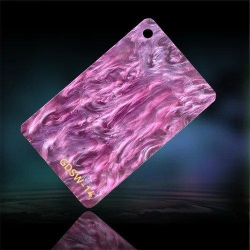
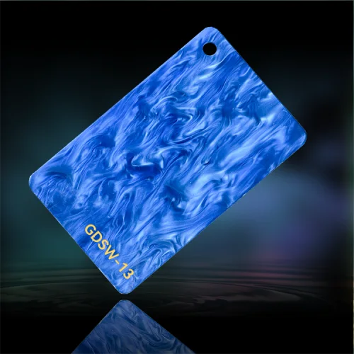
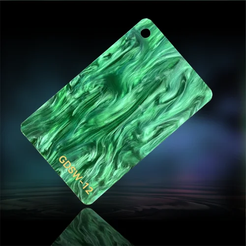
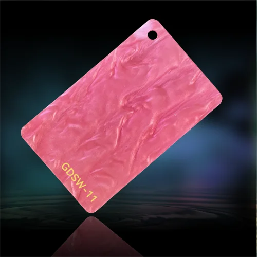
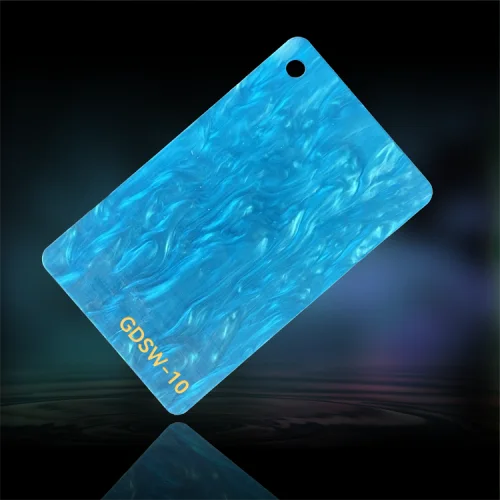
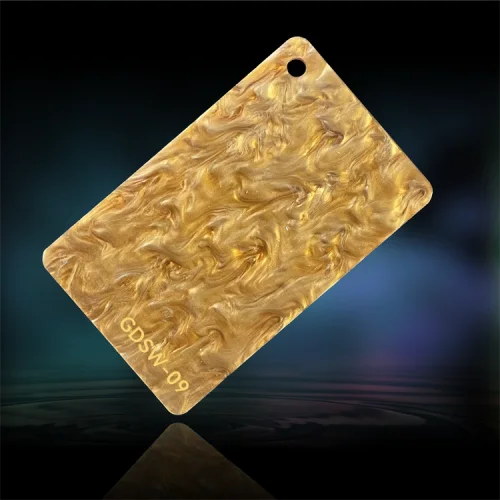
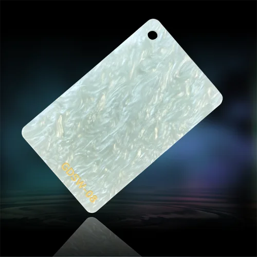
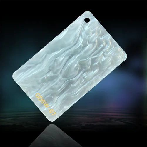
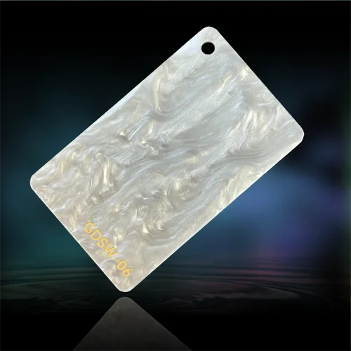
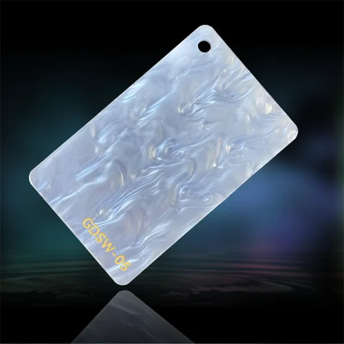
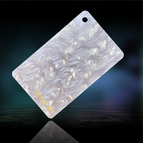
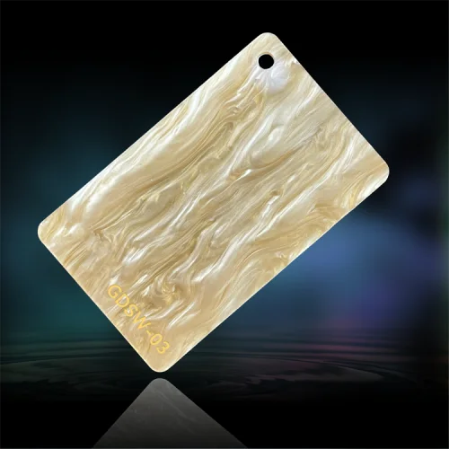
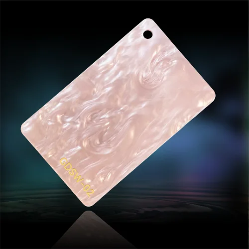
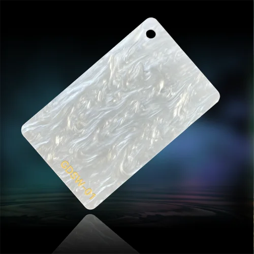
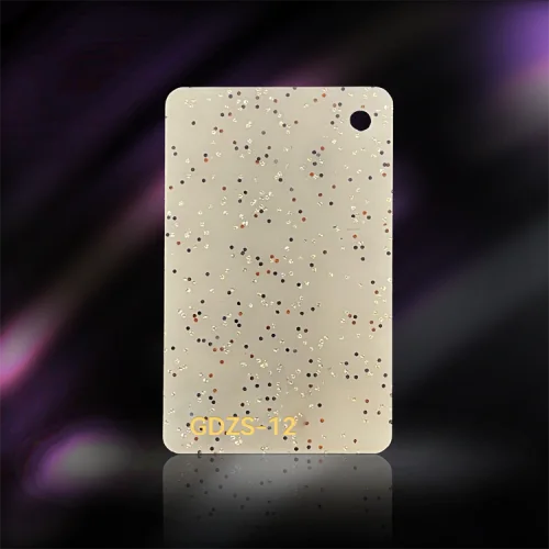
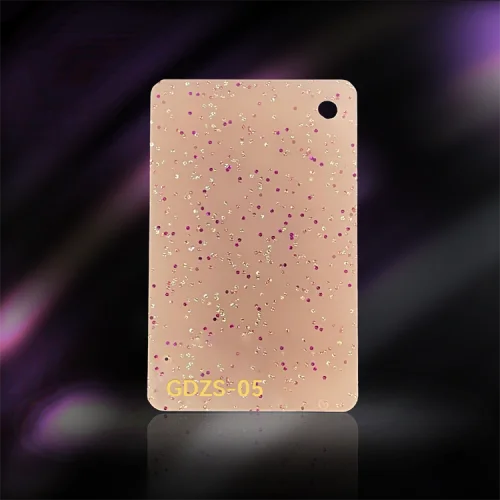
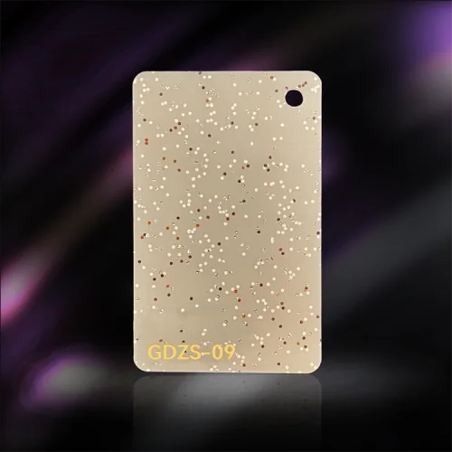
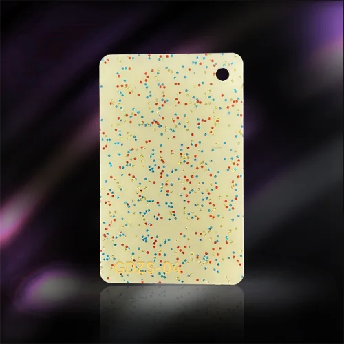
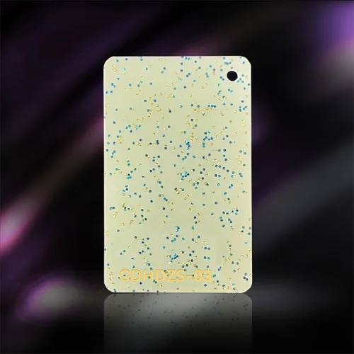
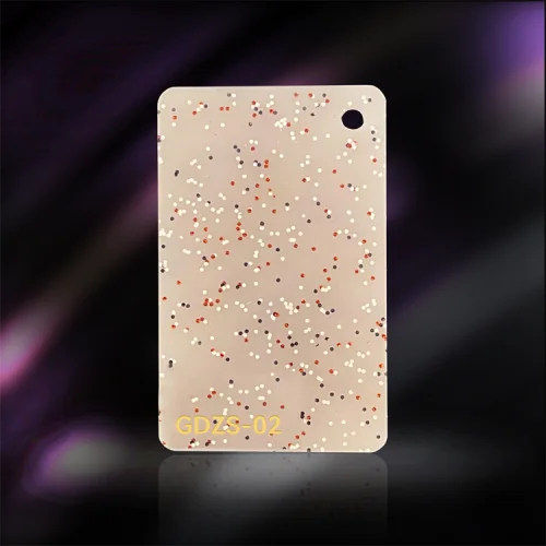
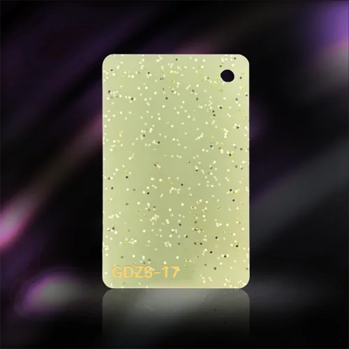
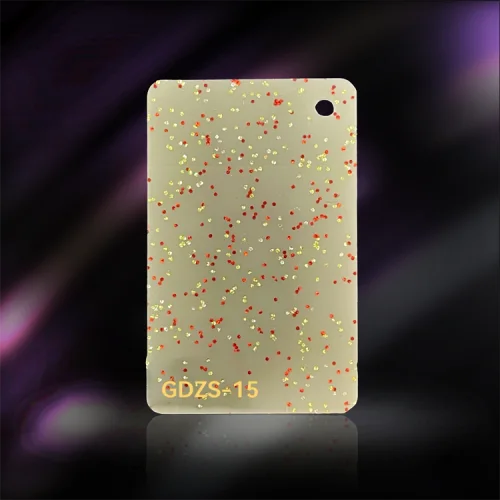
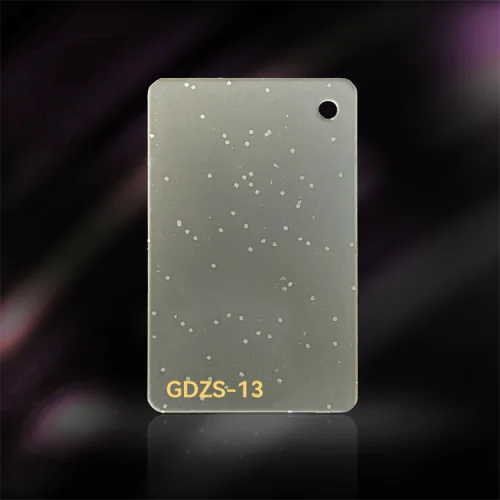
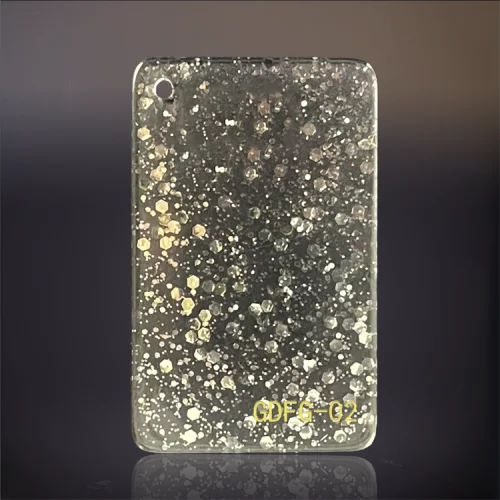
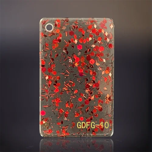
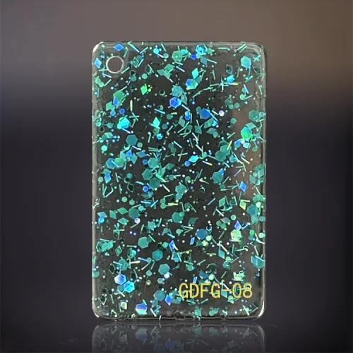
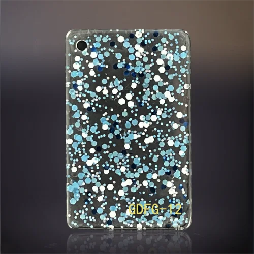
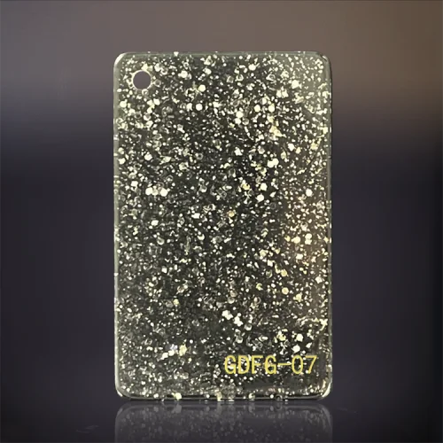
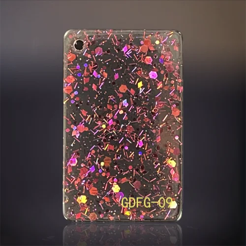
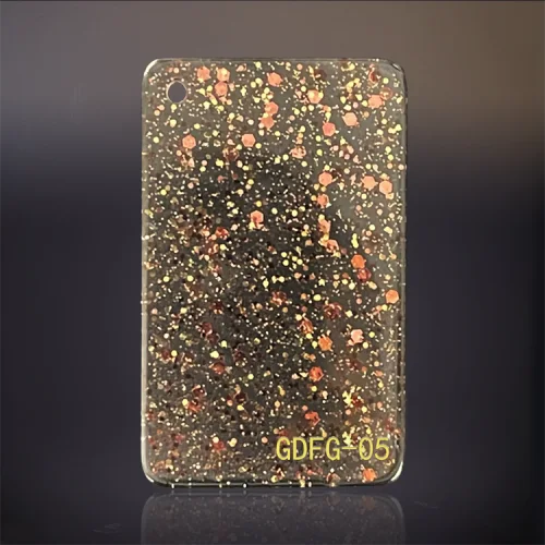
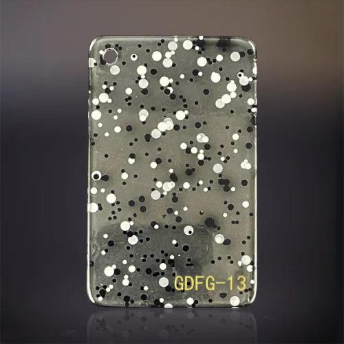
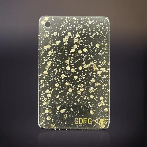
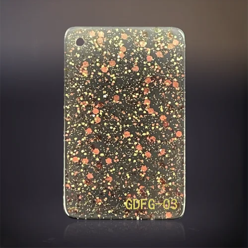
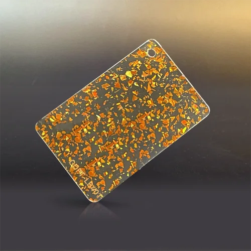
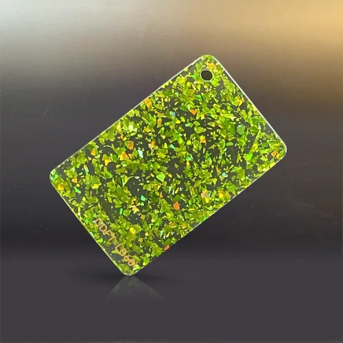
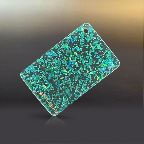
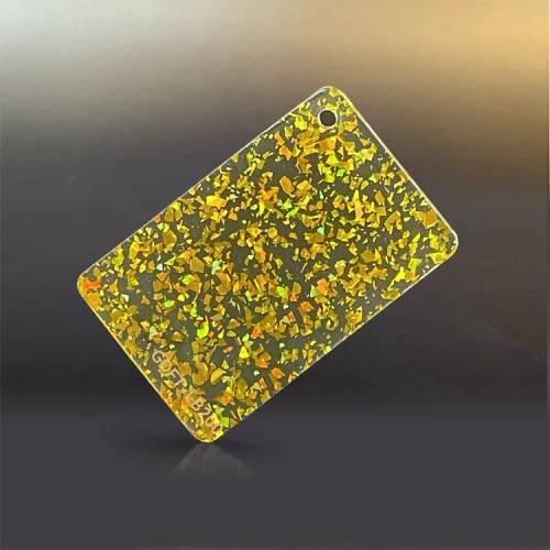
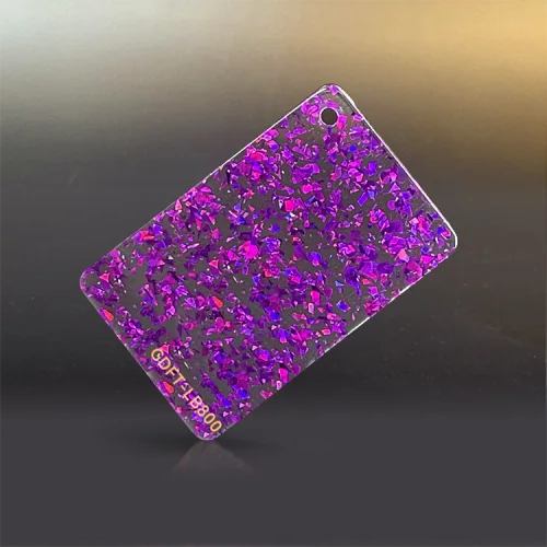
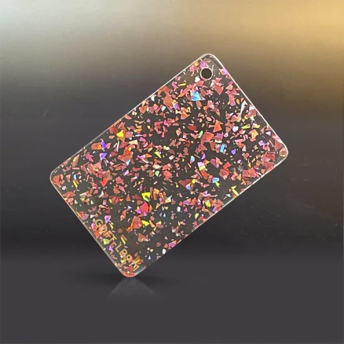
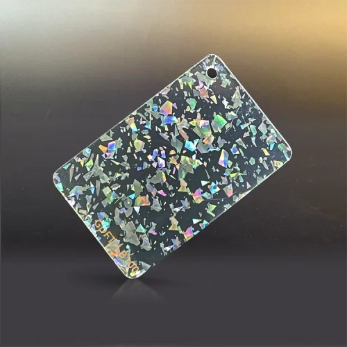
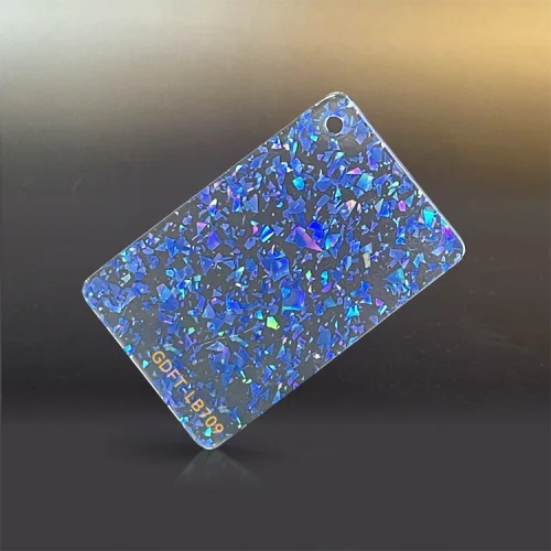
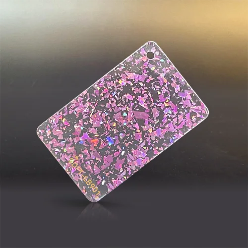
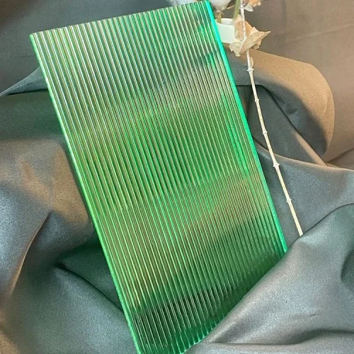
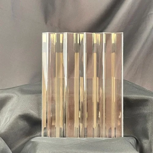
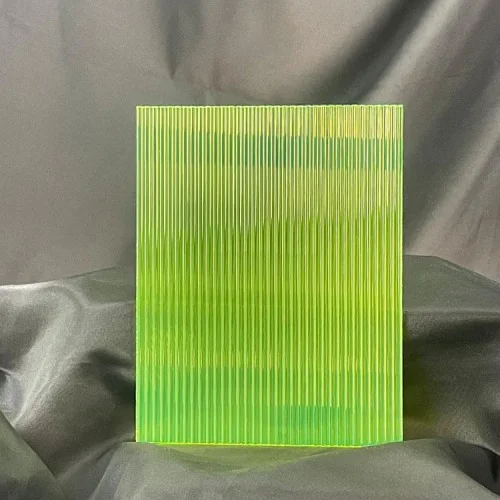
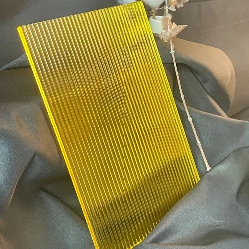
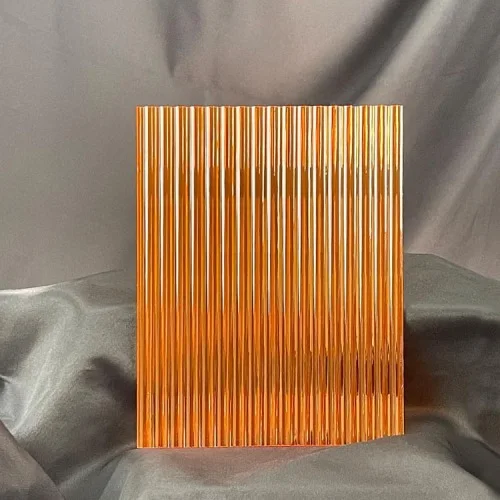
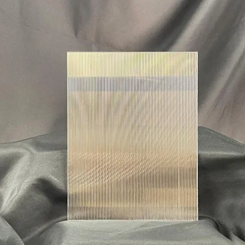
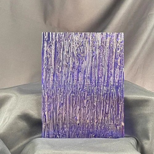
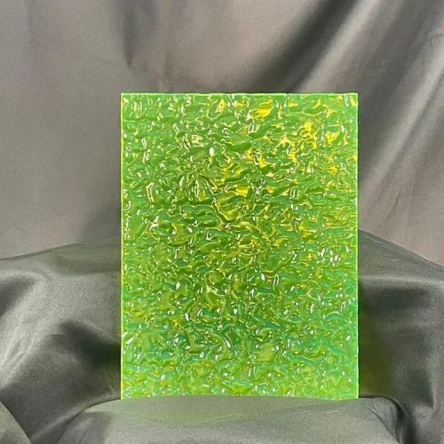
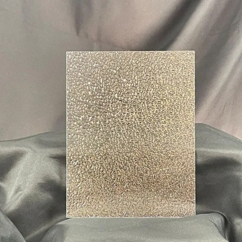
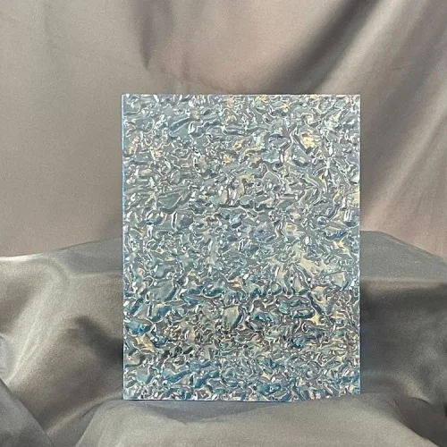
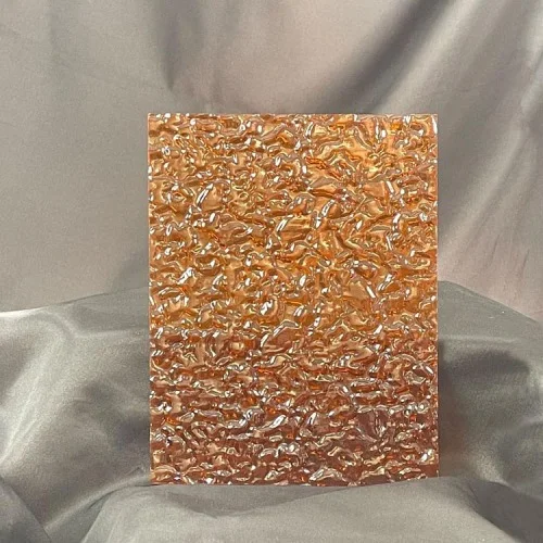
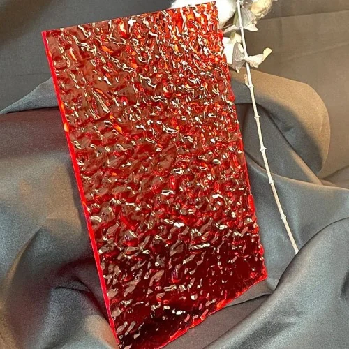
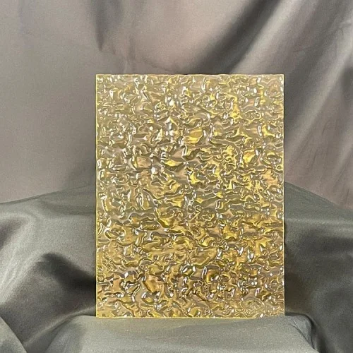
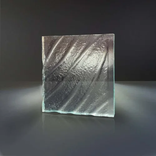
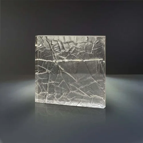
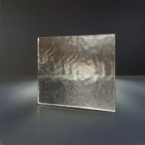
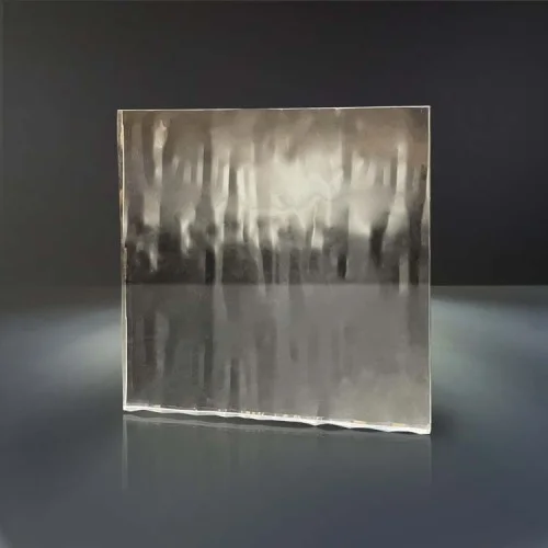
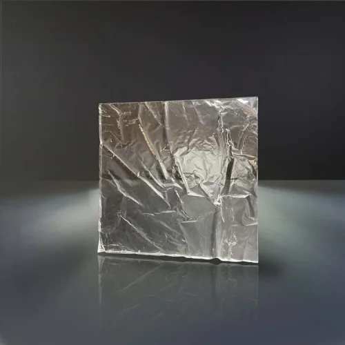
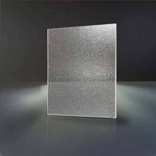
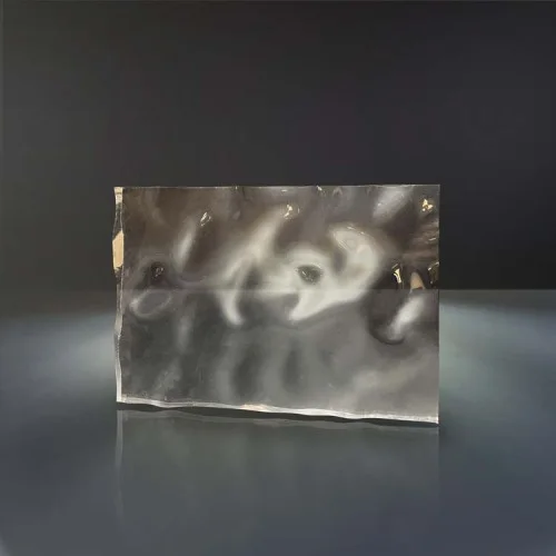
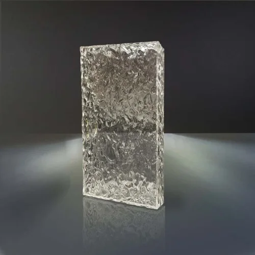
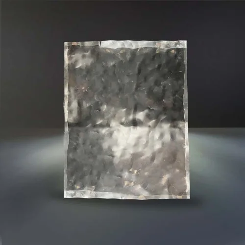
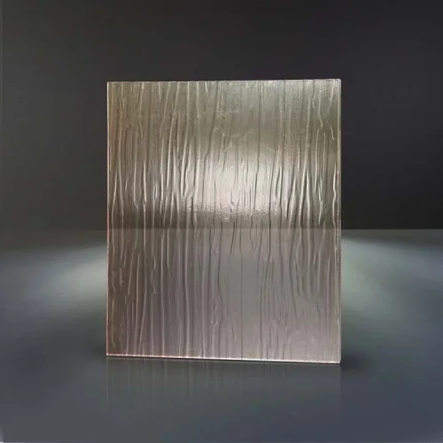
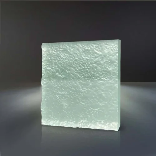
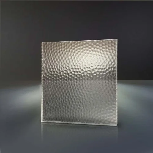
Pastel, pearl, glitter and effect sheets for project review. Photographs from the sheet maker; we check the selected material and thickness for your project.
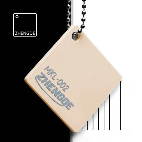
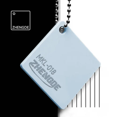
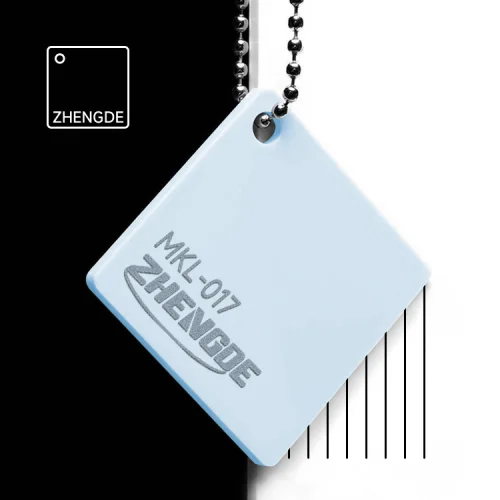
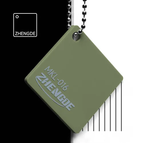
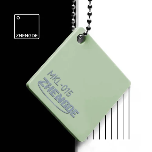
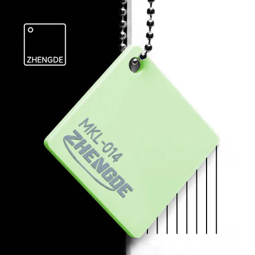
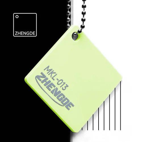
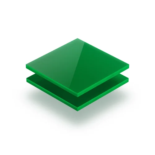
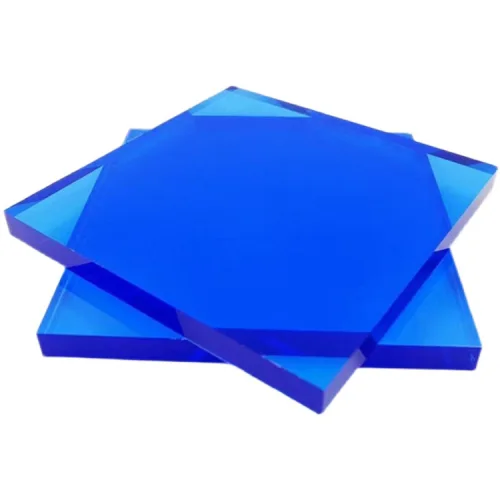
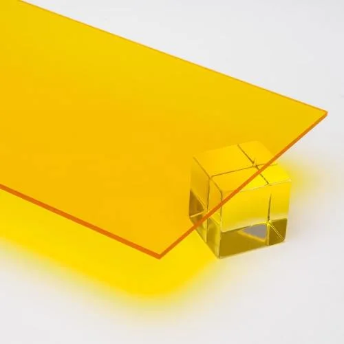
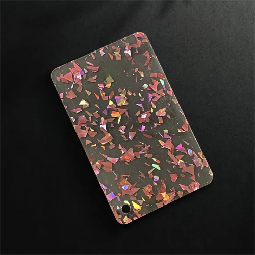
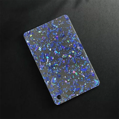
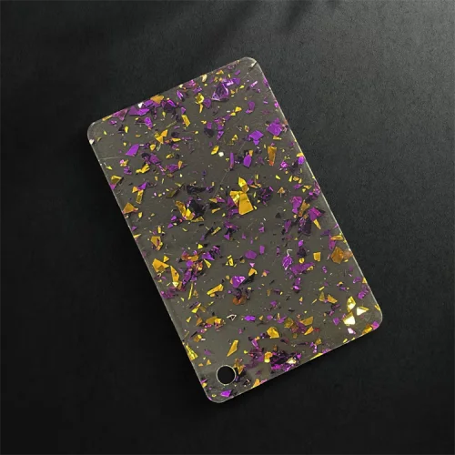
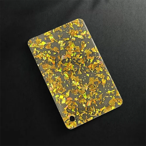
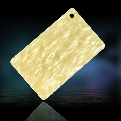
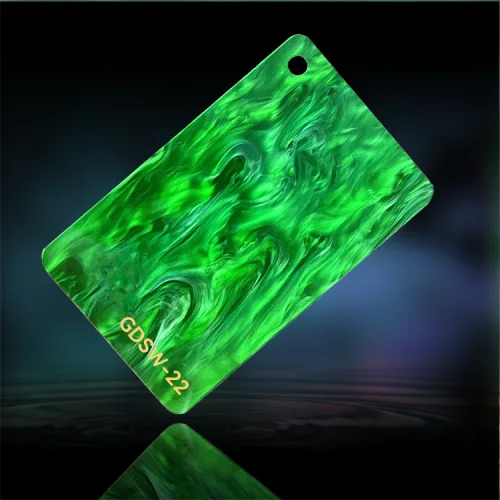
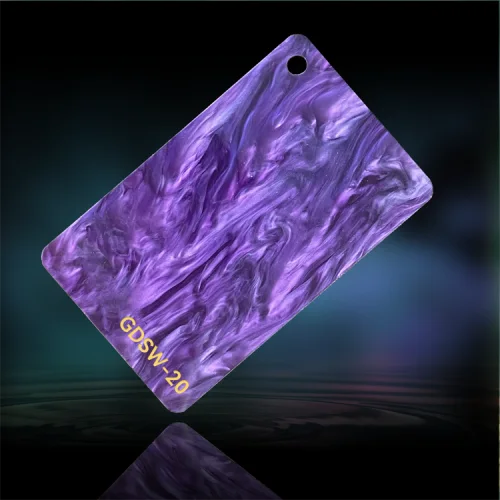
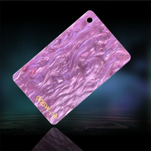
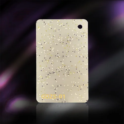
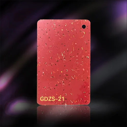
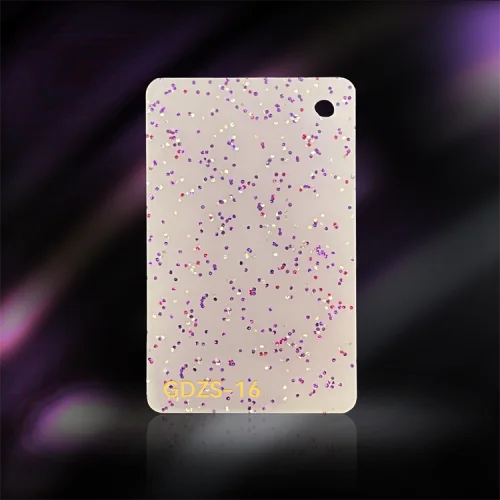
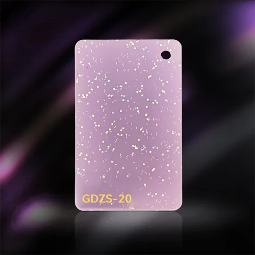
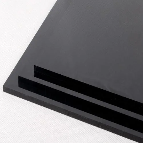
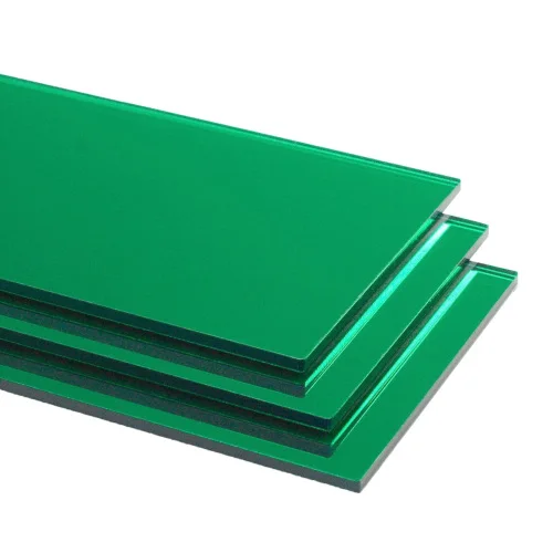
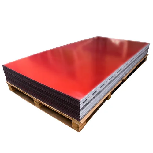
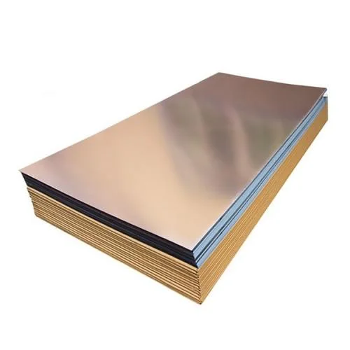
No code matches that text. Try a number (5053), a color word (ivory, turquoise) or a family (frosted, translucent).
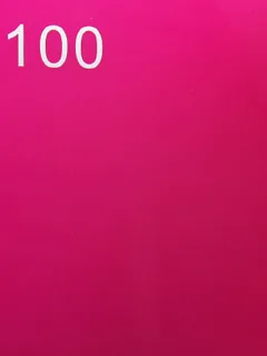
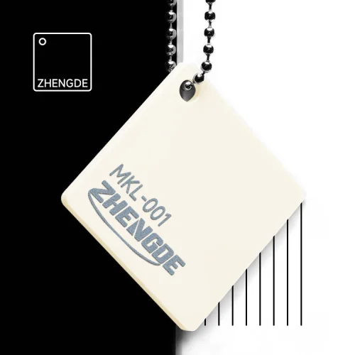
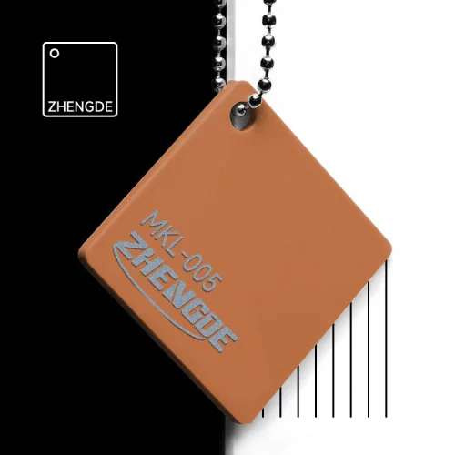
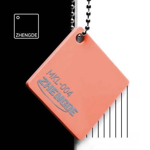
Catalog thumbnails focus on the material; the readable code is printed below each photo. Lighting and screens affect appearance, so approve the physical sample. The Pantone reference card is a vocabulary for describing targets that are not on this board.
Your finished collection
Review the chosen sheet color and its light transmission together with your finished tile body.
Check the face, core, back and matching accessories together. Thickness and transparency change how a color looks.
Keep the approved sample and written specification. These are the references for checking production.
Two routes, one standard. Route one: the closest of the 199 stock sheet references on this page, with availability in your required thickness confirmed before scheduling. Route two: a Pantone-matched sheet made to order, about 15 days for the sheet plus about 10 extra days on the sample, with the complete configuration price confirmed in the quote. On either route you approve the color on the physical sample; a 100% exact match is never promised, because the approved sample, not a Pantone number, is what production is checked against.
Yes — the in-stock sheet board on this page lists all 199 codes as a photograph of the real sample chip, with the code and the name, grouped by board and family. Copy the code into the configurator or write it on the brief. The Pantone reference card PDF is a vocabulary for describing targets that are not on the board.
Yes. Each layer is one sheet, so each layer takes its own color target — an opaque ivory face, a colored core, an effect back is the usual three-layer request. Put one target per layer on the brief. Layer construction and sheet thickness are set on the sizes and layers page.
They follow the same route and can be cut from the same sheet lot as the matching tile layer, which is the simplest way to keep one program in one color. Send one target for the accessories or tell us which tile layer they should match. See racks and pushers and cases and bags.
No — printed color and sheet color are two different things. UV-printed artwork colors follow the values in your files and the approved proof; sheet color is an in-stock code or a Pantone-matched sheet. Name both on the brief so they are judged separately.
Keep your approved sheet codes, finished sample and specification together. For a reorder, identify that reference and tell us whether any layer or accessory color should change.
The specialty references above include pearl and glitter materials. These are project requests, not confirmed mahjong stock codes. Send a reference so we can confirm the sheet and its suitability for your tile construction. Wood-grain and metallic looks are not sheet colors; whether your file can be reproduced as UV-printed artwork on the tile back is confirmed at the proof stage. Ask with your targets and we answer in the closest-sheet proposal.
Yes — in the modern sense. An "ivory mahjong set" sold today is an ivory-colored set, and ours is cast acrylic sheet in the ivory code on the board above (801, Ivory, an opaque solid), with cream and white grades beside it for a warmer or cooler face. No animal ivory is involved anywhere in the program. Name the code on the brief, or send a Pantone target for the closest match.
Your selected sheet material, thickness and construction determine the price — see the pricing page. Stock-sheet availability in the required thickness is checked before scheduling; a Pantone-matched sheet made to order adds about 15 days for the sheet and about 10 extra days on the sample. Additional effect, textured and mirror materials require a separate suitability and price check.
Name a stock code or color target for each layer and accessory. We confirm the sheet plan in your quote and the final color on your physical sample.