---
title: "UV Printing on Acrylic: Process, Adhesion, When It Fails"
description: "A factory engineer's guide to uv printing on acrylic — adhesion reality, white underlayer, outdoor fade timelines, and color matching pitfalls."
category: "Manufacturing"
author: "Dillion Chen"
authorCredential: "Production Manager at Wetop Acrylic — running laser, CNC, polishing, and UV printing lines since 2014, 1,500+ custom projects personally overseen"
datePublished: 2026-03-27
dateModified: 2026-03-27
primaryKeyword: "uv printing on acrylic"
url: https://wetopacrylic.com/guide/uv-printing-on-acrylic/
---
## How UV Printing on Acrylic Actually Works {#how-it-works}
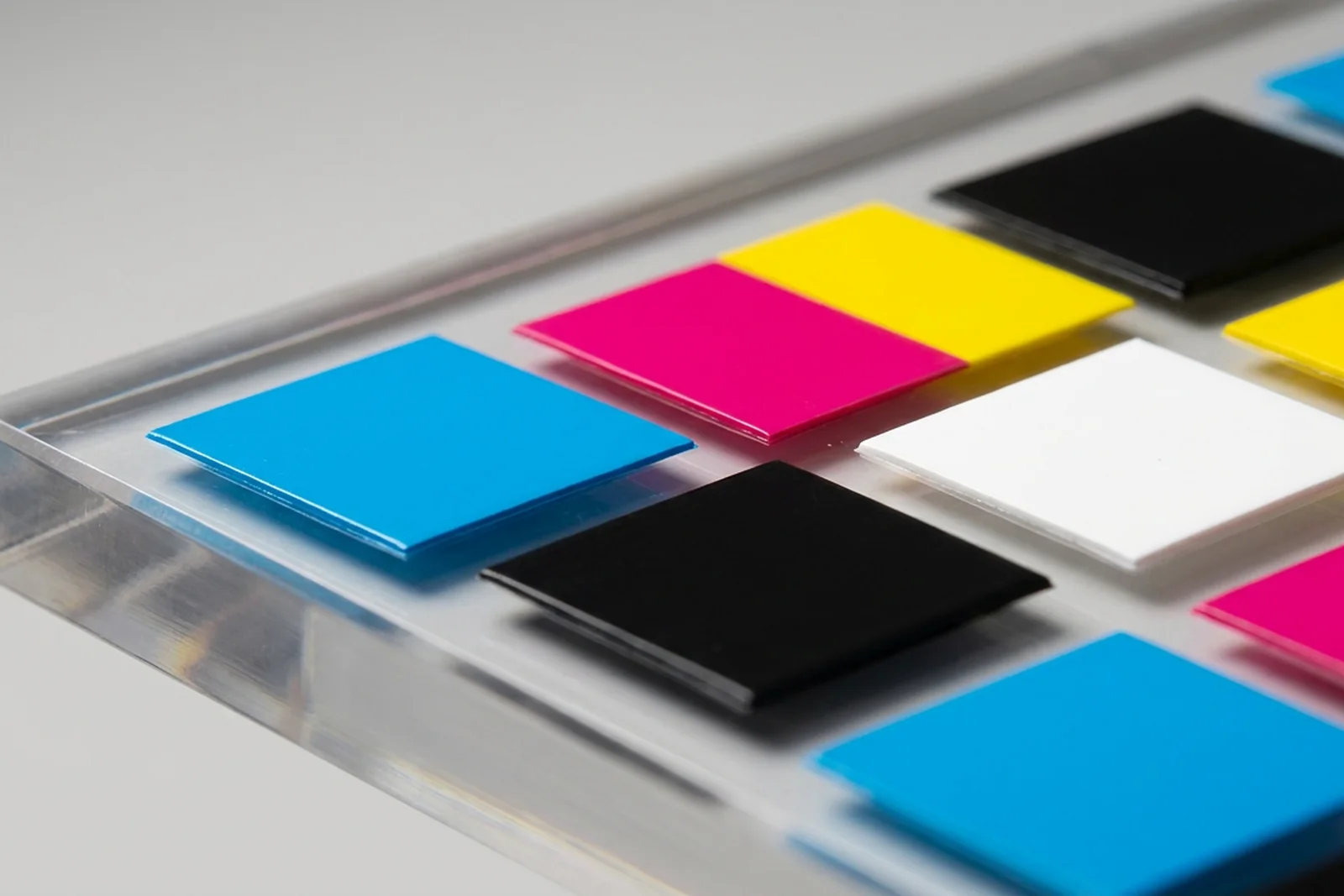
UV printing on acrylic uses a flatbed inkjet printer to deposit liquid CMYK, white, and optional varnish inks directly onto the acrylic surface. An onboard UV-LED lamp cures each ink layer instantly — the ink is polymerized and hardened within milliseconds of hitting the substrate, not after drying. The result is a sharp, full-color image bonded directly to the surface without any film, transfer medium, or heat lamination.
The critical difference from standard inkjet printing is that UV inks cure photochemically rather than evaporating. Solvent or water-based inks rely on the carrier fluid escaping into the substrate or the air — acrylic is non-porous, so those inks would simply sit wet and smear. UV inks solidify on contact with the LED lamp regardless of substrate porosity, which is why the process works on glass, metal, and rigid acrylic where traditional inkjet cannot. The tradeoff is that UV inks are stiffer once cured — they bond to the surface but don't flex with it, which matters for adhesion on curved or thermoformed acrylic.
UV-printed ink on acrylic is not "painted on" - it's deposited as a micro-thin layer and cured by UV-LED in milliseconds. The slight surface relief visible at macro scale is what you feel with a fingernail - and what makes adhesion depend so much on surface prep.
---
## When UV Printing Is the Right Choice — and When It Isn't {#right-choice}
UV printing on acrylic is the right method when the design is photographic or multi-color, the run is under 500 pieces, or the design changes frequently across versions. It is not the right method when the product will live outdoors without protection, when per-piece cost at high volume is the primary constraint, or when a single-color logo needs to last five years on a retail fixture.
I see the mismatch most often when buyers come to us with outdoor signage projects and assume UV printing is the default because we can produce a sample in two days. The sample looks excellent — and it will, for the first few months. But for an outdoor application running 12+ months, screen printing with UV-resistant inks or laser engraving filled with paint is a more honest recommendation. When a buyer's project clearly calls for outdoor durability, I tell them upfront rather than quote something that will need replacement in a year.
### UV printing on acrylic — application fit matrix
| Application | UV Print Fit | Reason |
|---|---|---|
| Retail POP displays (indoor) | Excellent | Full color, no setup cost, design flexibility |
| Cosmetics display stands | Excellent | Brand color matching, detail level, short runs |
| Award plaques and recognition pieces | Excellent | Photographic quality, personalization per piece |
| Trading card display cases | Good | Photographic label panels, short-run collector editions |
| Outdoor signage | Poor (without topcoat) | UV fading without protective overcoat |
| High-volume single-color print (1,000+ pcs) | Fair | Screen printing is cheaper per piece above 500 |
| Thermoformed or curved acrylic | Poor | Ink layer may crack or delaminate along bend lines |
| Frosted acrylic (rough surface) | Requires prep | Adhesion failure without correct pre-treatment |
---
## UV Printing vs Screen Printing vs Laser Engraving vs Vinyl {#comparison}
Each decoration method on acrylic has a different cost structure, output quality profile, and durability ceiling. The right answer depends on what you're optimizing for — and most buyers only see one or two of these methods at their current supplier.
Screen printing applies ink through a tensioned mesh screen — one color per screen, one pass per color. Setup involves burning a separate screen for every color, which makes it expensive for short runs or complex multi-color designs. At high volume (500+ pieces), screen cost is amortized and per-piece cost is significantly lower than UV. Screen inks can be formulated for outdoor UV resistance at levels UV printing currently cannot match. We use screen printing for high-volume single-color or two-color runs — things like branded display bases, shelf headers, and wearable event products.
Laser engraving removes material from the acrylic surface to create a frosted or white-appearing mark. It is permanent — no ink, no adhesion concern, no fading. The limitation is that it produces only one "color": the frosted-white appearance of vaporized acrylic. Color can be added by filling the engraved recess with paint or resin, but it's a secondary operation. Laser engraving is the correct answer when permanence is non-negotiable — awards, architectural signage, anything that will be handled repeatedly over years. Many of our [acrylic awards and plaques](/products/acrylic-awards/) use laser engraving as the primary decoration, with UV printing reserved for photographic elements.
Vinyl decals are a surface application — a printed film laminated to the acrylic. They're fast and inexpensive, but the film edge lifts over time, especially in humid environments or with cleaning. We don't apply vinyl as a production method; it belongs in the trade-show display category where turnover is measured in days, not years.
### Decoration method comparison
| Method | Full color | Setup cost | Per-piece cost (100 pcs) | Outdoor durability | Permanence |
|---|---|---|---|---|---|
| UV printing | Yes (CMYK + white) | None (digital) | Medium | 12-18 months (no topcoat) | High (indoor) |
| Screen printing | Limited (spot color) | Per screen per color | Low–medium | 3-5 years (UV-resistant ink) | Very high |
| Laser engraving | No (frosted mark) | Setup only | Low | Permanent | Permanent |
| Vinyl decal | Yes | Low | Low | 1-3 years | Low (edge lift) |
| Digital printing (solvent) | Yes | None | Low–medium | 2-4 years (laminated) | Medium |
Same product line, four different jobs. UV print is the do-everything default for short runs; screen amortizes better past 500 pieces; laser wins on permanence; vinyl earns its place only on short-life displays.
---
## Adhesion Reality: Surface Prep Matters More Than the Ink {#adhesion}
The most common UV print failure I see isn't ink delamination from bad ink — it's adhesion failure from inadequate surface preparation. On clear acrylic, the surface must be free of mold-release agents, polishing compounds, static charge, and any fingerprint oil before printing. Most peeling within the first 90 days traces back to one of these four contaminants, not to the ink formulation.
Frosted and matte acrylic surfaces require additional care. The micro-texture of frosted acrylic reduces contact area between the ink and the substrate. UV ink bonds to peaks in the surface texture but bridges over the micro-valleys — the effective bonding area is a fraction of the geometric surface area. This is not a defect; it's physics. The correct response is a surface treatment step: IPA wipe followed by a corona or plasma pre-treatment that activates the acrylic surface and increases surface energy to above 42 mN/m — the threshold at which UV inks reliably bond[^roland-uv-prep]. At our facility, every frosted panel goes through this treatment before printing. Without it, adhesion on frosted acrylic is genuinely unpredictable.
Colored acrylic creates a separate challenge. If you're printing on black or dark-colored stock, the substrate color bleeds through any ink layer thinner than 100% opacity. This is the same problem that comes up with screen printing on dark shirts — the substrate wins unless you block it. For colored acrylic, a white underlayer is mandatory. For clear acrylic, it depends on what you want.
### Common causes of UV print adhesion failure
| Root Cause | How It Presents | Prevention |
|---|---|---|
| Residual mold-release agent | Peeling at print edges within weeks | IPA wipe before printing — no shortcuts |
| Static charge attracting dust | Pinhole voids in the ink layer | Static elimination gun before printing |
| Fingerprint oil | Circular delamination spots | Clean room handling protocol |
| Frosted surface, no pre-treatment | Ink peels in sheets under flex | Corona/plasma treatment before print |
| Curved substrate (post-thermoform) | Cracking along bend radius | Engrave or screen-print curved parts instead |
---
## The White Underlayer: Transparent vs Opaque vs Colored Acrylic {#white-underlayer}
The white ink underlayer is the most misunderstood variable in UV printing on acrylic — and the one that most often explains why a printed sample looks different from what the buyer imagined.
On clear acrylic with no white underlayer, CMYK ink is translucent. Colors appear lighter than they would on paper because light passes through the ink and reflects off whatever is behind the acrylic — a white wall makes the print look vibrant; a dark shelf makes it look washed out. This effect is exploited intentionally for backlit signage and lightbox panels, where the goal is exactly that translucency. For [cosmetics display stands](/applications/cosmetics-perfume-displays/) where the brand color must read consistently under different store lighting conditions, a white underlayer is almost always required.
The white underlayer is printed first, directly onto the acrylic, before the CMYK image. It acts as a neutral opaque base that blocks the substrate color from affecting the final print appearance. Without it on clear acrylic, your red might appear pink under certain lighting. With it, you get a color response close to printing on white paper — predictable, consistent, and independent of what's behind the panel.
The tradeoff: a white underlayer makes the panel opaque in the printed area. For a buyer who wants a clear acrylic keepsake block with a visible image on one face — like [acrylic photo blocks](/products/acrylic-blocks/acrylic-photo-blocks/) — printing on the back face without a white underlayer creates the "floating image" effect where the image appears to be suspended inside the block. That effect disappears if you add a white underlayer. Specifying whether you want translucency or opacity is a decision that needs to happen before samples.
### White underlayer decision guide
| Substrate | Goal | White Underlayer? |
|---|---|---|
| Clear acrylic | Opaque colors, brand-accurate print | Yes — required |
| Clear acrylic | Backlit or translucent effect | No |
| Clear acrylic | "Floating image" inside block | No (print on back face) |
| Frosted acrylic | Any full-color print | Yes — substrate obscures color otherwise |
| Colored / dark acrylic | Any full-color print | Yes — substrate color bleeds through |
| White acrylic | Standard CMYK print | No — substrate is already white |
The white underlayer is a separate ink pass printed before the CMYK graphic — it seals the clear substrate so the colored ink sits on a neutral white base instead of the dark background behind. The result is brand-accurate color regardless of what the acrylic is mounted against.
---
## Outdoor and UV-Light Durability: Honest Timelines {#durability}
UV-printed acrylic is not a permanent outdoor decoration. I want to be direct about this because most manufacturer pages don't say it plainly.
UV-LED inks have improved significantly since we added UV printing to our capability in 2020, but the fundamental chemistry hasn't changed: organic pigments in CMYK inks degrade under sustained UV light exposure. Cyan and magenta fade fastest; black and yellow hold longest. The result is a color shift — not a uniform fade — where your image progressively loses saturation balance rather than dimming evenly. The shift is visible to the naked eye between 12-18 months of direct outdoor sun on an unprotected piece.
A clear UV-resistant topcoat layer (applied as a fourth overprint pass) significantly extends this timeline. In our production testing, panels with a gloss UV varnish overprint show substantially reduced color shift at 18 months compared to uncoated panels exposed to the same conditions. For outdoor applications, we quote topcoat as standard and flag clearly when a buyer declines it.
Indoors, UV-printed acrylic held under artificial LED or fluorescent lighting performs much better. Pigment degradation under retail and office interior light levels is slow enough that 3-5 years of stable color is achievable with quality inks. Display pieces in windowless environments or display cases fare even better. For [jewelry display stands](/applications/jewelry-displays/) or POS retail pieces in controlled interior environments, UV printing is a genuinely durable solution.
### Indoor vs outdoor durability by condition
| Condition | Expected Color Life | Notes |
|---|---|---|
| Indoors, no direct sunlight | 3-5 years | Standard UV ink, no topcoat needed |
| Indoors, near window (indirect sun) | 2-3 years | Consider topcoat for window-facing pieces |
| Outdoors, topcoated (UV varnish) | 2-3 years | Topcoat is mandatory for this timeline |
| Outdoors, no topcoat | 12-18 months | Visible color shift after this point |
| Direct storefront window (full sun) | 6-12 months | Worst-case scenario — plan for replacement |
For outdoor durability comparisons by ink technology type, PRINTING United Alliance publishes ink system performance data covering UV-cure, solvent, and latex systems under different exposure conditions[^printing-united].
---
## Color Matching: Pantone Conversion and Sample Approval Pitfalls {#color-matching}
The first thing I check on an incoming UV print RFQ is whether the artwork contains a Pantone spot color. If it does, I flag the color matching expectation before we produce a sample — because Pantone-to-CMYK conversion almost always produces a shift that surprises buyers who haven't seen it.
UV flatbed printers use CMYK (Cyan, Magenta, Yellow, Key/Black) plus white as the primary ink channels. Some advanced machines add orange and violet channels to expand the color gamut — but even with extended gamut, not all Pantone Solid Coated colors fall within what CMYK can reproduce. Pantone 485 C (a vivid red) and Pantone 286 C (a deep royal blue) are classic examples where the CMYK simulation will be visibly cooler or lighter than the reference chip when viewed side by side.
The industry measurement for color difference is Delta E (ΔE). A Delta E under 1.0 is imperceptible to the human eye; 1.0-3.0 is acceptable for most commercial print; 3.0-5.0 is visible under close inspection. Most Pantone-to-CMYK conversions produce a Delta E of 3-6 depending on the specific color. For a display piece seen at arm's length in normal retail lighting, ΔE 4 is usually acceptable. For a brand identity piece where color is the logo's primary asset, it may not be[^iso-12647].
Three pitfalls come up consistently during sample approval:
**Monitor approval.** A buyer approves a color by comparing the printed sample to their Pantone color on a calibrated monitor. Monitors are backlit; printed ink is reflective. They produce color differently, and approving the sample against a screen builds in an invisible mismatch. Always compare physical sample to the physical Pantone chip under your actual display lighting.
**Batch drift.** UV printers require regular calibration. A print run that passes color approval this week may drift 2-3 ΔE units in six months if the printer's color profiles aren't re-validated. For repeat orders, we retain color profiles from your approved sample and re-validate at the start of each production run — but if your previous supplier didn't, you may have received inconsistent color across orders without knowing it.
**Glossy vs matte vs frosted substrate shift.** The same CMYK values look different on gloss acrylic versus matte versus frosted — the surface texture changes how light scatters, which changes perceived saturation. If your design has been approved on clear gloss and you now want frosted, the color will read differently and needs a new sample approval.
---
## Cost Structure: Setup, Per-Piece, and MOQ {#cost-structure}
UV printing has an unusual cost structure compared to screen printing: there is no setup fee in the traditional sense. There are no screens to burn, no plates to make, no physical setup artifact that costs money and is thrown away after one run. You pay per piece from piece one.
This makes UV printing economically favorable for short runs and almost anything under 500 pieces. Above 500, screen printing typically becomes cheaper per piece because its fixed setup cost is amortized across more units while its per-piece ink and machine time cost is lower.
The actual cost drivers for UV printing on acrylic are substrate cost, image coverage, and post-processing. A full-bleed print covering the entire panel face uses significantly more ink than a small logo in one corner — the printer calculates ink volume from the image's coverage percentage, and full-coverage images cost more per piece than spot designs. White underlayer doubles the ink pass count on any panel requiring it — each panel prints once for white, once for CMYK, and optionally a third time for varnish. That adds time and ink cost, typically 20-40% more than CMYK-only.
We accept UV print orders from 50 pieces — consistent with our standard MOQ. Below 50 pieces, the per-piece economics become difficult because color calibration, test prints, and sample approval take fixed time regardless of run size.
### Print method cost structure comparison
| Factor | UV Printing | Screen Printing | Laser Engraving |
|---|---|---|---|
| Setup cost | None (digital) | Per color per screen | Setup only |
| Per-piece cost, 50 pcs | Medium | High (setup amortized poorly) | Medium |
| Per-piece cost, 500 pcs | Medium | Low (setup amortized well) | Low–medium |
| Color complexity | No limit | 1–6 colors practical | No color (mark only) |
| MOQ (Wetop) | 50 pcs | 50 pcs | 50 pcs |
| Design change cost | None | New screen per change | None |
| Break-even vs screen | ~500 pcs | N/A | N/A |
---
## Wetop's UV Printing Capability {#wetop-capability}
We added UV printing to our facility in 2020 and have since run it across hundreds of B2B projects — cosmetics brands, award programs, retail POS displays, collector editions for [trading card displays](/applications/trading-card-displays/), and branded [acrylic standees and ornaments](/products/acrylic-ornaments/acrylic-standees/).
Our flatbed UV-LED printers run CMYK plus white and gloss/matte varnish channels. Maximum print resolution is 1440 dpi — sufficient for photographic-quality output at normal viewing distances. Maximum substrate size is 2500mm × 1300mm, which covers most acrylic panels we produce. We print directly on cut-to-size pieces rather than printing on sheet and cutting after — this eliminates the risk of ink cracking at cut edges.
Standard process for a new UV print project:
1. **File review** — we check resolution (minimum 150 dpi at final size), color mode (CMYK preferred; RGB converted with profile), and Pantone flags
2. **White underlayer decision** — confirmed with buyer based on substrate and transparency goal
3. **Sample production** — one to three pieces printed and shipped for physical approval
4. **Color sign-off** — buyer compares to Pantone chip and approves or requests adjustment
5. **Production run** — profiled to match approved sample; calibration checked at run start
Lead times: samples in 3-5 days. Production runs 15-20 days from approval. ISO 9001-certified facility with 100% inspection on every printed piece before shipment.
If you have a UV print project — or aren't sure whether UV printing, screen printing, or laser engraving is the right method — send artwork and quantity to [inquiry@wetopacrylic.com](mailto:inquiry@wetopacrylic.com). We respond within 24 hours with a method recommendation and quote.
---
[^roland-uv-prep]: [Roland DGA — UV Printing on Acrylic](https://www.rolanddga.com/applications/acrylic) — technical guidance from a leading UV flatbed printer manufacturer on substrate pre-treatment, surface energy requirements, and adhesion protocols for PMMA and other rigid materials. Surface energy threshold reference (42 mN/m) from their substrate compatibility documentation.
[^printing-united]: [PRINTING United Alliance](https://www.printing.org/) — the largest printing industry trade association in the Americas; publishes peer-reviewed ink performance data and application guides covering UV-cure, solvent, latex, and screen inks under real-world exposure conditions.
[^iso-12647]: [ISO 12647 — Process control for the production of halftone colour separations, proof and production prints](https://www.iso.org/standard/62454.html) — the international standard governing color reproduction tolerances in print production. Delta E measurement and tolerance thresholds referenced from ISO 12647-2 for sheet-fed offset, adapted to UV flatbed context.