---
title: "Jewelry Display Ideas — 10 Layouts That Sell More"
description: "Jewelry display ideas from a factory that ships 2,000+ custom projects. Layouts, lighting, materials, and the $/sq ft math behind each."
category: "Industry"
author: "William Cho"
authorCredential: "Founder of Wetop Acrylic — building custom acrylic in Shenzhen since 2008, 2,000+ B2B projects shipped across 25+ countries"
datePublished: 2026-04-21
dateModified: 2026-04-21
primaryKeyword: "jewelry display ideas"
url: https://wetopacrylic.com/guide/jewelry-display-ideas/
---
## What Makes Jewelry Display Ideas Actually Work {#what-makes-work}
Effective jewelry display ideas share five traits: directed high-CRI lighting, tiered layout that gives each piece a focal moment, material contrast between fixture and product, density calibrated to price point, and rotation schedule that keeps the visual field fresh. Displays that ignore any of the five underperform regardless of how much the fixture cost.
Everything else (specific fixture shapes, material choices, color palettes) is applied on top of those five foundations. Since founding Wetop in 2008, jewelry retailers have been one of the recurring customer categories in our 2,000+ project history — boutique independent stores, mall-chain outlets, and luxury DTC brands all working through variations of the same merchandising problem. The pattern is consistent: the highest-performing displays aren't the most expensive ones. They're the ones where the retailer understood these five principles before designing the fixture. This guide walks through the 10 display layout ideas we see working in real jewelry retail, with the material and lighting context that makes each one effective on the floor.
---
## 10 Jewelry Display Ideas That Sell Per Square Foot {#ten-ideas}
Ten jewelry display layouts cover the vast majority of high-performing custom merchandising fixtures we ship. Each solves a specific shopper-intercept moment (window stopping power, counter conversion, wall SKU browsing, or discovery of a hero piece) and each has a typical material and cost profile.
**1. Tiered Acrylic Riser Grids** — 3 to 5 step-tiered platforms inside a counter case, displaying rings or earrings in rows. The tier geometry creates vertical separation so each piece gets its own focal moment rather than merging into a grid. Typical fixture cost: $30–$80 per riser set. Best for fine jewelry rings, high-margin earrings, and engagement ring merchandising.
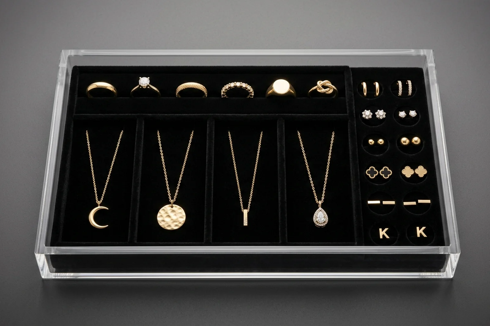
**2. Velvet-Lined Acrylic Drawer Trays.** Clear acrylic trays with black or navy velvet inserts, each tray holding 8–24 pieces in die-cut slots. The material contrast makes metals and diamonds visually pop; the tray format lets staff pull the entire tray out for close inspection without dismantling the display. Typical cost: $25–$60 per tray. See our case study on [luxury cosmetic organizers with velvet inserts](/case-studies/acrylic-cosmetic-organizers-velvet-inserts/) — the same velvet-insert acrylic fabrication technique applies directly to jewelry.
**3. T-Bar and Multi-Arm Necklace Stands.** Vertical acrylic or metal bars with crossing arms holding necklaces at eye-level, typically arranged in groups of 3–9 stands for a wall of necklaces. The vertical presentation shows chain length and pendant drop clearly; flat-tray necklace displays hide these details. Typical cost: $15–$45 per stand. **4. Bust and Neckform Displays.** 3D forms (usually black flocked or clear acrylic) shaped like a neck, displaying a single statement necklace in the context of how it would be worn. Higher perceived value per piece than flat displays, and drives consideration of larger pieces.
**5. Ring Bar Finger Displays.** Horizontal bars or vertical sticks holding rings in a row, sometimes tilted at an angle. The open format lets shoppers try rings on easily; the tilt adds sparkle catch from above lighting. Typical cost: $20–$50 per bar for 10–20 ring positions. **6. Tower Display Cases.** Full-height vertical glass or acrylic cases, often illuminated internally, showcasing hero pieces or brand storytelling. The height creates a focal anchor in the store layout that draws shoppers from a distance.
**7. Wall Pegboard and Hook Systems.** Grid pegboards with interchangeable hooks for fashion jewelry, fast-fashion SKUs, and high-SKU-count categories. The density and easy rotation make this the standard for impulse and fashion jewelry categories. Typical cost: $50–$200 per wall section. **8. Window Display Platforms.** Platform stages at varying heights inside storefront windows, with hero pieces lit and positioned for passerby stopping power. This is the single most valuable merchandising real estate in a jewelry store — glass frontage combined with focused lighting converts street traffic into entering shoppers.
**9. Table-Top Event Displays.** Portable modular displays for trade shows, pop-ups, and event activations: acrylic risers with travel-friendly packing, designed for setup in 5–10 minutes. Typical cost: $100–$400 per set depending on scale. **10. Mirror-Backed Accent Displays.** Display fixtures with integrated mirror backing so shoppers can see the piece from both front and reflected angles simultaneously. Particularly effective for earrings and necklaces where shoppers want to see how a piece sits against skin.
Five jewelry display archetypes mapped to their role in the store layout. Plan your fixture investment from these five positions — then layer specific layouts (tiered risers, velvet trays, T-bars, busts, ring bars) within each.Velvet-lined acrylic drawer tray — the standard merchandising fixture for fine jewelry. Material contrast between clear acrylic and dark velvet creates visual depth that makes metals and gemstones pop.
---
## Layout Principles: Hierarchy, Focal Points, Negative Space {#layout-principles}
Three layout principles determine whether a jewelry display converts or confuses: visual hierarchy, isolated focal points, and disciplined negative space. In 18+ years sitting in jewelry retailer briefings, I've seen the same density instinct repeat: buyers want to fill every inch of the case to justify the fixture cost, and the fixture under-performs because of it. The most common merchandising mistake in jewelry retail is density — cramming inventory to show everything available, which forces the shopper's eye to choose from a grid and kills the focal moment that drives purchase consideration.
**Visual hierarchy** means clearly establishing which piece is the hero, which pieces are supporting, and which are filler inventory. A jewelry counter with 40 rings laid out at equal height and spacing has no hierarchy — the shopper's eye bounces across the grid without landing. A counter where one centerpiece ring sits elevated on a riser, flanked by 6 supporting pieces at mid-height, with 20 filler pieces set in a lower grid, gives the eye a clear entry point and a path through the display. Tiered acrylic risers are the single most common tool for creating hierarchy — they're cheap, modular, and physically enforce the height differential that drives attention. **Isolated focal points** means giving each hero piece a surrounding zone of negative space so it doesn't compete with neighbors. Fine jewelry (engagement rings, statement necklaces, designer pieces) needs 8–15 cm of clear space around it to be read as premium; compressed density signals fashion jewelry regardless of the actual product.
**Negative space discipline** is the hardest principle for retailers to hold — the instinct is always to fill the case with more inventory to justify the square footage. But jewelry sales per square foot actually go up when you reduce density, because fewer pieces with more space convert at higher rates than many pieces competing for attention. The directional math: a smaller set of pieces with room around each one consistently earns higher per-piece consideration than a dense grid of the same inventory. I walk every new jewelry retail client through this tradeoff in their first qualification call — the fixture matters less than the density decision applied to the fixture.
---
## Lighting: The Biggest Sales Lever in Jewelry Retail {#lighting}
Jewelry display lighting is the single highest-ROI investment in jewelry retail — higher than fixture material, higher than layout design, higher than store location within a mall. Since founding Wetop, I've walked enough jewelry showrooms to know within 10 seconds of entering whether the lighting was spec'd by someone who understands jewelry merchandising or someone who picked whatever LED the general contractor stocked. Low-quality lighting makes diamonds look dull, gold look flat, and gemstones lose saturation; high-quality lighting makes the same inventory visibly sparkle and drives measurably higher purchase consideration. The [Gemological Institute of America (GIA)](https://www.gia.edu/) publishes guidance on gemstone presentation and lighting standards referenced across jewelry retail.
Two lighting specifications matter most: Color Rendering Index (CRI) and beam angle. **CRI** measures how accurately a light source renders colors compared to natural daylight on a 0–100 scale, as defined by the [Illuminating Engineering Society (IES)](https://www.ies.org/), the US professional body that publishes retail lighting standards. Standard retail ambient lighting typically runs 75–85 CRI; consumer home lighting runs 80–90 CRI. For jewelry, you want 95+ CRI, the top tier of retail LED specification aligned with IES recommended practice for high-contrast merchandise. The difference between 85 CRI and 95 CRI lighting on a display of diamonds is visible within 2 seconds of comparison; the diamonds under 95 CRI lighting look alive, the diamonds under 85 CRI lighting look flat. **Beam angle** determines how directed the light is — 24° narrow spots create the concentrated sparkle that makes diamonds and polished metals catch light; wide floods create even ambient that makes everything look uniform and unexciting. Jewelry displays should mix narrow-spot directed lighting on hero pieces (24°–36°) with broader ambient fill (60°+) at lower intensity.
Two lighting specifications matter most for jewelry: CRI 95+ at 3000-3500K color temperature, and narrow 24-36 degree directed spots on hero pieces backed by lower-intensity ambient fill. The difference between 85 and 95 CRI is visible within 2 seconds of comparing two cases side by side.
Color temperature matters but less than CRI and beam angle. **3000K–3500K** (warm white) is the industry standard for most jewelry retail — it renders yellow gold and rose gold accurately while keeping diamonds bright. 4000K (neutral white) is sometimes used for platinum and white-gold-focused retailers. 5000K+ (daylight) makes diamonds look icy but makes yellow gold look greenish — usually avoided unless the store has explicitly modern white-only positioning. For deeper color strategy around acrylic's own aesthetic (clear, frosted, or colored), see our guide on [clear vs frosted vs colored acrylic](/guide/clear-vs-frosted-vs-colored-acrylic/) — the interplay between fixture color and product lighting is a real design variable.
---
## Material Matrix: What to Specify Where {#material-matrix}
Four material categories cover almost all jewelry display fabrication, and each has a distinct fit profile based on brand positioning and campaign requirements. The decision matrix below is the one I walk every new jewelry retail client through on their first qualification call.
**Custom acrylic** is the default for most fine and premium jewelry display work — transparency allows lighting to pass through to illuminate pieces from multiple angles, custom shape flexibility accommodates any display layout, velvet inserts are easy to add for contrast, and the 50-unit MOQ at Wetop makes it viable for boutique retailers. Cost range: $25–$150 per fixture for most display types. **Metal** (brass, gold-plated steel, stainless) is used for heritage and luxury brand positioning — metal fixtures signal permanence and craftsmanship in ways acrylic cannot. Tradeoffs: heavier freight, longer lead time, higher unit cost ($100–$400+ per fixture), and less flexibility for design iteration. MOQ 100–500.
**Wood** (walnut, oak, lacquered MDF) is used for craft and artisan positioning — wood fixtures signal handmade quality and warmth, appropriate for craft jewelry, artisan brands, and boutiques emphasizing natural materials. Tradeoffs: moisture sensitivity, wood-grain consistency variability across units, higher unit cost. **Budget materials** (paper, foam, fabric-wrapped cardboard) work for low-price-point fashion jewelry, trade show booths, and pop-up events where fixture longevity isn't required. Don't use these for fine or premium positioning — the material gap is visible to shoppers and undermines perceived product value.
For the velvet-insert fabrication technique that drives premium fine-jewelry display, we apply the same production process documented in our [luxury cosmetic organizer case study](/case-studies/acrylic-cosmetic-organizers-velvet-inserts/) — laser-cut velvet drop-in inserts bonded to acrylic base, with pre-measured slot positions for specific jewelry types.
---
## 5 Common Jewelry Display Mistakes {#mistakes}
Five merchandising mistakes repeat across jewelry retail often enough that they're worth calling out explicitly. Each is avoidable at the display-design stage but expensive to fix after fixtures are installed. For broader industry compliance and retail disclosure context, the [Jewelers Vigilance Committee (JVC)](https://www.jvclegal.org/) publishes the compliance frameworks most US jewelry retailers operate under.
**1. Over-dense layouts that kill focal hierarchy.** Cramming 40 rings into a case meant for 20 cuts per-piece consideration rate in half. Reducing density reliably increases sales per square foot. **2. Low-CRI lighting that makes inventory look cheap.** Most retailers inherit the store's ambient lighting and accept what it does to their inventory. Installing dedicated 95+ CRI jewelry lighting over displays typically pays back within the first year of use and delivers a permanent visual-quality upgrade. **3. Equal-height presentation with no hierarchy.** Every piece at the same elevation produces a grid that the eye scans without stopping. Tiered risers — even cheap acrylic ones — create the vertical differentiation that establishes hero pieces.
**4. Wrong material contrast between fixture and product.** White fixtures with white-gold jewelry, clear acrylic with diamonds under bright ambient, dark velvet with all-black onyx — these combinations erase the visual contrast that makes pieces pop. The fixture should contrast the product, not match it. **5. Ignoring window display as a separate discipline.** The window is the highest-value real estate in the store, and many retailers treat it as an afterthought — rotating interior inventory onto window platforms without lighting, staging, or narrative. A properly designed window display with directed lighting, seasonal narrative, and hero piece staging converts street traffic into entering shoppers at measurably higher rates than generic window merchandising.
---
## Which to Spec for Your Store {#which-to-spec}
For most independent jewelry retailers, boutique chains, and DTC brand pop-ups, custom acrylic display fixtures with 95+ CRI directed lighting are the correct spec. The decision tree below covers exceptions and upgrade paths.
**Spec custom acrylic if:** budget is defined and you need premium visual quality without the tooling cost of metal or wood, OR your brand positioning is modern/minimal/clean, OR your display volume is 50–500 units (MOQ-constrained away from metal and wood), OR you need design flexibility to iterate layouts seasonally. **Spec metal if:** brand positioning is heritage, luxury, or legacy craftsmanship AND budget supports $100–$400+ per fixture AND you're building a 5–10 year fixture program rather than seasonal refreshes. **Spec wood if:** brand positioning is craft, artisan, or natural materials AND the retail environment has controlled humidity AND unit cost premium fits the positioning. **Add budget materials only if:** the fixture is for a temporary pop-up, trade show, or fashion-jewelry-only concept where fixture quality isn't a brand signal.
For custom acrylic jewelry display programs, we fabricate at Wetop from 50-unit MOQ, with standard options including clear or colored acrylic construction, laser-cut velvet drop-in inserts in black, navy, or custom colors, tiered riser geometries, T-bar and bust forms, counter and window case sizes, and integrated LED backlighting for premium hero displays. For product-page context, see our [jewelry displays application page](/applications/jewelry-displays/) and related case study work on [acrylic cosmetic organizers with velvet inserts](/case-studies/acrylic-cosmetic-organizers-velvet-inserts/) — the fabrication disciplines overlap directly. If you're planning a new retail launch or a fixture refresh and want a second opinion before issuing RFQs, email inquiry@wetopacrylic.com with your store concept, fixture count estimate, and target launch date. I'll respond within 24 hours with specific material, fixture, and lighting recommendations calibrated to your brand positioning and budget.
For complementary guides, see [retail acrylic display ideas](/guide/retail-acrylic-display-ideas/) for broader retail merchandising patterns, [custom POP displays for CPG brands](/guide/custom-pop-displays-design-cost/) for adjacent retail display thinking, and [acrylic thickness guide](/guide/acrylic-thickness-guide/) for the structural spec decisions behind any custom acrylic fixture.