---
title: "Acrylic Tray Logo Options: Etch, Print, Insert"
description: "Acrylic tray logo options routed in one guide: laser etch vs bottom print vs replaceable insert, decided by brand color, wear, and artwork-change needs."
category: "Buyer Guide"
author: "Amy Liu"
authorCredential: "Client Account Manager at Wetop Acrylic — coordinating B2B orders from first inquiry through delivery since 2020, 500+ custom projects handled"
datePublished: 2026-07-21
dateModified: 2026-07-21
primaryKeyword: "acrylic tray logo options"
url: https://wetopacrylic.com/guide/acrylic-tray-branding-methods-comparison/
---
## Which method your brief routes to {#routing-answer}
Acrylic tray logo options come down to three production methods: laser etching cuts a permanent frosted mark into the surface; bottom printing seals full-color ink under the tray floor; a bottom insert slides a replaceable printed sheet beneath the tray. Route by three questions — does the logo need color, how hard is the wear, will the artwork change.
The "can you put our logo on the tray?" email is never the brief — the follow-up answers are. A hotel group with a monochrome crest, a cafe chain with a four-color illustrated pattern, and a corporate-gift program that re-themes every quarter all ask the same question and need three different production lines. This guide is the routing layer: it tells you which method your program actually needs and why, then hands you to the deep spec guide for that method. Each of the three has its own full spec sheet on this site — [laser-etched logo specs](/guide/etched-logo-acrylic-trays-spec/), [bottom-print quality specs](/guide/bottom-printed-acrylic-trays-print-quality/), and [bottom-insert artwork specs](/guide/acrylic-tray-bottom-insert-spec/) — so the goal here is to get you into the right one on the first read.
The routing tree we walk buyers through on a first call. Color routes you right, permanence routes you down — and the paint-fill footnote covers the single-color program that wants etch durability without giving up its Pantone.
---
## What each method physically is {#three-methods}
The three acrylic tray logo options are different physical objects, not different print settings. An etched logo is geometry — material removed by a laser. A bottom-printed logo is ink bonded to the underside of the tray floor, viewed through the acrylic. An insert is a second part: a printed sheet the tray sits over.
That physical difference is what drives every downstream property, so it is worth thirty seconds of mechanics. Laser etching vaporizes a controlled depth of the surface — typically 0.05 to 0.2 mm — leaving a frosted mark that reads by contrast against the gloss around it; there is no ink involved unless the recess is deliberately paint-filled. Second-surface bottom printing lays UV-cured ink on the *underside* of the tray, reversed, usually backed with an opaque white layer and a sealing layer — so the logo has glossy acrylic above it and sealing below it, and the serving face stays bare PMMA. An insert is printed on its own sheet and laminated or placed beneath the tray floor, which makes it the only method where the branding and the tray are separable objects. One method removes material, one bonds ink to the tray, one adds a part — three different failure modes, three different strengths.
| Method | What it physically is | Color capability | Wear path | Artwork changeable? | Deep spec guide |
|---|---|---|---|---|---|
| Laser etch | Frosted recess cut into the surface | None (frost) or one paint-fill color at ΔE 2–3 | None — no ink layer to wear | No — permanent | [Etched-logo spec](/guide/etched-logo-acrylic-trays-spec/) |
| Bottom print | Reversed ink sealed under the tray floor | Full color, photographic | Protected — the tray body covers the ink | No — permanent | [Bottom-print quality spec](/guide/bottom-printed-acrylic-trays-print-quality/) |
| Bottom insert | Separate printed sheet beneath the tray | Full color, 85%+ ink opacity spec | Sealed in the assembly | Yes — swap the insert | [Bottom-insert spec](/guide/acrylic-tray-bottom-insert-spec/) |
All three run under one roof here, which changes the buying conversation more than buyers expect. We run the laser line, the UV print line, and the insert lamination step in the same facility, so we quote the three routes against each other honestly instead of steering every brief toward the one machine we own. It also means a mixed program is one purchase order, not three suppliers: the same tray geometry can ship as an etched version for the flagship stores and a printed version for volume locations, cut from the same tooling and inspected to the same standard.
### When a program combines two methods
Some of the strongest branded trays we build use two routes on one tray, because the methods answer different jobs. The recurring hotel pattern is an etched crest on the rim — permanent, tactile, tone-on-tone — over a full-color printed insert in the floor that carries the seasonal artwork. The crest never changes; the floor changes every quarter. A corporate-gift variant runs the reverse: a bottom-printed signature pattern as the permanent base, with an etched recipient monogram added per batch. Combining methods adds a production step, not a redesign — the etch pass and the print or insert pass are separate stations anyway — so the surcharge logic stays per-method. If your brief has both a permanent identity element and a rotating one, say so in the RFQ; splitting the two jobs across two methods usually costs less than forcing one method to do both badly.
---
## Axis 1 — does the logo need brand color? {#color}
Color is the first fork because etching cannot produce it. A clear etch is tone-on-tone: frosted white-ish contrast against gloss, elegant and permanent, but carrying zero color information. If the brand identity lives in its color — most do — the route runs through printing or an insert.
The nuance worth knowing is paint-fill, because it rescues one common case: the single-color brand that wants etch durability. A deeper etch (0.15–0.2 mm) becomes a channel that holds screen-printable pigment, matched to a Pantone Solid Coated reference within ΔE 2–3 — the range Pantone's published guidance treats as acceptable for commercial work.[^pantone] The pigment sits recessed below the surface, mechanically shielded from abrasion, which is why etch-fill outlasts any surface-applied mark. For multi-color and photographic artwork, second-surface printing is the ceiling: the ink reads through the acrylic with a depth and gloss that surface printing cannot reach, and a white backing layer keeps the colors vivid rather than translucent. Inserts carry full color too, with one spec that decides whether they look premium or washed out: ink-stack opacity above 85%, because under warm, dim hospitality lighting a thinner ink stack lets the background read through and desaturates the brand color. When I quote a color-critical program, the Pantone reference and the lighting environment are the two things I ask for before anything else — they decide the method faster than budget does.
---
## Axis 2 — wear, washing, and where each method fails {#durability}
Rank the three by wear resistance and the order is: clear etch, paint-filled etch and sealed bottom print roughly together, then insert — and all four beat a surface-printed logo, which is why surface print on the serving face is not one of the routes we recommend for trays. We still get asked for it, and we still talk buyers out of it: a logo that lives where the glassware slides is a logo with a countdown on it.
The reasoning sits in where each mark lives. A clear etch *is* the tray surface, so nothing can chip, peel, or fade; dishwasher chemistry can still craze the acrylic itself, but the logo has no separate life to lose. Etch-fill pigment sits below the wear plane. A bottom print never touches the working side at all — glassware, cutlery, and cleaning cloths meet bare PMMA while the ink hides underneath — but it inherits a sealing requirement: the underside stack must be sealed against wash water, which is a spec to confirm in writing, not assume. The industry vocabulary for verifying that cured ink stays bonded to a substrate is the cross-cut tape-adhesion test per ASTM D3359,[^astm-d3359] and a supplier who can tell you how their ink stack is sealed and verified is a supplier who has failed one before. Inserts are sealed inside the assembly and hold up well; their wear question is really a tolerance question — a loose insert that shifts a millimeter reads as a defect even when nothing has worn. On washing, all three routes obey the same acrylic care rules as any tray: hand-wash, mild soap, no dishwasher — the method changes where the logo hides, not what PMMA tolerates.
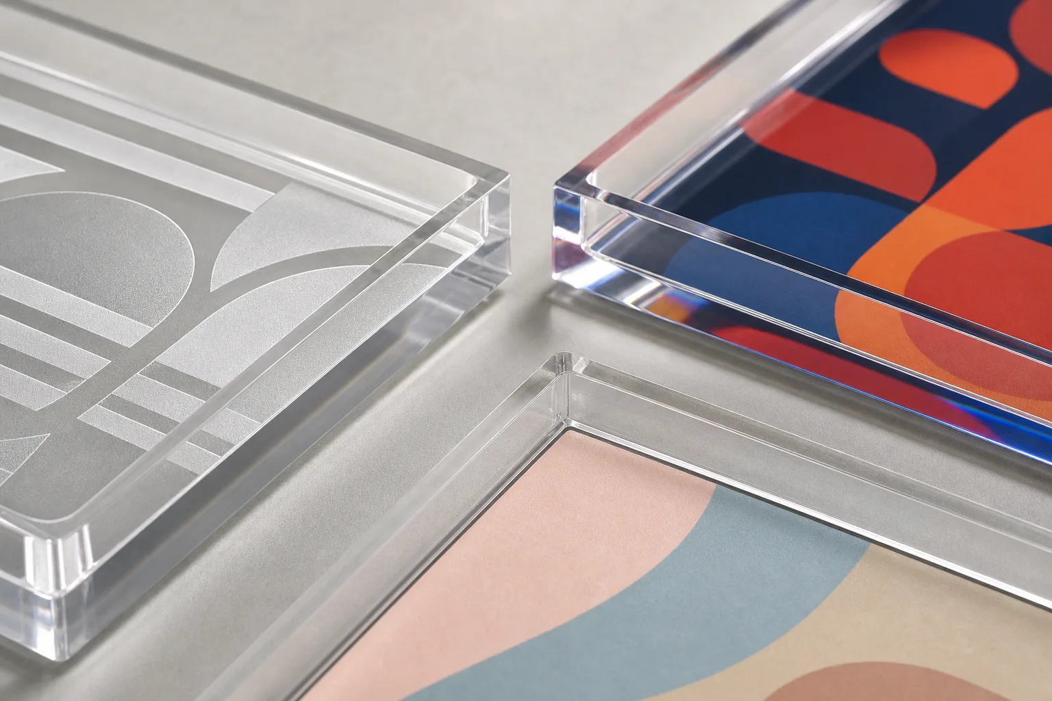
Three routes, one product family: an etched monogram that reads by frost against gloss, a bottom print whose color sits under the acrylic, and an insert whose printed sheet is a separate, swappable part.
---
## Axis 3 — will the artwork ever change? {#changeability}
If the artwork rotates — seasonal themes, campaign branding, a licensed design with an end date — the insert is not just the best option, it is the only one. Etched and printed logos are permanent by construction. An insert program changes artwork by printing new sheets while the tray fleet stays in service.
This axis is the one buyers most often discover too late, and it is the reason I push the question on every first call: a hotel that bottom-prints a beautiful anniversary design owns that design forever, on every tray. The economics of the insert route improve again on reorders. Because the register calibration, ink-stack profile, and cut paths are archived in a tooling library after the first run, a repeat order against the same tray geometry drops from roughly a 21-day timeline to 14 — new artwork, existing tooling. Two of our tray programs show the pattern from both sides: the [bespoke tray artwork integration case study](/case-studies/bespoke-acrylic-tray-artwork-integration/) is a fixed-artwork program where permanence was the point, while the [artist tray brand repeat-order case study](/case-studies/artist-tray-brand-repeat-order/) shows the reorder rhythm a rotating-artwork program settles into. If your brand calendar has quarters in it, route to the insert before you fall in love with a print sample.
---
## Artwork prep — the gate all three routes share {#artwork}
Whichever method you route to, the artwork gate is the same: vector files, outlined fonts, Pantone references, and stroke widths above the method's minimum. Most failed first samples across all three methods trace to the file, not the machine — so the file check happens before quoting, not after sampling.
The rejection patterns repeat so reliably that we run a design-for-manufacturing review on every incoming file. Hairline strokes are the classic: below about 0.15 mm they break up in an etch, and below about 0.3 mm they blur at insert-print scale. Gradient fills render as stepping in print workflows and cannot etch at all. RGB-only files shift when converted for production — send CMYK plus Pantone references. And raster logos pasted inside a vector container are still rasters, whatever the file extension says. If your logo exists only as a PNG, say so up front: redrawing it as vector is routine, but it belongs in the timeline before the sample gate. The [full customization options page](/customization/) covers how these branding methods combine with color, finish, and shape choices across products; the per-method spec guides linked above carry the exact stroke, depth, and opacity numbers for the route you land on.
---
## Writing the RFQ line — and what happens next {#ordering}
A complete branded-tray RFQ line reads like this: tray dimensions and format, method (or the three-question answers so the supplier can route it), vector artwork with Pantone references, quantity, and deadline. With those, a quote and a DFM file check come back in one pass — no spec ping-pong.
From our side the frame is identical across all three routes: MOQ 50 pieces per design, samples in 3–5 days after artwork approval, production in 15–20 days after sample sign-off, 100% inspection in our ISO 9001-certified factory. What the sample stage checks differs by route, and we build that into the approval: on an etched sample we confirm depth and how the mark reads under the buyer's own lighting photos; on a bottom print we confirm color against the Pantone reference and inspect the ink stack for bubbles and pinholes; on an insert we confirm register, opacity under warm light, and the fit that keeps the sheet from shifting. Approving the right things at sample is what makes the production run boring — which is the goal.
Pricing behaves differently per route — etching is surcharged by etch area (roughly $0.40–0.80 per piece at one square inch of etch), printing by coverage and color count, inserts by the second part they add — which is one more reason the routing question comes before the budget question. None of the three carries tooling fees: the laser and the printer are digital, so your artwork file is the tooling, and reorders inherit it. Tray formats, sizes, and thickness options live on our [acrylic trays hub](/products/acrylic-trays/), with the service-tray specifics on the [acrylic serving trays](/products/acrylic-trays/acrylic-serving-trays/) page. When you are ready, [send the RFQ line above with your artwork](/contact/?source=acrylic-tray-branding-methods-comparison) — I will come back with the routing recommendation and the file check within 24 hours, and the first physical sample will show your logo in the method your program actually needs.
[^pantone]: [Pantone — color matching reference system](https://www.pantone.com/) — the industry-standard spot-color system used for brand color on manufactured goods; Pantone's published guidance treats ΔE 1–3 as acceptable commercial color match, the register band quoted for paint-filled etching.
[^astm-d3359]: [ASTM D3359 — Standard Test Methods for Rating Adhesion by Tape Test](https://www.astm.org/d3359.html) — the cross-cut tape-adhesion protocol that is the industry vocabulary for verifying cured ink stays bonded to a substrate, referenced for how sealed bottom-print ink stacks are specified and checked.