---
title: "Printed Acrylic Box — UV, Screen, Vinyl, Engraved"
description: "Printed acrylic box decision guide: UV digital vs screen print vs vinyl vs laser engraving vs metallic foil, matched to your artwork, budget, and quantity."
category: "Manufacturing"
author: "Dillion Chen"
authorCredential: "Production Manager at Wetop Acrylic — running laser, CNC, polishing, and UV printing lines since 2014, 1,500+ custom projects personally overseen"
datePublished: 2026-08-06
dateModified: 2026-08-06
primaryKeyword: "printed acrylic box"
url: https://wetopacrylic.com/guide/acrylic-box-printing-methods-guide/
---
## Which print method your printed acrylic box needs {#short-answer}
A printed acrylic box can be decorated five ways: UV digital print, screen print, vinyl graphics, laser engraving, or hot-stamped metallic foil. Artwork decides the method — photographic and multi-color designs route to UV digital, flat one- or two-color logos to screen print or engraving, metallic lettering to foil. Budget and quantity then set the economics.
Half the box briefs that reach my production desk already contain the decision, phrased as a question. A buyer whose current boxes carry vinyl graphics asks whether the artwork can be digitally printed instead. A buyer with a four-color illustration asks why the last supplier said screen printing would not work. A gift-brand buyer asks for gold lettering on the front panel. I answer some version of each almost weekly, and the answers form the decision table below — the same one I walk buyers through before quoting any box on our [custom acrylic boxes hub](/products/acrylic-boxes/). Our minimum order is 100 pieces per design, samples ship in 3-5 days, and production runs 15-20 days after sample approval, whichever method you land on.
| Decision axis | UV digital print | Screen print | Vinyl graphic | Laser engraving | Hot-stamp foil |
|---|---|---|---|---|---|
| Artwork detail ceiling | Photographic, gradients, fine text | Flat spot color, medium detail | Cut lettering or printed film | Line art, logos, monograms | Lettering, logos, borders |
| Color count | Unlimited, no cost penalty | Priced per color | Limited by film | One (frosted tone) | One foil color per pass |
| Durability on a handled face | Good; best run second-surface | Very good cured ink film | Weakest — edges can lift | Permanent, in the material | Good on low-wear faces |
| Setup cost profile | Print file only | One screen per color per artwork | Cut/print file only | Engraving file only | Metal die per artwork |
| Quantity fit at MOQ 100 | Strong — no setup to amortize | Improves as volume grows | Any quantity | Strong — no setup to amortize | Die amortizes over volume |
| Lead-time impact | None over the base window | Screen making adds days on new art | Minimal | None | Die making adds days on new art |
The rest of this guide takes the table one row at a time: where the ink physically sits on a box, what each method does well, what it refuses to do, and how the choice moves your unit price.
## First-surface vs second-surface — where the ink lives on a box {#ink-position}
Before comparing methods, settle the question that outranks all of them on a box: which side of the wall carries the ink. A first-surface print sits on the outside face, exposed to every touch. A second-surface print sits on the inside face of a transparent wall and is viewed through the acrylic, so the material itself becomes the protective layer.
The same box wall, two ink positions. First-surface prints work on any acrylic color but expose the ink to handling; second-surface prints need a clear wall and put the material between the artwork and the world.
The choice is not free. Second-surface only exists on transparent walls — print on the inside of a black box and nobody sees it. It also demands reversed artwork and, for opaque coverage, a white backing layer behind the colors; the anatomy is the same one we spec on trays, walked layer by layer in our [bottom-printed tray print-quality guide](/guide/bottom-printed-acrylic-trays-print-quality/). First-surface is the default on colored and frosted boxes, on engraving, and on foil, which by nature sit on the outer face.
One box-specific planning note from my production floor: each face of a box is printed as its own flat panel, so artwork that wraps a corner becomes two prints meeting at a bonded seam. My operators align them carefully, but a design that places critical fine detail exactly on a corner is asking the seam to do a print's job — I flag it on every proof. Keep logos and text inside a single face and the problem never exists.
## UV digital print — the detailed-artwork default {#uv-digital}
UV digital printing is the answer to the most common question in box decoration: yes, your artwork can be digitally printed instead of cut from vinyl. A flatbed head jets the full design straight onto the acrylic panel and ultraviolet light cures the ink in place within seconds — the polymerization mechanism the radiation-curing industry body RadTech documents for UV-cured inks[^radtech-uv]. No screens, no film, no per-color anything.
That structure is what makes it the detailed-artwork default. Photographic images, gradients, tonal illustrations, small text, twelve-color labels — the printer does not care, because every design is the same single pass. When we added UV printing to our line in 2020, the pattern I was seeing daily was exactly this: box and display buyers arriving with artwork that screen printing had priced out. The process itself — adhesion, the white ink underlayer on clear panels, Pantone conversion — has its own deep dive in our [UV printing on acrylic guide](/guide/uv-printing-on-acrylic/); for the box decision, what matters is the profile: near-zero setup, unlimited color, and clean economics at our 100-piece MOQ where per-color methods struggle.
The honest limits: UV print is a surface process, so on high-wear exterior faces we either run it second-surface behind a clear wall or advise on placement, and large flood areas of a single brand color can be more economically screened at high volume. Those two caveats aside, when a buyer sends detailed multi-color art for a printed acrylic box, this is the lane we quote first.
## Screen print — one screen per color, and why detail breaks it {#screen-print}
Screen printing pushes ink through a stencil mesh, one color per screen, one pass per color. We have run a silk-screen workshop since 2010, and for what it does well it remains unbeatable: dense, opaque, perfectly even coverage of a flat spot color, at a per-piece cost that keeps falling as quantity climbs.
The same structure explains the answer buyers hear on detailed artwork. A four-color logo means four screens, four setups, four registration passes that must land on top of each other on every box face. Fine lines and gradients either fall through the mesh or demand halftone screens that add cost and soften detail. In 12+ years running both lines I have watched this math play out the same way every time: by the fourth or fifth screen, the setup bill and the misregistration risk have both outrun UV digital, which prints the same design in one pass. So the routing rule I give buyers is simple: one or two flat colors on a big run, screen print earns its keep; anything with photographic detail, gradients, or more than three colors, UV digital wins before the first screen is burned.
There is also an artwork-count multiplier hiding here. Screens belong to a specific artwork version — change the design, even slightly, and the screen set is remade. A program with five box designs in two colors is ten screens; the same program on UV digital is five files. If your line has many SKUs or seasonal artwork, that multiplier usually decides the method before print quality enters the conversation.
## Vinyl and adhesive graphics — when a decal is the honest answer {#vinyl}
Vinyl is the method buyers most often arrive with and least often leave with. Cut adhesive lettering or printed film applied to the box face costs almost nothing to set up, works on any box color, and can be produced same-week. For short-lived promotional boxes, artwork that must change after delivery, or decorating stock boxes already on your shelf, a vinyl graphic is the honest answer, and we will say so.
Its weakness is the edge. A decal is a separate material bonded to the surface, and on a box that gets handled — lids lifted, faces gripped, cartons packed — every film edge is a place where a fingernail, a cleaning cloth, or humidity can start a lift. Direct print has no edge to catch; the ink is part of the surface. That is why our default recommendation for production boxes is direct UV print, with vinyl reserved for the cases above where its changeability genuinely earns the tradeoff.
## Laser engraving — permanent marking with no ink to fail {#laser-engraving}
Laser engraving removes the durability question instead of answering it. The beam vaporizes a shallow layer of acrylic, leaving a frosted mark that is part of the wall itself — no ink, no film, no adhesion, nothing to scratch off. We have been cutting and engraving on the same laser line since 2008, so an engraved logo adds no new process to a box order at all.
The tradeoff is chromatic: engraving gives one tone, the frost-white of machined acrylic against whatever the wall color is. On clear and on dark tinted boxes the contrast is elegant and reads as premium restraint; brands that want "just an etching, not a color logo" are asking for exactly this. What engraving cannot do is brand color, gradients, or photographic art. It pairs well, though — an engraved monogram on the lid over a UV-printed interior card, or engraving on the body with foil lettering on the front face, are pairings we build routinely.
## Metallic gold lettering and foil finishes {#metallic-gold}
Gold lettering on the front of a gift box is one of the oldest requests in our inbox, and it has a real answer: hot stamping. A heated metal die presses metallic foil onto the box face, transferring a genuinely reflective metal-effect layer that printed ink cannot fully imitate. Wetop runs hot stamping alongside the print lines, and for logos, monograms, and border rules on gift and retail boxes it is the premium route.
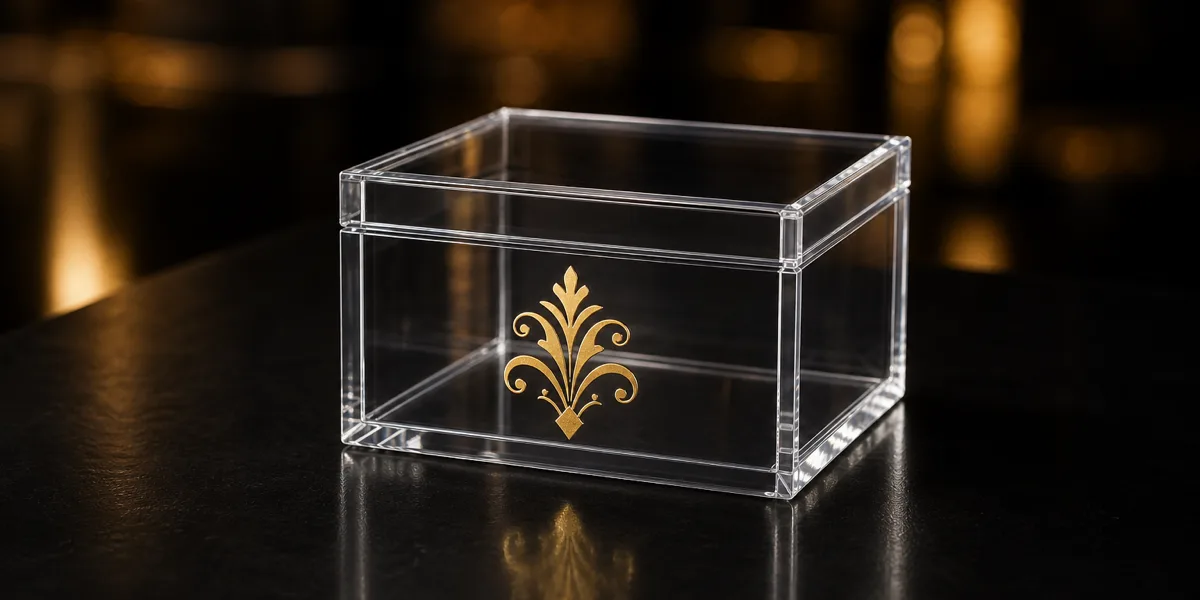
Hot-stamped gold foil on a clear acrylic gift box front. The foil layer is genuinely reflective — a mirror-like finish that metallic-effect printed inks approximate but do not match.
The first thing I check on a gold-lettering brief is whether the mark will change between orders, because that answer picks the route before aesthetics do. Two things to know before you spec it. First, the die: hot stamping needs a custom metal die per artwork, so it behaves like screen printing economically — a setup cost that amortizes over quantity, best spent on lettering and marks that will not change between orders. Second, the alternative: metallic-effect UV inks print gold and silver tones as part of a full-color design with no die at all. The effect is a shimmer rather than a mirror, and which reads better depends on the artwork and the light it will live under.
That uncertainty is why metallic work carries its own approval habit. A finish that looks right on a backlit screen can land warmer, cooler, or flatter in physical foil, so for metallic and specialty finishes we quote an A/B sample — the standard version and the metallic version side by side — before bulk. It is the same logic that governs sheet-level specialty materials in our [metallic and pearlescent finishes guide](/guide/specialty-acrylic-finishes-metallic-pearlescent/): when appearance is the purchase, approve the appearance physically.
## Will the print scratch off? Durability by method {#durability}
Durability on a box is a geometry question first and a chemistry question second. Rank the methods by what protects the artwork: engraving is untouchable because the mark is the material; second-surface UV print is next because millimeters of polished PMMA stand between ink and world; first-surface prints — UV, screen, foil — rely on the bond between cured ink and acrylic; vinyl trails because its edges are exposed by design.
For the bonded methods, adhesion is the property to talk about, and it has an industry vocabulary: the cross-cut tape method of ASTM D3359[^astm-d3359], which scores a lattice through the coating and rates how much detaches. That is the vocabulary I tell buyers to use with any supplier — "how does your cured ink perform on a cross-cut test?" invites a specific answer where "is the print durable?" invites reassurance.
On our own orders the practical gate is inspection: every box we ship passes 100% piece-by-piece QC, and on printed boxes that includes checking the print against the approved sample and a wipe-down of the printed faces — a print that marks the cloth or lifts at an edge does not leave the factory. Pair that with sensible placement (high-wear faces engraved or printed second-surface, foil kept off sliding contact surfaces) and scratch worry stops being a reason to avoid a printed acrylic box.
## How print method moves your unit price {#unit-price}
Print method is one of seven levers that set a custom box price: size, construction, thickness, lid style, print method, artwork count, and quantity. The first four price the box itself — a hinged lid prices differently from a lift-off lid, as our [acrylic box with lid buying guide](/guide/acrylic-box-with-lid-buying-guide/) breaks down — and the last three price the decoration program on top of it.
The methods split into two economic shapes. UV digital, engraving, and vinyl are file-only: almost no setup, so the 100-piece order and the 500-piece order carry the same per-piece decoration logic, and adding artwork versions costs little. Screen printing and hot stamping are tooling methods: screens and dies cost real money per color and per artwork version, then fade toward irrelevance as quantity spreads them thin. That is the whole pricing story in two sentences — detailed multi-color art on modest quantities belongs on UV digital not because screen printing cannot do it, but because you would be buying a stack of screens the math cannot justify; a two-color logo on a 2,000-piece annual program belongs on screens for exactly the mirrored reason.
When we quote, we price the drivers separately, so you can see what the print method itself costs and test a swap without re-specifying the box. Ask for the quote that way; a supplier who prices the box and the decoration as one opaque number has made the comparison impossible.
## Blank boxes now, printed later — the budget fallback {#blank-vs-printed}
When a printed quote lands above budget, the fallback is not always a cheaper print method — sometimes it is no print at all. Blank boxes drop the decoration setup and per-piece cost entirely, and some buyers have graphics applied by a local sign shop, or launch blank and add printing on the reorder once the product proves out. We quote blank and printed versions side by side whenever a buyer asks, with no argument for the bigger number: the box construction is identical, so the blank order protects the launch date and the budget while keeping the printed spec on file.
Three practical notes from orders that took this path. Deadlines: production runs 15-20 days after sample approval regardless of printing, so removing print scope late in a project does not conjure back a missed freight window — every launch I have seen forced onto air freight lost its buffer at the artwork stage, not the factory stage. Scope: we manufacture and ship the boxes; filling them with your product is kitting work that happens on your side, so plan that step into the timeline. And scale: one boutique brand program we built — a 250-unit multi-SKU gift box rollout, delivered in 22 days — is documented in our [acrylic gift box case study](/case-studies/acrylic-gift-box-boutique-rollout/) if you want to see how construction, decoration, and deadline decisions play out on a real order.
If a box program is on your desk, the fastest route is to [send your artwork and box specs for a quote](/contact/?source=acrylic-box-printing-methods-guide) — imperfect files welcome, since flagging what needs fixing is the first thing we do. Still shaping the spec? Start with our [customization overview](/customization/), or browse constructions on the [acrylic boxes hub](/products/acrylic-boxes/). A correct-size printed sample in 3-5 days is the cheapest way to settle every question this guide raised about your specific artwork.
[^radtech-uv]: [RadTech — The UV & EB Curing Process](https://radtech.org/the-uv-eb-curing-process/) — the UV/EB curing industry association's explanation of how ultraviolet light polymerizes monomer/oligomer formulations (inks, coatings, adhesives) onto a substrate, supporting the description of UV-cured inkjet printing used here.
[^astm-d3359]: [ASTM D3359 — Standard Test Methods for Rating Adhesion by Tape Test](https://www.astm.org/d3359.html) — the cross-cut adhesion protocol cited as the industry method for verifying that cured ink stays bonded to a substrate; referenced here as the method itself, not as a test Wetop performs in-house.